| Image |
Comment |
| 07/31/2007 12:56:42 AM |
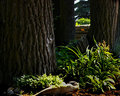
Day 15 - Under the Treesby PrismComment: (Without reading anyone else's comments)
I feel cool looking at this. A nice shady spot to hide from the summer sun. Bringing out some more detail out of the shadows, then dropping the levels a bit would add to the richness in my opinion. |
 Photographer found comment helpful. Photographer found comment helpful. |
| 07/31/2007 12:54:48 AM |
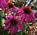
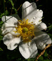
Day 12 - Roseby PrismComment: (Without reading anyone else's comments)
Ouch - Reds are tough. What our eyes see is never what our cameras capture, and Reds can be about the worst to replicate. Saturation and contrast are too high on this in my opinion. |
| Photographer found comment helpful. |
| 07/31/2007 12:53:13 AM |
Day 14 - Bad Hair Dayby PrismComment: (Without reading anyone else's comments)
A bit harsh and busy. If you are willing to experiment, try adding a soft focus filter to the background and reduce it's levels and saturation at the same time. That will put the main focal point out to grab and hold teh attention.
Cool fence by the way - quite rustic and far from the cookie-cutter-same -as-everyone-else kind of fence. A lot of character there. |
| Photographer found comment helpful. |
| 07/31/2007 12:50:30 AM |
Day 13 - In the Shadeby PrismComment: (Without reading anyone else's comments)
A bit too punchy in my opinion. The shadow details seem kind of lost, while the green jump off the page. |
| Photographer found comment helpful. |
| 07/31/2007 12:49:00 AM |
|
| Photographer found comment helpful. |
| 07/31/2007 12:48:20 AM |
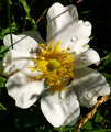
Day 11 - Delphiniumsby PrismComment: (Without reading anyone else's comments)
Nice use of complimentary colors between main focal point and the background. A touch harsh, but I know I've tried to get these kind of colors and levels right, and dagnammit it's hard! |
| Photographer found comment helpful. |
| 07/31/2007 12:46:31 AM |
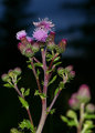
Day 10 - Canada Thistleby PrismComment: (Without reading anyone else's comments)
Nice background to compliment the colors.
The background thistle is a plus, just wish it had been a little higher and maybe more behind the main one. That generally prevents two main focal points in an image and keeps ones eyes in the main part. |
| Photographer found comment helpful. |
| 07/31/2007 12:44:23 AM |
Day 9 - The Visitorby PrismComment: (Without reading anyone else's comments)
Mixed feelings on the diagonal shadows. In one way it adds to the shot, in another, it makes for too busy. Overall I think it could use a tad more punch in the way of levels, or added brightness/contrast, or as some call it, luminosity. |
| Photographer found comment helpful. |
| 07/31/2007 12:42:21 AM |
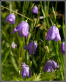
Day 8 - Bluebellsby PrismComment: (Without reading anyone else's comments)
Very nice presentation. Great levels, details and overall tones, with a very effect minimal depth of field.
(I know - couldn't avoid the pun) |
| Photographer found comment helpful. |
| 07/31/2007 12:40:27 AM |
Collage 1 - Everything Floralby PrismComment: (Without reading anyone else's comments)
Nice presentation and way to present your shots for the week.
Having each image with a drop shadow kinda adds a nice touch often. Just something to consider. |
| Photographer found comment helpful. |
Home -
Challenges -
Community -
League -
Photos -
Cameras -
Lenses -
Learn -
Help -
Terms of Use -
Privacy -
Top ^
DPChallenge, and website content and design, Copyright © 2001-2025 Challenging Technologies, LLC.
All digital photo copyrights belong to the photographers and may not be used without permission.
Current Server Time: 06/21/2025 02:14:06 AM EDT.