| Image |
Comment |
| 04/19/2005 07:52:03 AM |
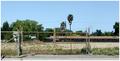
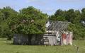
Please Lock Gate When Leavingby GeneralEComment: A touch of humor at last!
Well seen and an unusual take on this challenge. Not sure if the building is abandoned or the field is, but regardless, the fencing seems to be taking top honors as a focal point instead of a building. Image is a bit soft/needing to be a bit sharper/clearer. (4) |
 Photographer found comment helpful. Photographer found comment helpful. |
| 04/19/2005 07:40:40 AM |
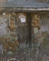
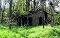
Door that's closed for everby tiki28Comment: Well seen.
Image is a little soft or out of focus and should be a bit sharper. A slight boost in saturation and slight decrease in brightness would richen this image up in my opinion. |
| Photographer found comment helpful. |
| 04/19/2005 07:38:55 AM |
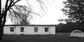
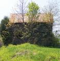
Camp Turleyby LesleyNelsonComment: Though meeting the challenge, there isn't a lot to really capture a viewr's attention here. The focal point shifts back & forth between the dome structure to the main building, fighting for attention (distracting). |
| Photographer found comment helpful. |
| 04/19/2005 07:36:35 AM |
Withered and Weatheredby totaldisComment: Pretty good composition and well seen.
The black borders are hurting this image and a wider aspect crop would have looked better in my opinion. We aren't stuck to 640x480. 640x640, 640x512, 640x480, 640x400 and even 640x320 are fairly popular sizes |
| Photographer found comment helpful. |
| 04/19/2005 07:34:02 AM |
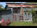
This one has seen better days....by Physics_GuruComment: Perhaps a little too centered composition-wise.
A little different point of view would have eliminated the "pipe" in the lower right corner, which is an element of distraction. |
| Photographer found comment helpful. |
| 04/19/2005 06:06:08 AM |
One day I will be grand.by raykay23Comment: A little to bright/high on the contrast in my opinion.
As a suggestion, try taking the image into Photoshop (assuming you have it), and in the Hue/Saturation adjustments, take the yellow channel hue and saturation to the right a little (may 10 pts) and bright the lightness down a bit (10-20 pts) to give the yellows more of a darker, richer green look, and bring the red saturation up just a little. |
| Photographer found comment helpful. |
| 04/19/2005 06:05:10 AM |
This Old Houseby rexComment: As a suggestion, try taking the image into Photoshop (assuming you have it), and in the Hue/Saturation adjustments, take the yellow channel hue and saturation to the right a little (may 10 pts) and bright the lightness down a bit (10-20 pts) to give the yellows more of a darker, richer green look, and bring the red saturation up just a little. (4) |
| Photographer found comment helpful. |
| 04/19/2005 06:01:31 AM |
Plank Houseby eaemthomasComment: Image seems more about the foliage than the building in my opinion.
Perhaps a little more angle on the building would help the composition.
As a suggestion, try taking the image into Photoshop (assuming you have it), and in the Hue/Saturation adjustments, take the yellow channel hue and saturation to the right a little (may 10 pts) and bright the lightness down a bit (10-20 pts) to give the yellows more of a darker, richer green look, and bring the red saturation up just a little. |
| Photographer found comment helpful. |
| 04/19/2005 05:59:49 AM |
Once upon a time....A man's castle was his home.by arminComment: As a suggestion, try taking the image into Photoshop (assuming you have it), and in the Hue/Saturation adjustments, take the yellow channel hue and saturation to the right a little (may 10 pts) and bright the lightness down a bit (10-20 pts) to give the yellows more of a darker, richer green look, and bring the red saturation up just a little. |
| Photographer found comment helpful. |
| 04/19/2005 05:59:27 AM |
JUST LISTED - Charming Fixer-Upperby 2ShayComment: As a suggestion, try taking the image into Photoshop (assuming you have it), and in the Hue/Saturation adjustments, take the yellow channel hue and saturation to the right a little (may 10 pts) and bright the lightness down a bit (10-20 pts) to give the yellows more of a darker, richer green look, and bring the red saturation up just a little. |
| Photographer found comment helpful. |
Home -
Challenges -
Community -
League -
Photos -
Cameras -
Lenses -
Learn -
Help -
Terms of Use -
Privacy -
Top ^
DPChallenge, and website content and design, Copyright © 2001-2025 Challenging Technologies, LLC.
All digital photo copyrights belong to the photographers and may not be used without permission.
Current Server Time: 06/26/2025 01:02:58 PM EDT.