| Image |
Comment |
| 04/19/2005 10:01:27 PM |
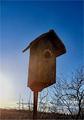
...For Now...by cosmicComment: Got a couple things to comment on here and hope they can be of help.
I'm sure by now you have received comments about the mottled/blotchy sky. I see this sometimes using neat image, sometimes if I have "played with" the contrast & saturation too much. In any case, if you didn't use neat image, it is a decent tool to have in your arsenal to reduce noise.
The bird house and horizon being off, throw this out of balance in my opinion
and lastly a slightly different composition would help to have the main subject not quite in the center.
Tough shot with the sun where it was, as i can just see a bit of lens flare, which is OK to have in a shot like this, and often adds to it a bit.
I hope you take no offense at what may seem "picking it apart", but it will hopefully be taken as constructive critisism. (4)
|
 Photographer found comment helpful. Photographer found comment helpful. |
| 04/19/2005 08:15:29 PM |
Dayton (My First Entry)by jdw_picsComment: AT 400x320 pixels, this image is a bit on the small side for a challenge.
Seeing as the boy doen't look to be abandoned, I can only assume the rubble behind him is what is abandoned. Though a decent shot photographically, a viewer's eyes will be drawn to the boy rather than what the challenge was intended to be about. Had the image been taken from a bit further back and had him off to the side maybe fro perspective, this would have met the challenge better. |
| Photographer found comment helpful. |
| 04/19/2005 04:35:32 PM |
Bye Bye Birdieby bhoundComment: Great detail and exposure control.
Depth of field was just right for this shot, as was the "fuzz" left behind. |
| Photographer found comment helpful. |
| 04/19/2005 04:22:23 PM |
|
| Photographer found comment helpful. |
| 04/19/2005 03:16:29 PM |
Lost in the Mistby tazzaComment: Well seen and composed.
In my opinion, the shot coud use some white in it, but then again can't dodge in an open challenge. |
| Photographer found comment helpful. |
| 04/19/2005 03:15:10 PM |
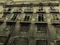
A haunted manor?by carlosmfernandesComment: Well seen and cropped.
The toning in your post-processing this shot adds a lot to the mood.Is that a person on the upper left balcony? |
| Photographer found comment helpful. |
| 04/19/2005 03:13:12 PM |
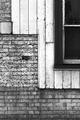
Timber & Bricksby robsmithComment: The more I look at this, the more I like it.
You have a good eye for a composition / crop and like all the intersecting textures.
Good choice for B&W too. Had to bump it up a notch. |
| Photographer found comment helpful. |
| 04/19/2005 03:11:39 PM |
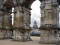
2000 years unusedby rhipsterComment: Good exposure control and level of detail.
I also like the framing of the distant tower between the uprights. |
| Photographer found comment helpful. |
| 04/19/2005 03:10:28 PM |
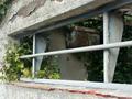
Convenient for the weedsby WobbleComment: Nice artistic interpretation on this challenge.
Detail in the plaster/stucco textures and in the broken brickwork add a lot to this shot.
Good eye! |
| Photographer found comment helpful. |
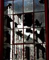
| 04/19/2005 03:09:07 PM |
Broken Glassby racerComment: Nice moody composition - well done. Would be curious to see this in a B&W/Duotone.
Good eye!
Came back to bump this one up a couple notches. The more I look at it, the more I like it. |
| Photographer found comment helpful. |
Home -
Challenges -
Community -
League -
Photos -
Cameras -
Lenses -
Learn -
Help -
Terms of Use -
Privacy -
Top ^
DPChallenge, and website content and design, Copyright © 2001-2025 Challenging Technologies, LLC.
All digital photo copyrights belong to the photographers and may not be used without permission.
Current Server Time: 06/26/2025 05:23:29 PM EDT.