| Image |
Comment |
| 04/30/2005 12:23:08 AM |
Spike a Drink by TranquilComment: Greetings from the Critique Club!
"The sign of a photographer: Take a mundane subject and turn it into art"
This was an unusual challenge in that the object was to take an ordinary household object and create an interesting photograph from it, all within in a time frame of 24 hours.
Composition:
Your image was a unique and very imaginative one that thrilled the viewers and voters. There is dropping a tack into fluid, then there is the tranquil method - with PUNCH! This shot has a lot going for it in the way of punch: The colors are vivid and well chosen. The angular trajectory kept this from being a boring shot, as the eye is drawn not only to where the tack is now, but the mind can easily re-trace where it entered the fluid, and yet does not compete with the main focal point. The depth of field falls off at the right point in the image in my opinion, keeping the focal point in one place.
Interest, wow factor and the tranquil punch all added up to this being THE 24-hour challenge winner, and well-deserved at that.
Lighting:
How much can be said about the lighting here that the image doesn't say for itself? It rocks and was the key element in taking this shot right to the top. Well-balanced with just the right amount of contrast.
Post-Processing:
You have a good handle on your post-processing in this picture. You didn't go off the deep end in the saturation and as easy as this may have been to go over the top with an unusual border, you chose the simple approach, and was effective in being supplemental to the overall look/feel.
Suggestions/Improvements:
I think after studying this for a while, I have found I have nothing to suggest in ways to improve this image within the open challenge editing guidelines.
Congrats on a very fine job and on the Blue Ribbon Lee!
I hope this was useful to you, and please feel free to contact me via PM if you have any questions regarding this critique or anything else relating to the site in general.
Regards,
Brad Message edited by author 2005-07-31 12:41:20. |
 Photographer found comment helpful. Photographer found comment helpful. |
| 04/29/2005 04:16:54 AM |
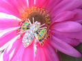
A little something extraby buzzmomComment: I am having a tough time with this one.
This image is bursting with color from one corner to the other.
That much color is a clash in the eyes, especially when you are trying to grab attention to a primary focal point - the jewelry.
Perhaps a darker flower would have worked better, such as a dark rose.
Met the challenge, and did it with a color explosion on my monitor - LOL (5) |
| Photographer found comment helpful. |
| 04/29/2005 04:12:54 AM |
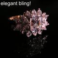
Elegant Blingby phreakonComment: Wow - this jumps off the page at me!
Clarity & cut - no wait that would be rating a diamond - the clarity & detail here look pretty good and from the number of stone facets, a nightmare to shoot without reflections, which are very present in the shiny surface this was shot on.
Had you placed this on black velvet, a black mirror or similar, I think it would have looked a bit better and the distractions in the foreground (reflections) wouldn't be so strong. Not sure the font style works for me, but a minor thing really. (6) |
| Photographer found comment helpful. |
| 04/29/2005 04:08:24 AM |
My ringby RUEDISCHMUTZComment: Excellent B&W choice here in this somewhat abstract composition.
The strong diagonal in the background adds a nice flair to the shot, the reflections in the glass work well and overall a very nice take on this challenge. (8) |
| Photographer found comment helpful. |
| 04/29/2005 04:03:31 AM |
Skull Ringby pawdrixComment: Beauty & the Beast approach!
Nice composition, with the rose taking a bit too much of the focal point in my opinion.
Lighting overall is good, with only a small area blown out on the forehead of the skull. (5) |
| Photographer found comment helpful. |
| 04/29/2005 03:59:13 AM |
Tree of Amberby smartypantsComment: While not really looking like a jewelry advertisement, your composition is nicely laid out in that it was offset slightly, tipped back and not a dead straight static shot which capld have easily been done. The small stones do compliment the shot and the total white out of the background keeps the eyes where they belong. Some of the foreground stones being out of focus in some ways distracts me, but then again, lead my eyes inwards, where they should be going anyway. (6) |
| Photographer found comment helpful. |
| 04/29/2005 03:05:25 AM |
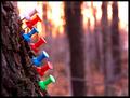
Marching One By Oneby DeniseBernadetteComment: Greetings from the Critique Club!
"The sign of a photographer: Take a mundane subject and turn it into art"
This was an unusual challenge in that the object was to take an ordinary household object and create an interesting photograph from it, all within in a time frame of 24 hours.
Composition:
Your composition pulls the eye right to the main focal point - The Tacks. This accomplished meeting the challenge with a bull's eye. The strong presence of the tacks in the shot keep the eyes from wandering around, being distracted by additional objects in the image. The background, while colorful, is supplemental and not over-powering as the depth of field drops it strongly out of focus.
Lighting:
Your subjects are well lit, and you demonstrated a fine job of placing the sun directly behind one of the tacks with just enough flare on it's sides to recognize what it was, without blowing out the shot. The glow on the tree bark and the colors cast in the background trees balanced this out well.
Post-Processing:
You have a good handle on your post-processing in this picture. The tacks have a natural color, the sharpness is good and overall the image is not over processed nor over saturated. The simple border applied was complimetary to the shot and the color chosen feels right with the overall look.
Suggestions/Improvements:
I think after studying this for a while, I have found little to suggest in ways to improve this image. One possiblity would have been to change the order the tacks were arranged so the upper tack would have been a darker one and would have stood out a bit more against the bright background.
I hope this was useful to you, and please feel free to contact me via PM if you have any questions regarding this critique or anything else relating to the site in general.
(On a side note, you were the recipient of my very first critique here)
Regards,
Brad |
| Photographer found comment helpful. |
| 04/29/2005 12:32:33 AM |
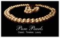
Pure Pearlsby bobdaveantComment: Dear anonymous participant,
This by chance, came up next and just noticed that it will be 2,000 image comment since I joined this site, and am actually happy this shot came up, as I really like it!
Composition is well laid-out, the lighting is soft enough and the text / font used as well as the message are just right. In a member's challenge, you would have been able to destaurate / tone down the 2 orange lighting reflections in the back, but such is life in an Open Challenge.
Good luck and now going to add to my favorites as a milestone tonight. (8) |
| Photographer found comment helpful. |
| 04/29/2005 12:09:56 AM |
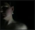
The Earringby saiphfireComment: I like the intent here and applaud you on pulling off a rather unusual & difficult lighting job on just the earring.The skin tone has a less than natural / appealing greenish tone to it that seems to be clashing with the pink cheeks. (5) |
| Photographer found comment helpful. |
| 04/29/2005 12:01:01 AM |
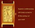
Gruenby graphicfunkComment: Nicely laid out composition with a complimentary color for the background.
Only thing that isn't coming across well here is the style / size / spacing of the font. Not sure what may look better, just seems at odds with the watch. (6) |
| Photographer found comment helpful. |
Home -
Challenges -
Community -
League -
Photos -
Cameras -
Lenses -
Learn -
Help -
Terms of Use -
Privacy -
Top ^
DPChallenge, and website content and design, Copyright © 2001-2025 Challenging Technologies, LLC.
All digital photo copyrights belong to the photographers and may not be used without permission.
Current Server Time: 06/28/2025 08:53:14 AM EDT.