| Image |
Comment |
| 05/17/2004 07:28:33 PM |
Right through the center...by YomiComment: OHMYGOSH! Superb colors, textures. Shutter speed PERFECT for the water. I HOPE no one uses a micrometer to claim it's not "dead center" - what a crazy thread about that in progress.
Did you try a polarizer on this by chance? If the light angle was right - you may be able to tone down some of the reflections on the rock. (It's fine as is - and don't REMOVE the reflection, just remove part of the glare.)
Overall - it's got everything going for it - standby for a ribbon headed your way. |
 Photographer found comment helpful. Photographer found comment helpful. |
| 05/17/2004 07:28:17 PM |
Oh, hello! by JeanComment: Excellent indeed! It's near perfect and is getting high marks from me. The hint of feet at the edge of th shell is a GREAT touch. Here's a way to turn a strong 9 into a 10: 1) There is a merger with the back ege of the shell and the frog's left eye. It would read a bit better if the eye stuck up a bit more. 2) Your filesize is just about 50 k - and there's quite a bit of mottling in the shell. Save it with less compression, closer to the 150 k limit and you'll have a stronger entry.
Congratulations on a superb entry. |
| Photographer found comment helpful. |
| 05/17/2004 02:35:07 PM |
Linksby peeceeComment: Hi Paul and *Greetings from the Critique Club *
YOu are fortunate to have received quite a few comments during the challenge.
As you know - most of the comments mention they'd like more in focus - but you - the artist, said "you got what you were looking for." So that's easy - the artist wins in every case!
Even with ypur shallow DoF - you may consider cropping out a bit of the left side, thereby placing the in-focus link right in front.
I can envison that link in the bottom left corner and then the chain running is a diagonal line towards the top right.
In any event - keep shooting and sharing - you do nice work.
-Tom- |
| Photographer found comment helpful. |
| 05/17/2004 09:58:38 AM |
Butler County Landmarkby jpochardComment: Hi Judy and *Greetings from the Critique Club *
As you will note, I left a fairly long comment on your image during the challenge. I stand by my earlier comments and am very surprised your image didn't finish higher.
There was a comment about the image being tilted - which is not the case. If you look at the left and right sides of the image - the building is victim of the effect called "keystoning" which is caused by shooting up with a wide angle lens. Keystoning can be corrected by a) Using a shift perspective lens (expensive and probably not available on the 717), b) Shooting level with the building (have a heliocopter?) or c) Post processing.
Once again - a very strong and vibrant submission - congratulations. |
| Photographer found comment helpful. |
| 05/16/2004 09:51:26 PM |
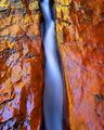
Water On Fireby bruskiComment: Hi Nick and *Greetings from the Critique Club *
Although I already commented on your image during the challenge - it's nice to see what others have said and see if we can come up with a consensus.
First - it's a great image - coming in 29th in a very competitive challenge. The major things that pushed it up there are: a) Superb Colors, b) Superb textures, and c) Perfect exposure.
On the downside, a few commenters, including me, had some difficulty with the composition. I don't know if you've had any "art theory" classes, but they have actually "measured" viewers eyes to see where the eyes "go" inside an image - and the path to get there.
In America, and other countries where they read from left to right, the studies show that images which have a "lead-in line" starting at the bottom left or so - then take the viewer into the image - rate higher more consistently than those that don't. Of course that's not a hard rule saying there should "always" be one. (The study I am familiar with did not comment on countries that read right to left.)
So - since you do have a lead in there - note that it takes you diagonally up and to the left - and out of the frame. That's why I commented earlier that if you included the bottom of the lens shape, it would do better.
I know I've used a lot of words to say very little, but when the image is as close to "PERFECT" as yours, sometimes it's nice to know the theory behind what commenters are saying.
In any event - keep up the good work - and I definitely predict you'll be on the ribbon list(s) very soon. I loved your entries in Still Life and Proportion. |
| Photographer found comment helpful. |
| 05/16/2004 07:23:29 PM |
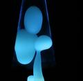
Father & Childby RoosterComment: Hi Rooster and * Greetings from the Critique Club *
Yours is a very lovely and intriguing entry indeed. I can see it nicely framed and hanging in the reception area of a high class office.
It's a shame that the rules said that "if you can tell what it is, it's not an abstract." I believe some of the voters deducted points because they thought they knew what it was. In this case, even if you KNOW - it's still an abstract - that's what lava lights do - create abstract shapes!
I usually like to give some ponters on how to make an image better - but I honestly don't know what you could do to improve this image. Everything seems to work very well - as is - including the title.
The dark background, exposure, composition, lighting, and post processing were all done to perfection.
|
| Photographer found comment helpful. |
| 05/16/2004 06:59:25 PM |
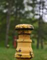
Rusty pipeby BikeRacerComment: Hi Ara and *Greetings from the Critique Club *
Congratulations on your first challenge! You have received a good collection of valid comments that pretty much agree. So let's just summarize and add a bit of "reason why."
1) When a viewer looks at a picture - the initial tendency is to find the area of greatest contrast. That could take the form of a bright area next to a dark, or an area where two colors "clash" - that is they are opposites on a color wheel, or where there is an abrupt change in focus - all depending on the image. If that's where you want them to go, that's great. If not, something should be done to change it.
2) In your image, there are three areas of "contrast" - a) The white sky in the trees at the top and b) the red next to green area, and c) the yellow next to green area (which has both a color contrast and a focus change contrast.)
So - what the comments have said in summary it that you could remove two of these areas either by cropping, or by changing the camera angle, leaving just the one you want.
I'm not sure I agree with the comment that the DoF works really well. You shot this a f11, but since the yellow pipe subject is pretty much on the same plane - I think it may be better shot a bit more open, (say from f 2.8 - f 5.6). That would tend to make the background a bit more blurry - which I believe would be a help to the image.
All in all - a very nice entry - especially for a very first. Please keep sharing.
-Tom- |
| Photographer found comment helpful. |
| 05/16/2004 03:12:15 AM |
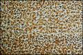
Brownian Notionby GeneralEComment: Hi Paul and *Greetings from the Critique Club *
As a pretty new member to DPC and the Critique Club - let me thank you for the work you do on the SC. I can tell by the recent activity, it's not an easy task.
Your image is an enjoyable one - a nice abstract tapestry that is made a bit mysterious by the title. Unfortunately, I would call it a "Howard Cossell" image - people will either LOVE it or HATE it because they are looking for something it doesn't have.
Since it's an abstract - all the "rules" are pretty much null and void - but I hope you played around with color enhancement. I really like the areas where a subtle blue tint sneaks through.
May your worst shot in the future be better than your best shot of the past. (A toast, slightly modified.)
-Tom-
|
| Photographer found comment helpful. |
| 05/16/2004 02:40:49 AM |
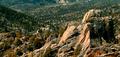
Peak and Valleyby goinskiingComment: Although a nice scenic with great lighting - presented well, it's a real stretch to get "opposites." I know the title tries to convince me, but it doesn't. It still a nice image - thanks for sharing it. |
| Photographer found comment helpful. |
| 05/16/2004 02:36:03 AM |
Intermingleby elsapoComment: Interesting, nice high key - and would make a good image for the reception area of an office building. But dummy me, I just don't get much "opposite" - even tho the primary colors are complimentary on a color wheel. |
| Photographer found comment helpful. |
Home -
Challenges -
Community -
League -
Photos -
Cameras -
Lenses -
Learn -
Help -
Terms of Use -
Privacy -
Top ^
DPChallenge, and website content and design, Copyright © 2001-2025 Challenging Technologies, LLC.
All digital photo copyrights belong to the photographers and may not be used without permission.
Current Server Time: 08/26/2025 07:51:50 PM EDT.