| Image |
Comment |
| 11/19/2004 01:43:01 PM |
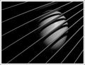
Slicesby MoreiraComment: This one is just way to simple. Not much to look at. At first at least. I however after a few seconds started to like this one. Stronge lines, Great Dof, Very sharp. Extremly good light and shadow work. While the subject is not overely exciting the almost flawless lighting makes up for it. Great job. |
 Photographer found comment helpful. Photographer found comment helpful. |
| 11/19/2004 01:38:01 PM |
Can´t wait...by LalliSigComment: hmm good lighting I like the shadows around the neck and shouldes. Good DoF and subject. The pose dosn't quite work for me. I suppose however that getting a pregnate woman to pose fo hours, until you find just the right one would be close to suicidal. The phot oalso looks a little soft but I thing I like it considering the subject. |
| Photographer found comment helpful. |
| 11/19/2004 11:29:52 AM |
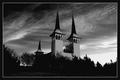
Two Towers by JohannesFrankComment: Well I like it. It's the best lanscape shot of the challenge IMO. I unfortunately just havn't found a lanscape shot in B&W that I didn't think would look better in color. (my own included). But this one has good focus and shadows. It is also interesting to look at. |
| Photographer found comment helpful. |
| 11/19/2004 09:51:41 AM |
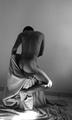
poo-phobiaby funkaruckComment: While I can't say I undestand the phobia of poo. I do enjoy this shot and find it to be quite funny. (I hope that was the point). Normaly I would not have like the shadow of the hand crossing through the image. I feel however in this instance with phobia's the long shadows help.I also would like to have seen a little of the face. From a technical stand point this shot has pretty good focus, but seem s alittle soft. Everything else looks pretty good.
Keep up these great shots. |
| Photographer found comment helpful. |
| 11/19/2004 09:45:24 AM |
Body in greyby TiagoComment: hmm and I didn't think the male body could be made to look atractive. Great shot. I like every thing about this shot except the lighting. I don't like the bright light on the models knee or on the ground. Other than those 2 spots the lighting is pretty good. keep up the ggod work. |
| Photographer found comment helpful. |
| 11/19/2004 09:40:50 AM |
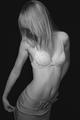
MTV generation..."Oh my god, I am soooo fat"by DogAngelComment: Great shades and textures. This is one of my favorites of the challenge. I only see a few things I would like to have seen done differently, and those are just a matter of personal taste. Photrgaphicly I see no flaws. Good lighting, Great focus, good contrast and balance. I "personaly" would like to have seen the pants made of denim. I feel this would have added a nice texture that you could have easily acoplished in this lighting. Next I would like to have see a little of the models face. And last of all I think the polka dots on the bra are a little akward. But like I said thats just a matter of personal taste. Great shot. I look forward to seeing more like this. |
| Photographer found comment helpful. |
| 11/19/2004 08:07:58 AM |
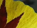
November.(maple on ginko leave)by docpjvComment: Greetings from the Critique Club :)
I think this is an excellent shot. I must admit however I am not very familiar with the Korean culture. So I can't say how well this paticular photo fits the month. While this image has very powerfull lines and balance. The edge of the yellow leaf (wich i'm assuming is the ginko) is a bit out of focus. The other leaf the maple I beleive is the primary trouble maker in this paticular shot. It appears to be grainy and lacking in detail. I would like to have seen more of the veins that run through it.
I think the yellow in this image may be slightly overpowering. I usually try use a variety of colors unless there are many contrasts and details within the photo to keep it interesting. While this is intitialy a good shot. There is just not enough to keep me interested for any period of time.
The perspective of this image, IMO, needs some depth so it does not give the impression that your subject is completely flat. I feel that with a little more definition by picking up more of the lines in the top leaf. Then little playing with the colors, or perhaps trying it with B&W this might have had a shot at a ribbon.
One thing I can definitely tell from this image is that you have some talent. Don't be afraid to do a lttle editing. I doubt a single ribbon has been won in here without at least a lttle bit of it. I can however respect and admire the fact that you were trying to pull it off. I hope to see what work you will come up with in the future.I also hope that my comments were at least a little helpfull. :)
Kudos on an excellent shot :)
Tristalisk
|
| Photographer found comment helpful. |
| 11/18/2004 03:45:10 PM |
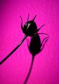
Juneby WildpurpleComment: Greetings from the Critique Club :)
I think this is an excellent 'abstract' image. I'm not sure how this photo was intended to fit the title, so I don't know how well the image represents that.
I think the pink background in this image may be slightly overpowering.This makes the rose appear black and kills most of the details. I think another improvement on this shot would be different lighting. I say this for the same reason as before. I just can't tell if intended for the rose to be black. The two dark shadows on the bottom right, and top left edge of the frame is somewhat distracting. It looks almost as if this is actualy the lense of the camera causing a ring. However I asume this is just a lighting problem. So this could have been fixed by tighter cropping or slightly different lighting.
my overall perspective of this image, IMO, needs something more. It has too much blank space, and not enough detail. I have had good luck in situations like this one using darker backrounds and use my soft lighting to illuminated the subject a little more.
I can see the direction you were going for with this shot. I feel it was a great idea and would have been a great photo if it had worked the way you had planed.
I hope that the lack of commnents and score you received by posting this image here were not hurtful. You have to take these responses with a grain of salt and keep on plugging :)
Troy Hayward
|
| Photographer found comment helpful. |
| 11/18/2004 03:17:23 PM |
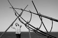
Sun, Sea and Boats (or what is left of it...)by ChrisJComment: This is a very strong and powerfull image. The lines from the "boat frame?" and very comanding. I like lots of long and gracefull lines in a photo. This is somthing you definately accomplished. There are only 2 things I don't like in this photo. The first is that the womans pants blend into the background. This gives me an impression of a floating torso. The other think I don't care for is a matter of personal taste. I feel I would have liked for the boat frame to be a little darker, giving it a stronger Silhouette . Great shot one of my top 10 picks of the challenge. |
| Photographer found comment helpful. |
| 11/18/2004 03:10:00 PM |
Living Statueby GraciousComment: Great shot very imaginative. The lighting on this makes it very persuasive that this is actualy a statue. Lots of lovely shadows. The gentle smile is remeinecent of early religious statues of the saints. There two keys that give it away as not being a statue. The first one i like. The eyelashes add an unrealistic and too lifelike depth to the "statue". The second wich I don't like is the seam in the fabric along the bottom. This is a large give away that this is not an actual statue. I also find it distracting. All around great shot. One of my top 10 picks for the challenge. |
| Photographer found comment helpful. |
Home -
Challenges -
Community -
League -
Photos -
Cameras -
Lenses -
Learn -
Help -
Terms of Use -
Privacy -
Top ^
DPChallenge, and website content and design, Copyright © 2001-2025 Challenging Technologies, LLC.
All digital photo copyrights belong to the photographers and may not be used without permission.
Current Server Time: 08/20/2025 12:36:10 PM EDT.