| Image |
Comment |
| 01/19/2005 10:47:06 AM |
Motherly Loveby photomayhemComment: Greetings from the critique club!
Initial opinion: aww how nice...4.8783! what the....
Does it meet the challenge: I must admit that it is very weak in the brokeh catagory. Whaile the brokeh is there it's not very strong. I feel that in good brokeh the chakground would be almost unidentifiable yet hint at what it might be. While out of focus I can still clearly tell that they are cabinets with bottles plates and some christas style flowers on the counter. I feel this might have a bit to do with such a strong and wonderfull image scoring so low.
Lighting: I realy like the lighting. The flesh tones are very rich and full of life. The slight shadows dancing around the face are also very well done.
Focus; he he focus on a Brokeh photo..almost a funny catagory. But still necessary. I feel the the two main characters are focused very nicely. I think that the soft focus works very well on them and I would not change a thing here. As I stated earlier however, the backgound could use a little less focus.
Back ground: Perhaps if this had been shot in front of a less identifiable back ground it would have done better. I personaly would like to have seen this shot in front of some fall colored trees, some reeds, or somthing of the sort. Another option that might work well is to cop this image a little tighter. Perhaps right along the bottom of the glass in the cabinets.
Overall: I realy like this shot. I feel that with the back ground fixed and peoples phobia to pictures of peoples childen, this could have easily been a contender for a ribbon. This in my opinion is a great example of a family shot that you can enjoy even if you don't know the family. I don't remeber what I scored this shot in the challenge. But I would score it about a 7 now. If the background was more brokeh. I would easily say an 8 or 9. This is a wonderfull and well exicuted shot in my opinion. So keep up the great work, and I hope you have better luck in future challenges.
Tristalisk
|
 Photographer found comment helpful. Photographer found comment helpful. |
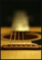
| 01/19/2005 09:56:37 AM |
Strung Outby MR_PComment: Greetings from the critique club!
Initial impact: oooh guitar..woh I'm dizzy...
Does it meet the challenge.... hmm I don't know... My personal opinion is no. However from your comments many say yes. It looks to me from your score it was pretty well divided. with the yes group winning. My reason for saying no is this. I feel that Brokeh is the element of having an Out of Focus back ground with and having somthing to do with light. The "object" of your focus gradualy goes out of focus. You don't have an out of focus background in my opinion. But like I said it apears the voters disagree for the most part.
Lighting: wonderfull lighting, you alow the weiwer to see all of the rich tones in the wood grain, and I feel that placing the light to alow the reflecion of the pegs on the woods was agood choise. It adds a little more depth to the shot.
Color: I could not ask for more great color.
Composition and framing: I am happy with these aspects as well. The border works well with the image.
Overall: I'm not sure why but this photo gives me nausia. Not that it's a bad image. But the angle or the fade or the combination just dosn't sit well with me. I get a feeling of vertigo. Yet this is a very well shot and thought out peice of photographc art. It is technicaly has almost no imperfections. Yet just does not click with me.
So in conclusion I feel that some might not have seen this as fitting the challenge. This might have had a bit to do with this not making the top 10. Aside from the debate on what is brokeh.. this is a great image and I hope to see more like it. Good luck in future challenges..
Tristalisk |
| Photographer found comment helpful. |
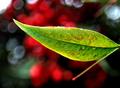
| 01/19/2005 09:09:29 AM |
The Lone Leafby MontereykiddoComment: Greetings From the Critique Club!
First impression: Wow Nice.. ooh brokeh I like this.
Does it meet the challenge? Undoubtably Not only did it meet the challenge in my eyes. It meet the challenge definition and the texbook definition of brokeh. You have an out of focus background with points of light that enhances the overall image well done.
Color: Wonderfull use of colors the red and green contrast works very well. The Darker background on the lighter leaf also looks nice. I tend to agree with Bear musics comment however the light area of light in the top left corner does become a little distracting. I would be tempted to edit that spot.
Composision: Very nice well balanced shot. Everything feels to be in the right place.
Focus: hmm on a brokeh shot..almost a void catagory. But I do however see one area that I feel could be improved. The base of the leaf nearthe stem is a little out of fucus it would have been nice if that could have been kept crisp as well.
Lighting: I'm sure this might be debated, but I feel that the white line across the top edge of the leaf is distracting. I thik it pulls away from the natural beauty and color of the shot. While I'm sure others could easily see it as a nice highlite. Other than that the lighting apears perfect.
Overall; This is a very nice image in many aspect. While it's slight imperfections may hurt it a little this is still a great image. I remember voting on this in the challenge I had given it a 7 I still feel pretty happy with that rating. In a little less compeditive challenge, or a little more touch up this could have easily been a contender for a ribbon. This is a great shot with few flaws. Keep up the wonderfull work.
Tristalisk |
| Photographer found comment helpful. |
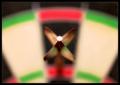
| 01/19/2005 07:47:46 AM |
Treble 20by KonadorComment: Greetings from the critique club!
First impression: wow fuzzy... oh ok it's for the brokeh challenge.
Does it fit the challenge: yes it does fit the challenge it is without a doubt brokeh. However I feel that part of what may have hurt the score for this picture is that the brokeh does not enhance the image IMO. The Center of intrest the rear of the dart does nor have enough detain by itself to keep me interested.
Title: Treble 20.. I have no clue what this means. So I am unable to form a relationship between the title and the look of the photo.
Lighting: From what details I can make out the lighting looks to be good There are no harsh shadows or blown out areas.
Focus: While your shallow DOF did give you the brokeh for the challenge I feel that you may have went to shallow. Perhaps allowing the viewer to see more of the dart and maybe the fins leaving the board in brokeh would have been more interesting.
General Overview: While I like and enjoy alot of this shot. Such as I like the rich colors. I think the proportions were done well, and I realy like what I see as the concept you were aiming for. I would not have voted this above a four because it still apears to an out of focus picture to me. I can see where this is easily a love or hate shot. It will come down to a matter of personal opinion. Is it out of focus with a shallow DOF. Or is it a creative use of brokeh.
I wish I could have written you glowing review. But I assume that by submmitting for a C.C. critiqueyou would rather have an honest opinion. I do however enjoy alot of yopur other work. Even if this isn't one of my personal favorites of yours, I hope to see what wild and interesting shot you come up with next.
|
| Photographer found comment helpful. |
| 01/18/2005 08:52:04 AM |
Into Eternityby NazgulComment: wow great image 10... I can't see anything I don't like about this image. Keep up the wonderfull work. |
| Photographer found comment helpful. |
| 01/17/2005 07:43:07 AM |
Sib Bahtby Mark of SRQComment: I might have scord this better if I knew what the title ment....But alas without a name this photo lacks a bit of appeal. |
| Photographer found comment helpful. |
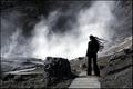
| 01/13/2005 09:00:01 AM |
Observation Roundby ewebComment: beautifull shot. However I feel that it is a little week in the Brokeh catagory. While I don't think it will score very high in this challenge> I feel it would scor very well as a stand alone image. As for what i think would help it score better in this challenge. I think it needed a few more details in the back ground to show the brokeh. Sush a couple green lily pads. Or some overhanging branches.
however like I said this is still a good shot. Keep up the great work. |
| Photographer found comment helpful. |
| 01/13/2005 08:48:55 AM |
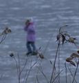
Lake Skatingby smoon273Comment: I don't feel that the brokeh enhanced this shot I feel that the person should have been the in focus object. Or that it should have been a closer crop of just the right side creating a tall photo with brokeh snow as the background completely leaving the person out. |
| Photographer found comment helpful. |
| 01/12/2005 11:45:26 AM |
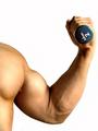
I will not be afraid to use bigger weightsby nico_blueComment: Greetings from the Critique Club!
Wow what a wonderfull photo. But I suppose you would like a bit more of a critique than that. So I suppose I should start with technical aspects.
Technical: This shot was very well done from a technical aspect.
Lighting: is wonderfull giving a good variety of light and shadows. The skin tone is very rich and vibrant.
Sharpness: is also very good the only defect I can find within the shot is at the very top of the shoulder. If I were to guess from the looks of it I would say it was a smudge on the lens.
Balance: This shot also has a very good balance and flow of lines. The eyes start at the chest and folow the lines up to the weight.
Meets the challange: I would have to say yes working out is a common resolution.
Composition: I must agree with the other commenters on this one the nipple does appear to be a bit akward. I think that turning the model just a little bit towards you would give it a more natural apearance.
Personal Feelings: I feel this would have done very well in a fitness magazine. If this didn't ribbon I must admit I am suprised. I feel that as much as I hate to touch this area some water would have helped. Ok I said it yes more of those silly water spots DPC'rs complain about so much. I feel that lightly misting you model with water adding presperation would have further enhanced an already wonderfull shot. I also feel that this well formed arm lifting that tiny little two pound weight is great.
Its a Wonderfull shot and I hope to see more work like it in the future.
|
| Photographer found comment helpful. |
| 01/12/2005 09:56:06 AM |
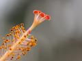
Pistil and Stamenby umbrisComment: A very nice shot with to narrow a depth of feild IMO. Some of the small arms are in great focus while others are not. They seem to go out of focus in both the fore and background. I feel that the brokeh back ground works well with the shot aand the colors are great. I feel this is still a slightly above average photo even on DPC. Kee |
| Photographer found comment helpful. |
Home -
Challenges -
Community -
League -
Photos -
Cameras -
Lenses -
Learn -
Help -
Terms of Use -
Privacy -
Top ^
DPChallenge, and website content and design, Copyright © 2001-2025 Challenging Technologies, LLC.
All digital photo copyrights belong to the photographers and may not be used without permission.
Current Server Time: 08/20/2025 04:54:30 PM EDT.