| Image |
Comment |
| 05/14/2005 09:54:44 AM |
|
 Photographer found comment helpful. Photographer found comment helpful. |
| 05/14/2005 09:52:06 AM |
Mountain Highby babylonComment: I love the negative space - I don't like the bold border. I think a border, if necessary (which I don't think it is), should be very soft to compliment this image. The bar across the bottom doesn't help the image either. 6 |
| Photographer found comment helpful. |
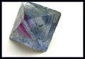
| 05/14/2005 09:30:36 AM |
Reflections. on Notesby tasha4pawsComment: I love the graphic design elements and complimentary colors here. My only criticism is that I keep looking for symmetry in this design and it's just a little off. If it was way off, it wouldn't bother me at all because I wouldn't be expecting it. Still, I'm giving this an 8 for creativity |
| Photographer found comment helpful. |
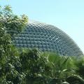
| 05/14/2005 09:21:01 AM |
Building with Trianglesby SteveinnzComment: The image has kind of an overall washed out look to it. The sky is so light that it distracts from the geometric shapes of the building. I think this could be a terrific shot if done at dawn or dusk. |
| Photographer found comment helpful. |
| 05/14/2005 09:16:57 AM |
|
| Photographer found comment helpful. |
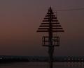
| 05/14/2005 09:15:42 AM |
Channel Markerby Aussie_BlueyComment: I love the simpe elements of this photo, and the lighting is very complimentary as well. I'm sure you're being slammed for the noise, and it is significant - dropping the image score a point from me. Still, I'm giving it an 8. |
| Photographer found comment helpful. |
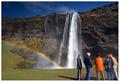
| 05/12/2005 06:34:49 AM |
Bloody touristsby GautiComment: Good shot, but would have been better if the feet had not been cut off. |
| Photographer found comment helpful. |
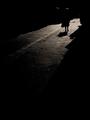
| 05/10/2005 09:19:54 PM |
Nuit Américaineby jjbeguinComment: This is my favorite in the challenge and my only 10. I really like the light on the hair, it really sets it off. |
| Photographer found comment helpful. |
| 05/10/2005 09:14:42 PM |
|
| Photographer found comment helpful. |
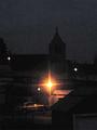
| 05/10/2005 09:01:17 PM |
View From 800 Feetby Mr_PantsComment: The building is too strong and detracts from the image. If you would have cropped it out and put the horizon line about 1/3 from the top, the image would have been a much stronger composition and more interesting to me. |
| Photographer found comment helpful. |
Home -
Challenges -
Community -
League -
Photos -
Cameras -
Lenses -
Learn -
Help -
Terms of Use -
Privacy -
Top ^
DPChallenge, and website content and design, Copyright © 2001-2025 Challenging Technologies, LLC.
All digital photo copyrights belong to the photographers and may not be used without permission.
Current Server Time: 06/21/2025 12:33:31 AM EDT.