|
|
| Image |
Comment |
| 03/04/2010 12:51:57 PM | Dance in the sunby Rino63Comment: Hi, Critique Club here...
I like this image very much. I like environment aspect of it, and I like the addition of the umbrella. I also like the balance between the bent leg and the umbrella, it just works.
The hot spots don't bother me, it seems natural.
One critique that might make it even better is all the sky on top doesn't do anything for me. You probably included it to make the person seem smaller in the environment, but the lack of details in the sky just make it a rather uninteresting element to me.
As for the theme, if I didn't know this was about dance, I would have thought this was about Yoga. The image doesn't scream dance to me but that's OK.
These are just one person's opinions. Hopefully they give you something to consider.
|  Photographer found comment helpful. Photographer found comment helpful. |
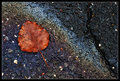
| 03/04/2010 12:15:04 AM | All that is left...by sekarmalathyComment: Hi, Critique Club here...
This one is easy for me because there is so much right about it. The colors all work together and I love the diagonals in the composition.
I can understand the comments and some of the lower scores for not being garden enough though. Even with those, you finished above 6, which is great.
What I would nitpick though is I think the white rock in the asphalt is a bit distracting. The black crack I both like and dislike. I like it because I think it balances out the composition. I dislike it because it's bold enough to attract attention and following it leads the eye out of the picture in either direction.
I didn't vote in this challenge but if I had, this would have gotten a 7 from me. Holding it back a little would have been the weakness in relating to the challenge.
Of course this is just one opinion, I hope it's helpful.
| | Photographer found comment helpful. |
| 03/01/2010 11:59:09 PM | No Woman No Cryby MArteSiComment: Hi, Critique Club here...
I enjoyed this image but for a couple reasons I can understand the lower scores (although I do not believe it deserved and twos).
You've gotten the technical aspects nailed down well. Exposure of the subject, Sharpness, DOF, all good.
So what held the scores back?
My opinion is there is too much going on that detracts from the actual subject, the shoes. All those onions are dominating the photo to the point where the shoes seem like they were added to a photo about onions. I think if you had used only one onion the photo would have been stronger for the challenge theme. You still could have propped a shoe on it, and also maybe had a diagonal to play with in the composition. I would have gotten rid of the stem that is on camera left.
Just one persons opinions. If I voted in the challenge, I would have given this a 6 for meeting the challenge and being technically well done. | | Photographer found comment helpful. |
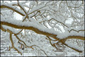
| 02/27/2010 08:25:08 PM | Constructed Viewby FireBirdComment: Hi, Critique Club here...
I love these days where the snow is heavy and builds up on branches. I have also tried to photograph it in an interesting way (other than a full landscape), and have had trouble making an interesting composition. I think composition is where this one doesn't work very well. It has no depth to pull a viewer into it. There is no focal point to hold interest. It's just a bunch of lines (branches) with snow. If there was another element in there, like say a red cardinal for example, this would have been beautiful and probably would have been in the 7 range. But as is, the viewer dismisses it quickly with a "nothing more to see here" process. One other thing that kind of jumps out at me is there is a strong yellow cast to it, maybe a white balance setting?
So to sum up, while technically, there is nothing wrong with this image at all, compositionally, it needs to be more focused.
This is just one opinion so take it as that. | | Photographer found comment helpful. |
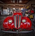
| 02/27/2010 08:10:23 PM | Classic Dodge Fire Engineby signal2noiseComment: Hi, Critique Club here...
This is a really nice image with some eye-popping color. It scored pretty well too so that should tell you something.
Regarding the clutter. When I first opened the image, that was my second thought, the first being the cool wide angle perspective on the front of the fire truck. You say there was nothing you could do, and maybe that's true, but it is there and is somewhat distracting nonetheless. Maybe you could have minimized it by taking a different angle approach, or not. You were the one who was there. But I seriously think that if you had options like if you could go in there and light it so you could use a very small aperture to allow the background clutter to fall off into darkness, this would have been a 7 score. Of course I don't know if you were there as part of an open house type thing, or if you have influence to be able to set up a shot like that but if you do, it would be very cool.
I like that you listed your edit settings here.
If I had voted in this challenge, I probably would have scored this an eight.
| | Photographer found comment helpful. |
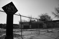
| 02/27/2010 03:11:13 PM | The Truth according to Manby dali_lama_2kComment: Hi, Critique Club here...
I get what you're going for here, but I think this might be a case where you can't get the feeling of being there to translate through a photograph. Your central points are the sign and the overall appearance of this lot and to that end, the placement of the sign is good, it's the first place I looked when I opened the image. Then my eye followed the strong leading line, which is the fence, but unfortunately the line leads us to a place in the photo that doesn't contain anything of interest - the middle right side. It's such a strong element in this photo that it's hard to get past it without being distracted by it. You have to make an effort to see beyond it to delve further into the image - not a good thing for a viewer. Also, I think the sign is too dark, I would have liked to have seen some detail in it.
The building that appears to be run down is in shadow which makes it hard to actually get the feel for it. Looking through the fence give the image a feeling of isolation, but at the cost of distracting the viewer from whats inside.
So I think to improve, you want to shoot at a time of day that best shows your subject. You'll also want to be conscious of what the various elements are contributing to what you're trying to say. Remember the old photography adage... What doesn't contribute to the photo, detracts from it.
To do well here, you'll have to either have eye candy, a hugely emotive subject, and/or a technically perfect image.
I hope you take this mostly negative critique in the spirit in which it was given - and rememeber, this is only one opinion and not gospel.
Good luck to you in future challenges. Message edited by author 2010-02-27 15:18:32. | | Photographer found comment helpful. |
| 02/26/2010 09:34:13 PM | Minimalby dahvedComment: Hi, Critique Club here...
I have to congratulate you for taking chances. Unfortunately, when you crawl out on a limb, sometimes it breaks. I think this one broke.
I think it scored low for a number of reasons.
1) People don't know what it is. If this were an abstract challenge, people would expect that but in these types of challenges it's mostly eye candy that scores well.
2) I pulled it in to Photoshop and it's a couple stops underexposed. That gives it a sort of muddy appearance.
3) The dark edge in the upper right is a bit of a distraction. I think you could have cropped it out and still maintained your rule of thirds as you did with this composition.
I hope this is somewhat helpful. Good luck in your next challenge. | | Photographer found comment helpful. |
| 02/25/2010 09:26:11 PM | Merry Go Roundby ankursomaniComment: Hi from the Critique Club...
Very colorful image here! I love the motion of the merry go round.
I would have liked it better if something was in focus, it looks like you tried it hand held. 4 seconds is a long time! The other thing is the light in the center is really bright and is a distraction. I don't know if there was another angle that would have minimized it, or if that's just the way it was. In any event, a large distracting element like that will get lower scores than one without.
I think it's quite artistic, even with all elements blurred and I rather like it. Now that the challenge is over, maybe you could try cloning the light out and see how you like it.
| | Photographer found comment helpful. |
| 02/25/2010 06:17:31 PM | Winter Sunset over Lake Louiseby CitadelComment: Greetings from the Critique Club...
I like this image. I like the tracks at the bottom because the lead the eye into the mountains. I wish the Sun wasn't quite so overexposed, but then the mountains would have been even darker and being a basic challenge, multiple exposures were out. I also would have liked to see the mountains lighter, but per above, you were limited.
One thing that could be better is there are halos around the edges of the mountains. I usually see these appear from too much sharpening or other processing in high contrast areas.
Sorry I can't give you a better critique, but I don't think there was much you could do better under the circumstances. | | Photographer found comment helpful. |
| 02/21/2010 08:45:51 PM | Nap anyone? 1, 2, 3,.....by jayzundelComment: Hi, Critique Club here...
Great interpretation on the challenge theme - very creative.
I think you did a great job exposing for the sheep while keeping the white snow white and not blown out. I like that the three sheep in front are looking at you.
But there is something, I think compositionally, that is not fully engaging me and I can't quite put my finger on what it is. Maybe it's that the three main figures are too centered. Maybe they are too linear and in a predicable pose in relation to the camera. Maybe it's the sheep on the left that is looking out of the frame and creating an implied line that my eye wants to follow. To be honest, I'm not sure what the missing piece is.
A couple thoughts.
1) try cropping the sheep that's not paying attention out, that would eliminate that distraction as well as move the main group off center.
2) get low for a more dramatic angle. People get used to seeing things from eye level so shooting from a different angle gets our attention.
3) maybe isolate just a few (usually use odd numbers in composition) to provide a stronger focal point to engage the viewer.
Not saying that any of the above are right, just food for thought.
If I had voted in this challenge, I would have given this a 6.
Hopefully this is somewhat helpful for giving you things to consider.
Keep having fun! | | Photographer found comment helpful. |
Home -
Challenges -
Community -
League -
Photos -
Cameras -
Lenses -
Learn -
Help -
Terms of Use -
Privacy -
Top ^
DPChallenge, and website content and design, Copyright © 2001-2025 Challenging Technologies, LLC.
All digital photo copyrights belong to the photographers and may not be used without permission.
Current Server Time: 08/01/2025 10:26:57 AM EDT.
|