|
|
|
Showing 161 - 170 of ~457 |
| Image |
Comment |
| 07/01/2004 09:04:28 PM | Marakiby AlexysComment: Lighting: The light is well suited for the model, but it seems to come from directly over your head. This has caused rather strong shadows under the nose, lips and chin, and flattened out your models features. Using two lights, a strong one from one side and another, weaker, from the other to fill in the shadows slightly would have corrected this.
Pose: Her pose is pleasant, but again the perspective is from straight on. it is generally more flattering for the model for the perspective to be from slightly above her eye level. On a related note, a portrait should be of the person you are taking the photo of, having someone else in the shot is distracting, particularly when they are not fully in the shot and are blocking some of the light that would have been better used lighting your model (top of head).
Background: The background is nice, although it is a bit close as there are pronounced shadows visible on it. |  Photographer found comment helpful. Photographer found comment helpful. |
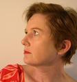
| 07/01/2004 08:42:44 PM | Roger the Plumberby biggood53Comment: Lighting: The heavy lighting coming only from his right is causing heavy shadows on his left side; so heavy the eye and features beside the nose are almost lost. A lower amp fill light (or reflector) on his left would have taken care of this, while a difuser on the main light would have been less harsh on his skin tones and prevent the near hot spot on his forhead. The catchlight in his eyes are what save the left half of his face from vanishing into the shadow.
Pose: There is nothing drastically wrong with the pose, it is good; but it could have helped to prevent other problems if done slightly differently. His slouched posture gives him a feeling of being at ease with himself and his surroundings, which is good. However, it also produced the wringles in his clothing that help to accent how strong the light is (again, a fill light could help here).
The tilt of his head is a bit too straight on for my tastes. Having him look slightly more to his right (just enough to hide his right ear) would have moved his face more into the light, without his features casting such harse shadows.
Background: The only thing I would change about the background would be to move him further from it (to get it to blur more), as it is nearly as sharp as he is, which can be a bit distracting. | | Photographer found comment helpful. |
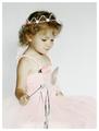
| 07/01/2004 04:39:04 PM | Princess by SonifoComment: Lighting: Very nice, even and well balanced, light that is giving wonderful skin tones. However, there is a touch of over-exposure in the crown and lower-left gown and the harsh shadow under the chin is not flattering.
Pose: Near perfect. The only think I could recommend would be to raise her head just a bit (diminishing the shadow) and placing her left hand on her lap. On a related note, the tip of her wand seems to be outside your DOF or blurred from motion and is quite distracting from an otherwise well posed shot.
Background: Not much to say about the background. A very (very) light shade of pink would have kept with the theme better, but would have provided much less separation. | | Photographer found comment helpful. |
| 07/01/2004 06:32:13 AM | Forty-Nineby charmayneComment: Lighting: Lighting is well balanced, with a nice catchlight. But there seems to be a bit of a color-cast to the image as a whole, and the harshness of the lighting is not flattering her skin tone. Judging from the contrast and the well-defined shadow on the background, the portrait would have benefitted from the use of something to diffuse the light more.
Pose: Having her look up is good as it flatters the face and neck. However, with the raised head, the shot should be taken from above her level with her head tilted toward you (revealing both eyes) instead of away. Also, lifting the right shoulder gives me a feeling of her pitching backwards, so the left shoulder would have been better.
Background: The background is a nice neutral shade and fits the subject quite well. The only thing I would sugest on this would be to put more distance between the model and the background; this would have reduced or eliminated the shadow behind her.
It is a shame the cropping did not include the back of her head. | | Photographer found comment helpful. |
| 07/01/2004 03:50:15 AM | Troyby MickComment: Lighting: Good and generally well balanced, with a nice catchlight in the eyes. However, there are a couple of small hot spots (left elbow and upper ear, and a rather harsh shadow under the chin.
Pose: The expression conveys a bit about his character, which is a good thing; but spreading his legs around an open-backed chair was probably not the best choice for a formal portrait. Cropping just above the waist would have removed this problem.
Background: The black works well with this subject, with the exception of the hair on his head. The head needs a strong separation from the background and could have been achieved with a small wattage backlight aimed at his head.
| | Photographer found comment helpful. |
| 06/23/2004 01:43:35 AM | Alone by bongoComment: Congrats on the ribbon, it is well deserved.
I did not get a chance to even look at the entries in this challenge, but I wanted to comment on this one.
Technically; having not read the rest of the comments, I imagine others have pointed out the lack of contrast and tilt. But these imperfections did not matter much once my eyes found your daughter. The poise with which she holds the pose carries the message past any technical barriers. Whomever is responsible for the pose, your coaching or her contribution, it worked very well.
I added you (and the picture) to my favorites because you have accomplished the conveyance of a strong emotional charge that I have been studying to be able to even attempt. That is an ability that I certainly want to keep an eye on.
As a final note; well done on the courage to attempt an image representing such a strongly charged subject that it is nearly guaranteed to create conflict. Not to mention to pull it off so well that you are able to ribbon with it. I have had an image that, like this one for you, simply will not leave me alone; but I have been unwilling to attempt it as I know I lack the skill to do it justice just yet. Having the image stuck in my head gives me a goal to work toward, and you have (unknowingly perhaps, but none the less) given me a needed push to stop stalling so much.
David | | Photographer found comment helpful. |
| 06/07/2004 01:17:26 AM | | | Photographer found comment helpful. |
| 05/25/2004 05:34:28 AM | Calm after the stormby JeanComment: Love the reflections and the calm rippling of the water. The sky is a bit too white, but it works with the general tone of the image, and the reflections of that white make the boat appear to be floating out of the water. | | Photographer found comment helpful. |
| 05/16/2004 06:34:03 AM | | | Photographer found comment helpful. |
| 05/16/2004 06:31:29 AM | | | Photographer found comment helpful. |
|
Showing 161 - 170 of ~457 |
Home -
Challenges -
Community -
League -
Photos -
Cameras -
Lenses -
Learn -
Help -
Terms of Use -
Privacy -
Top ^
DPChallenge, and website content and design, Copyright © 2001-2025 Challenging Technologies, LLC.
All digital photo copyrights belong to the photographers and may not be used without permission.
Current Server Time: 08/01/2025 11:02:29 PM EDT.
|