| Image |
Comment |
| 07/04/2004 08:49:22 PM |
Great Grandpa,Chuck and his story book.by camelotnorthComment: Lighting: The lighting is nearly perfect.
Pose: With the left elbow sticking out the lines draw the eye away from him. Taking the photo from his right instead of his left would have taken care of this. Also, on a minor note, the eyes are the most expressive part of the face, having him look down is fine within the context of the rest of the image but cutting his eyes in half with the rim of his glasses is distracting.
Background: The leaves are bit distracting, but not overly so. |
 Photographer found comment helpful. Photographer found comment helpful. |
| 07/04/2004 08:44:37 PM |
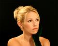
Pleasant thoughtsby awpollardComment: Lighting: Well done, with perfectly expressive catchlights.
Pose: The pose is well done, but I think tilting her head toward the camera and then moving the camera up to just above eye level would have been more expressive without the foreshortening.
Background: The solid black is well done, but a lighter color would have conveyed 'pleasant' more clearly. |
| Photographer found comment helpful. |
| 07/04/2004 08:38:33 PM |
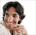
My Love...by toddheadComment: Lighting: The lighting is great.
Pose: The pose works well, but I don't care for her expression. I can not tell if it was intentional, but I am guessing not, but the focus at the back of her hair is getting a bit soft.
Background: The smooth black is well done. |
| Photographer found comment helpful. |
| 07/04/2004 08:32:33 PM |
Tessby sixmacsComment: Lighting: Lighting is well balanced, but the lack of a catchlight leaves the right eye looking flat.
Pose: The pose is fine, but the extreme smile has caused some unflattering lines.
Background: Is a bit cluttered, but not overly so. |
| Photographer found comment helpful. |
| 07/04/2004 08:28:08 PM |
Safari Samby JackoComment: Lighting: Just shy of perfect -- the back of the chair got a bit too hot.
Pose: the only thing I would change is the creasing of the shirt, but little ones being what they are that really can not be helped.
Background: seamless and perfect slight gradient. |
| Photographer found comment helpful. |
| 07/04/2004 08:25:01 PM |
Someday.....by geewhyComment: Lighting: The lighting is nearly perfect, just a tad bit brighter than I would have liked on the left.
Pose: works well.
Background: very well chosen for the subject and mood. |
| Photographer found comment helpful. |
| 07/04/2004 08:19:44 PM |
Tamaraby PhilosComment: Lighting: Fine, except for the eyes. With eyes that dark I would prefer more of a catchlight.
Pose: Nothing more to say than that it works.
Background: The pattern on the right is distracting. Her hair is the main background, so a tighter crop would have worked better I think. |
| Photographer found comment helpful. |
| 07/04/2004 08:15:38 PM |
Bill & Kimby TooCoolComment: Lighting: The lighting is well balanced, but without a catchlight their eyes are not as expressive as the rest of their face. The top of her hair seems a bit hot.
Pose: Works, although her expression could be a bit better.
Background: is fine, except for the blown out sky. |
| Photographer found comment helpful. |
| 07/04/2004 08:04:10 PM |
flirtaceous. by theodor38Comment: Lighting: The softbox is really working well for you, although I would have liked to see more light in the left eye.
Pose: You have as much fun in front of the camera as you do behind it, and it shows.
Background: The white works well. |
| Photographer found comment helpful. |
| 07/04/2004 07:57:53 PM |
Bella Fioreby scalvertComment: Lighting: Good light from the right, but needs more from the left to balance and get rid of the dark shadows (particularly in the eyes and rose. The eyes are too dark without a catchlight.
Pose: Very cute pose, but she is leaning a bit too far forward for it to work I think. Cropping the chair just slightly forms lines that draw the eye out of the scene. In fact, I think it would be better with a much closer crop from all sides except the top.
Background: The background is distracting, particularly the molding running through her head. |
| Photographer found comment helpful. |
Home -
Challenges -
Community -
League -
Photos -
Cameras -
Lenses -
Learn -
Help -
Terms of Use -
Privacy -
Top ^
DPChallenge, and website content and design, Copyright © 2001-2025 Challenging Technologies, LLC.
All digital photo copyrights belong to the photographers and may not be used without permission.
Current Server Time: 08/01/2025 08:28:57 AM EDT.