| Image |
Comment |
| 10/30/2009 04:41:27 AM |
|
 Photographer found comment helpful. Photographer found comment helpful. |
| 10/30/2009 04:40:33 AM |
|
| Photographer found comment helpful. |
| 10/30/2009 04:39:41 AM |
|
| Photographer found comment helpful. |
| 10/30/2009 04:36:37 AM |
|
| Photographer found comment helpful. |
| 10/30/2009 04:35:26 AM |
Centered Composition, Rule of Thirds, Tilted Angleby shetlandComment: Very cool. Gives a bit of a stock photo feeling but could easily at the same time have been a fashion shot. This is just a guess but it looks as though you might have had an all burned out background that you slightly altered to take away from the stock photo look.
Lighting is no doubt done to perfection (great job accentuating her cheek bones!) and the pose is awesome (how?!?). The wide angle choice from above is unusual and fun.
The image has a lot of depth - almost 3D like. And when details are this small it is the more important to have this depth. For example separating the chin from the neck which is perfect here.
Maybe not an image articulating the deepest message but for what you were trying to accomplish there is IMO nothing to deduct - 10 points. |
| Photographer found comment helpful. |
| 10/30/2009 04:21:16 AM |
High Key, Portrait, Stop Actionby jimboneComment: Very well done but a little messy. To me it's a little hard to see what's going on with the umbrella and there is something that just doesn't jive... maybe that it looks like an action shot with a strong gust damaging her umbrella but at the same time her hands and face shows more evidence of a relaxed stroll in the sun. But I do like the concept and the overall look of the image. |
| Photographer found comment helpful. |
| 10/30/2009 04:05:46 AM |
|
| Photographer found comment helpful. |
| 10/30/2009 04:03:26 AM |
|
| Photographer found comment helpful. |
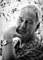
| 10/30/2009 04:02:00 AM |
Backlight, Bokeh, Centered, Portrait, by JulietNNComment: The use of Neat Image or the like may look a little overdone but gives an ok effect nevertheless. I always like to apply it to such a degree that it does make a difference but without anyone knowing for sure that I used it.
I would also maybe not have sharpened the shirt as much as the rest of the image to avoid the shirt stealing focus from the main subject but this is just nitpicky stuff. He is after all not a teenager so a bit more weathered look would have been appropriate.
I love the detail with the arm/hand including the watch. The fact that he is wearing an 'old school' watch (that he probably owned since before marriage)does in my opinion tell me a lot of the man. No doubt down to earth, sensible and not at all materialistic. The one nail that is showing is 100% clean (this makes me happy!) and clipped in a way that tells me he pays attention to detail. Is he an avid golfer?
The lighting is very good and I do like the hard'ish contrast but I do see some vignetting that I definitely would have removed. You may have left it there on purpose or even added it in post edit, but I still do not think it looks good here due to the backlight which to me makes it look a little dirty.
I love the overall look of the image, the pose, expression, choice of b/w, bokeh and crop. Well done - 8.
A little less neat image/increased texture in his face and and a little softer focus on the shirt would have given you a better score from me though. |
| Photographer found comment helpful. |
| 10/29/2009 07:00:26 PM |
|
| Photographer found comment helpful. |
Home -
Challenges -
Community -
League -
Photos -
Cameras -
Lenses -
Learn -
Help -
Terms of Use -
Privacy -
Top ^
DPChallenge, and website content and design, Copyright © 2001-2025 Challenging Technologies, LLC.
All digital photo copyrights belong to the photographers and may not be used without permission.
Current Server Time: 06/27/2025 08:56:17 PM EDT.