| Image |
Comment |
| 11/12/2008 05:13:07 PM |
|
 Photographer found comment helpful. Photographer found comment helpful. |
| 11/12/2008 05:09:08 PM |
Aluminum - San Marino 10 Lire Coinby Marc923Comment: Not another coin... I'm sorry but I just don't see anything creative or technical good with this other than it is clear, sharp and you cropped it so that it is not dead in the center.
It's just not a very interesting image in my eyes. |
| Photographer found comment helpful. |
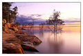
| 11/12/2008 05:07:36 PM |
The Day Rests (H2O)by BarbBComment: No doubt a beautiful image. I love the colors, sharpness but soft at the same time and flood effect. All in all very good but I really wish you had straightened it.
Whenever there is a horizon on a picture and if you do not intend to do a crazy look it should be absolutely straight. I know that is only slightly off but it does make me want to tilt my head when I look at it.
Just like a photo on a wall; if it's just a little crooked, it sticks out like a sore thumb. And it is so ridiculously easy to straighten it so there is really no excuse. Still a 7 from me on this |
| Photographer found comment helpful. |
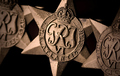
| 11/12/2008 05:03:11 PM |
copper, zinc, courage, tearsby MichaelCComment: Good attempt but I don't care about the composition. I would have opted to lay one flat on a table with one laying on top of it but on the side as if they had been casually left on the table.
This 'line-up' seem unnatural to me. |
| Photographer found comment helpful. |
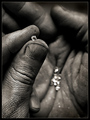
| 11/12/2008 05:00:47 PM |
Currency of Love and War by scalvertComment: So very true! Great texture on the hands and a nice composition. The shallow DOF looks good to me.
But I really wish that the finger sticking out under the thumb, towards the bottom of the picture wasn't there. It kind of sticks out like sore thumb - although it's not a thumb :) |
| Photographer found comment helpful. |
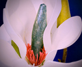
| 11/12/2008 04:57:56 PM |
Pb (Lead) Magnolia Stamen.by BrianRComment: Seems over sharpened to me (but could be my monitor) and although an interesting idea not a very pleasing image.
The yellow flower in the background should have been removed prior to the shot. |
| Photographer found comment helpful. |
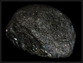
| 11/12/2008 04:56:41 PM |
Native Cu (copper) Oreby AlainComment: Another photo of a rock... You achieved a nice light cast on this but it is still just a rock and does not make for a very interesting shot with any amount of photographic value. |
| Photographer found comment helpful. |
| 11/12/2008 04:55:21 PM |
One A Day (Ca, P, I, K, Mn, Cr, Mg, Zn, Se, Cu, Cl, Mo, B, Ni, Si, V, Fe)by JuliBocComment: Nice attempt to make a picture of a vitamin pill look interesting. Technically it is sharp, good lighting and all but is just not an attractive photo to me. |
| Photographer found comment helpful. |
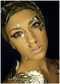
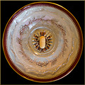
| 11/12/2008 04:54:03 PM |
Mask Of Goldby LadyKComment: Interesting image with exciting lighting. I wish the shades had been a little softer but otherwise looks good. |
| Photographer found comment helpful. |
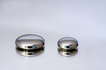
| 11/12/2008 04:52:29 PM |
Mercury by robstComment: I'm very happy you used two mercury drops and not just one. Makes a world of a difference to my eyes.
I love the minimalistic look and quality. The reflection in the surface in addition to the flare adds to it. The white does not look perfectly white to me. This is (at least to me) more difficult to achieve and looks so much better! It kind of looks like a pearl finish.
Overall a great picture that deserves a 10! |
| Photographer found comment helpful. |
Home -
Challenges -
Community -
League -
Photos -
Cameras -
Lenses -
Learn -
Help -
Terms of Use -
Privacy -
Top ^
DPChallenge, and website content and design, Copyright © 2001-2025 Challenging Technologies, LLC.
All digital photo copyrights belong to the photographers and may not be used without permission.
Current Server Time: 06/23/2025 03:45:42 PM EDT.