|
|
| Image |
Comment |
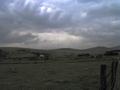
| 04/28/2003 05:36:44 AM | Storm On The Horizonby ioComment: Hello from the Critique Club!
Hello Io!
Wow, I love the earthy tones in this picture. it's so drab, and base, like I would imagine a storm to be. I've been to Devon, and I remember the fields just like that. So lovely and wonderful, I really miss it sometimes.
On the technical side of things, I find this photograph a tiny bit grainy. Now how can you avoid this in the future? Well.. start with a slower shutter speed. That will allow more light to come into the shot, and that means you'll get a larger range of colour, and basically, more light. I think the Aperture was fine... and well, you haven't provided me with the ISO, so I have no clue what it was. By the looks of it, it may have been 300 or 400, I'm not too sure. What else could you have done? I think a bit of colour enhancement with the hue and saturation, if you'd played with that a bit, you could have gotten more of a range of colours instead of the drabness (which I don't really mind, it seems more realistic this way). I would also suggest using a tripod for any kind of shot because it removes the shaky hand syndrome as I call it. You'd be surprised how much your hands shake when you don't mean it, so when you stick your camera on a tripod and hit the timer, you can stand back and let your tripod do the work, and that's lovely seeing the image afterward, crisp and sharp.
I definitely feel this picture has met the challenge, and very well indeed. I feel you were marked down because of the fuzziness to the photo, and that's it. Well done, and keep up the good work!
-Annida |  Photographer found comment helpful. Photographer found comment helpful. |
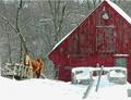
| 04/17/2003 08:01:27 AM | Fresh April Snowby printer4uComment: Hello from the Critique Club!
Hi printer4u :)
What a cool idea for a photo. Everything wants me to look at the horse, but the way the lines are set up they send my eyes to the red building, which is what you were aiming for I believe. The pole in the foreground draws your eye back, and so does the line of the snow on the left.
Technical stuff. Well, let's start with the snow; it seems a tad bit over exposed. Which would mean you should use a faster shutter speed, so that the white doesn't have so much time to really pop out. Over exposure also usually means that there's soft focus to the photo; i've noticed that in my own sunset shots, where you try to take a good picture of the sun setting, and you end up having a really fuzzy foreground. I guess it doesn't help if you were out at mid day taking the picture. I would have chosen a fairly higher aperture too, like F8 ish..
What really makes this picture is how the red pops out in this snow. Great work, good luck on the next challenge!
-Annida | | Photographer found comment helpful. |
| 04/17/2003 07:52:02 AM | ruinby GinaRothfelsComment: Hello from the Critique Club!
Hi Gina
Well, my first impression of this picture is definitely colour. Everything is a tiny bit over saturated, so it all sticks out! The fact that it all sticks out kind of makes it all ... flat. There seems to be no horizon or depth in the photo. Kind of like a painting, which is a very cool effect, if you ask me. It seems like you took this around 12 noon or something, which made the lighting quite harsh and bright.
Something that could help a bit is if you make the picture straight. it seems the camera was tilted to the left a bit; unless the road was a bit tilted, it just doesn't look like it was intentional, which makes it look you didn't plan it that way.
I like the fact that this isn't the conventional type of "colour" photo for this challenge. Well done, good capture, and good luck in the following challenges.
-Annida | | Photographer found comment helpful. |
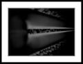
| 04/13/2003 08:04:37 PM | Dark Lightby moonoComment: Hello from the critique club!
Hi Oebi,
Now, this is a true abstract. Voters dislike not knowing what something is, and they tend to vote lower than they would if you gave a clue as to what this is. lol, believe me, I am having the same problem right now on one of the challenges.
Anyway, on to your picture. The one thing you could have done to improve your score was to give more of a hint as to what this is.
I think a lot of people would have complained about how dark this photo is as well. So better lighting would have helped a bit.
It also looks a bit.. blurry, which means points were removed because of that.
Personally I like this shot. I like abstracts though.
Good luck in the next challenges
-Annida | | Photographer found comment helpful. |
| 04/13/2003 05:18:47 AM | Rust and Skyby BudweezerComment: Hello from the Critique Club!
Hi Budweezer!
HRMMMMM this looks very very familliar, lol.. Did you return to the same place to take the picture? lol, that's funny.
Well, what can I say? I like this picture, definitely. It fits the challenge nicely. The biggest compliment I can give you is that I can't really think of anything you can do better! You can't go wrong here with a sky shot, with such lovely blue. I'm not sure about the main subject though, it looks a bit old and rusty. Maybe that's why your score was just under 6. I'd have given you a ten if I had been voting in this challenge!
I think what did get you was a bit of compression, that's it.
Well done!
good luck in the rest of the challenges.
-Annida | | Photographer found comment helpful. |
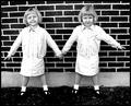
| 04/12/2003 02:11:43 AM | Paper Dollsby sagestudioComment: Hello from the Critique Club!
Hello SageStudio!
Well, what a cute picture :) I'm glad I got this one, as it shows symmetry in a different way. The subjects of the two identical twins is inspired, and they make perfect symmetry in that they are well... identical.
Somebody mentioned the picture didn't seem quite straight, and I agree with them. If you look at the background of the shot, you will notice the white behind their legs tilts a tiny bit. It's so marginal, but it makes the picture look a tiny bit wonky.
Likes and dislikes? Well, I think the light coloured outfits they are wearing were a tiny bit over exposed, and a bit of white balance would have helped quite a bit. I like their pose, and how natural they look; a set up candid. I don't like how the feet melt into the ground, you can't see their shoes, they almost look like little trees. I actually like the background, it's perfectly symmetrical, and adds to that aspect nicely.
I like this photo, well done, good idea, and good luck in the future challenges.
-Annida | | Photographer found comment helpful. |
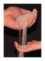
| 04/06/2003 11:43:55 PM | Sands of Timeby one66stangComment: Hello from the critique club!
Hello One66stang!
Great picture. And you were very creative with it. Well done. I like how you can see all the individual grains of sand on the pitch black background. The young and the older hand make it quite poignant.
Technically, I think the ISO rating of 400 made the picture a bit grainy, which you could have made less grainy by lowering the ISO a bit, to 300 or so. Other than that, great idea. Good job :)
-Annida | | Photographer found comment helpful. |
| 04/06/2003 04:53:00 PM | Almost Holy by KonadorComment: Well well well.. hello from the critique club!
Hi Ben.
LOL, nice way to put me on the spot with giving me a winner. Darned mixed critiquing thingy list. YOu know what I mean. Well. let's get to your picture.
Personally, I love negative space, and I use it frequently in my photos, and I love black and white, which I also use frequently enough. Soo... What's the problem and why didn't you win? That's the main thing I think I will focus on.
Now.. I think there's a teeeny tiny focus problem and the focus is a tad bit soft on your face (not the negative space). Now a soft focus on this picture is good in my opinion, but some people don't like it.
I know I can't give you any helpful critisism. Honestly. BUT! I can tell you that you achieved a great shot here, and my only suggestion would have been a candle in the left hand corner. I don't know what that woulddo, but it might make more sense with the actual title. You know? maybe just half the candle.. ooh, I think that would be nice.
Anyway, enough of that, I think this is a stunning shot and conveys emotions very well. You should be proud. I think this is one of your best shots ever.
*smooches*
-da
| | Photographer found comment helpful. |
| 04/05/2003 12:19:12 AM | | | Photographer found comment helpful. |
| 04/03/2003 08:24:08 PM | | | Photographer found comment helpful. |
Home -
Challenges -
Community -
League -
Photos -
Cameras -
Lenses -
Learn -
Help -
Terms of Use -
Privacy -
Top ^
DPChallenge, and website content and design, Copyright © 2001-2025 Challenging Technologies, LLC.
All digital photo copyrights belong to the photographers and may not be used without permission.
Current Server Time: 08/01/2025 05:00:06 AM EDT.
|