| Image |
Comment |
| 02/15/2003 01:08:54 AM |
|
 Photographer found comment helpful. Photographer found comment helpful. |
| 02/15/2003 01:08:01 AM |
Happy Hallmark...er...St. Valentine's Dayby zadoreComment: Great colours on this shot. Good composition and lighting. I like this very much. Perhaps a tighter crop at the top would have helped make the composition a bit stronger. -Annida |
| Photographer found comment helpful. |
| 02/15/2003 01:07:01 AM |
Sweet Heartsby AnachroniteComment: Loads of bright colours in this one! hehe, cute. a bit of oversaturation on some of the yellows, but good shot -Annida |
| Photographer found comment helpful. |
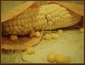
| 02/15/2003 01:02:26 AM |
Mama Miaby MajorChaosComment: YOu had to go and make me hungry! It's a great idea and well executed, and I'm sure it was delicious! The lighting is a bit dim, and there's a distracting glare off to the top of the shot, but it is still good. -Annida |
| Photographer found comment helpful. |
| 02/15/2003 12:59:28 AM |
Candlelight Romanceby BigSmilesComment: This looks like a lovely start to a romantic evening. The starry effect from the candles to the side are a tiny bit distracting. Did you try this with a little bit more light? -Annida |
| Photographer found comment helpful. |
| 02/14/2003 06:05:01 AM |
Twilight of Idolsby magnetic9999Comment: Greek columns, I am partial to this being greek :) Your use of low saturation is very clever, and the lighting works. The shadow of the leaves on the column lets you imagine where they are situated, and your eyes are certainly drawn up to the top. Very good image, good DOF. 10 -Annida |
| Photographer found comment helpful. |
| 02/14/2003 06:00:22 AM |
Round by albright1Comment: Excellent work, I like how your eye is drawn and you just want to go turn the corner to see what's there. The trees in the background make it even more interesting in my opinion, and give more perspective. Well done. 10 -Annida |
| Photographer found comment helpful. |
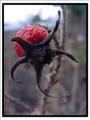
| 02/14/2003 05:39:02 AM |
When Roses Are Not In Bloomby Ricky CleaveComment: Good evening from the Critique Club!
My first impression of this image was wow! Then I sat and stared at it for a very long time. Then I sat and wondered whether it actually fit the challenge, and then I decided that it did, and thus it resulted in a high score from me :)
The Depth of field is excellent in this. I like how crisp the dead rose is. The dull light fits the mood of the shot very well. I'm impressed that you were able to pull this off. somebody said that it looked like some kind of alien, I agree :) It's got a very otherworldly feel to it.
Well done, and I hope to see more from you in the future! Message edited by author 2003-02-14 05:46:06. |
| Photographer found comment helpful. |
| 02/10/2003 03:57:35 PM |
|
| Photographer found comment helpful. |
| 02/10/2003 01:36:36 PM |
My Angelby indigo997Comment: Gooday from the Critique Club!
First impressions:
This is what I consider a very mellow shot, so the first impression was of serenity, and peace... silence. A little cherub on a bed, it's very beautiful. Belongs in an art gallery.
This is the type of photo that I consider created in an artistic style. Very renaissance, and very in the style of a painter from that genre. I am also very glad that there are no straps or anything holding those wings in place!
Technically:
I think the lighting is great, it's very soft, and fits the mood you wanted to achieve wonderfully. The focus in my opinion is a tiny bit too soft though, and makes the child look blurry in places, while at the same time other bits are pretty in focus, like the torso. I saw your attempts at the black and white, and I did in fact think it worked better, perhaps if you worked with levels to get a more "drawn" effect for the coloured version? I think that would be very cool.
Background:
Well, you know I love dark photos, and the black background for me is superb, it fits with the tone of what you wanted, and it makes the child look even more angelic.
My opinion:
I like it, I scored this photo pretty high because of the artistic merit of it. Well done! |
| Photographer found comment helpful. |
Home -
Challenges -
Community -
League -
Photos -
Cameras -
Lenses -
Learn -
Help -
Terms of Use -
Privacy -
Top ^
DPChallenge, and website content and design, Copyright © 2001-2025 Challenging Technologies, LLC.
All digital photo copyrights belong to the photographers and may not be used without permission.
Current Server Time: 08/01/2025 09:37:51 PM EDT.