| Image |
Comment |
| 03/10/2003 10:11:30 AM |
|
 Photographer found comment helpful. Photographer found comment helpful. |
| 03/03/2003 05:52:35 AM |
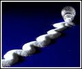
Seeing Beyondby NatashaComment: Hello From the Critique Club!
Goody for getting one of my favorites of the week! Well, let me tell you what I thought of this. I can say I absolutely loved it. It is very very simple, and very effective. The lighting is perfect, the white isn't too bright, and the twigs in the background are nicely in focus. I think maybe it would look better without the curvy lines at the top. It would then be a complete study of negative space, which is not what you were aiming for. This could be used for various magazines, including architecture, real estate, nature, etc.
Well done!
-Annida |
| Photographer found comment helpful. |
| 03/03/2003 04:40:48 AM |
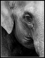
Set Me Freeby NatashaComment: Greetings from the Critique Club
Does this meet the challenge? yes, I say yes! It definitely does. This is a very evocative image and you convey the depression this wild animal is feeling in captivity really well. I like the use of the black and white, and I also think you made the right choice in the composition and framing; I even like the border, which sometimes is detrimental to the photo, but not here. In my eyes, this is almost a perfect photo. I think the only reason it didn't do as well as it could have was because it is an animal shot. A lot of people don't realize that animals have feelings too, and maybe this is too subtle for the average user here.
Beautiful work, I'm sorry you didn't score higher!
-Annida |
| Photographer found comment helpful. |
| 03/03/2003 04:14:43 AM |
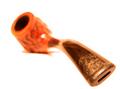
Pipe Dreamsby greenem2Comment: Hello from the Critique club!
I liked this image a lot, and I gave it a fairly high score. I like the excellent composition, and the great shalow DOF you chose. What I think got you was the very harsh light you used, and the way the light glares off the pipe. To make it better you could have made the lovely designs on the "cup" of the pipe the focal point. IN other words move the back to the front, and do the shalow dof that way.
As for whether this is meeting the challenge? I think so. It could be an advertisement for a pipe, or used for a magazine article on pipe smoking.. etc. so Challenge met :)
Great work!
-Annida |
| Photographer found comment helpful. |
| 02/26/2003 10:54:27 AM |
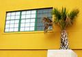
Tropical Viewby xertionComment: Greetings from the Critique Club:
Does it meet the challenge? It certainly does. The background is definitely yellow, and cannot be mistaken for another colour. That's even though the focal point of the picture isn't the yellow itself.
Very realistic colours, and it seems to have had very little post processing.
Personally, I would have cropped a bit more off the bottom, to remove the horizontal line, which does nothing for you composition. That would have also made the palm seem a bit taller, and it would draw more attention toward the focal point of your picture which is the window.
I agree with one of the comments where you could have tried taking the photo straight on, or from a completely different angle, but I'll assume you did, and you chose the best one in your eyes :) The focus is very good, and so are the colours. There's not much you could improve on, other than that attempt at a crop.
Well done on a good photo. I look forward to seeing more of your work :)
-Annida Message edited by author 2003-02-26 10:55:35. |
| Photographer found comment helpful. |
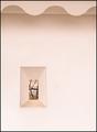
| 02/24/2003 12:03:38 AM |
|
| Photographer found comment helpful. |
| 02/15/2003 02:49:05 AM |
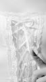
Love & Laceby kosmikkreeperComment: Nice shot, I almost missed the finger the first time I saw it :) I think I would have liked this better if I could see more of the lace and what it's attached to! -annida |
| Photographer found comment helpful. |
| 02/15/2003 02:47:51 AM |
Happy Valentine's Dayby SonifoComment: Superb shot, I really can't think of anything you could have done better. perfect
score. -annida |
| Photographer found comment helpful. |
| 02/15/2003 02:47:01 AM |
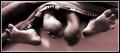
Snugglin'by JackoComment: Great photo. The feet curling are so funny, It's a tiny bit blurry though! high marks anyway! -annida |
| Photographer found comment helpful. |
| 02/15/2003 02:44:41 AM |
somebody loves meby shutterflyComment: Good shot. The white in the background is so stark, it looks a bit over exposed, but it definitely brings the subject out well. I like how I can see the blue of her eyes, and the sparkle in them. The roses are lovely too. 'well done.' -annida |
| Photographer found comment helpful. |
Home -
Challenges -
Community -
League -
Photos -
Cameras -
Lenses -
Learn -
Help -
Terms of Use -
Privacy -
Top ^
DPChallenge, and website content and design, Copyright © 2001-2025 Challenging Technologies, LLC.
All digital photo copyrights belong to the photographers and may not be used without permission.
Current Server Time: 08/04/2025 07:00:12 PM EDT.