| Image |
Comment |
| 03/16/2003 11:26:44 AM |
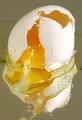
Goodbye Cruel Worldby ArtifactsComment: I think the critique was a little short, so let me add a bit :)
Good idea to put the egg on the mirror. A few people did that, but not quite the way you did. What is not very attractive is the white gunky stuff which is in eggs. That stuff makes me think of phlegm, and make the image a little less appealing than it could have been. The other thing I find offputting was the splotches of egg white which didn't want to remain in the frame. It would have been almost like a leading line to have the bottom splotch down at the bottom of the frame inside, which would have added continuity. I hope that made sense.
Things I really liked: The lighting is superb. Absolutely magnificent. I like how there is no glare on the egg, and just nothing is over exposed at all, which is almost a miracle. I also like the simple colour scheme you have here of the egg yolk and the white of the shell. It's so simple. I'm not sure if you meant for the grainy feel on the top of the egg shell, but there's a program called Neat Image, which you can get on the internet (just go to google.com and type neat image and it pops up), which will get rid of graininess. It doesn't always work, but sometimes the results are stunning.
Well, good luck in the future challenges! You've been doing great so far :)
|
 Photographer found comment helpful. Photographer found comment helpful. |
| 03/16/2003 08:18:00 AM |
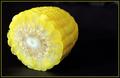
Yellow Zeroby karmatComment: mmm, I wouldn't mind a bite out of that! The colours are delicious, perfect for a photo of food. man, I'm drooling. high marks on this one. well done. |
| Photographer found comment helpful. |
| 03/16/2003 08:16:39 AM |
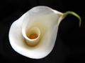
Lovely Number Sixby boyte1Comment: Yes, it is! I love this photo. I'm not usually a fan of flower shots, but damn, this is stunningly part of the challenge, and just strange enough to catch my attention. I like how the 6 is the most in focus bit. well done. |
| Photographer found comment helpful. |
| 03/16/2003 08:15:16 AM |
Iron Eighteenby ChrisW123Comment: Nice use of dof. a bit over exposed on the top part of the 8. Although I like this, it's not exactly what I believed was required from the challenge description. My apologies if you've heard this a million times before. |
| Photographer found comment helpful. |
| 03/16/2003 08:13:57 AM |
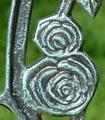
Decorative Numberby kandyjComment: So many 7's, laughs, this is one of the pricklier ones :) I like your DOF, and the detail on this uh, plant is very successfully caught. well done. high marks. annida |
| Photographer found comment helpful. |
| 03/16/2003 08:12:56 AM |
Sliver of Skyby GeneralEComment: That's the TINIEST little 8 I've ever seen. lol. Very clever. I'm impressed you even noticed it. Well done. Annida |
| Photographer found comment helpful. |
| 03/16/2003 08:11:11 AM |
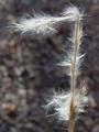
7by muckpondComment: Very nice 7 you have there. I like this picture. What is a bit odd is the background which seems to blend with the branch. It's a shame you didn't play with the contrasts more to bring out the branch more. Well done though -annida |
| Photographer found comment helpful. |
| 03/10/2003 10:11:30 AM |
|
| Photographer found comment helpful. |
| 03/03/2003 05:52:35 AM |
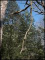
Seeing Beyondby NatashaComment: Hello From the Critique Club!
Goody for getting one of my favorites of the week! Well, let me tell you what I thought of this. I can say I absolutely loved it. It is very very simple, and very effective. The lighting is perfect, the white isn't too bright, and the twigs in the background are nicely in focus. I think maybe it would look better without the curvy lines at the top. It would then be a complete study of negative space, which is not what you were aiming for. This could be used for various magazines, including architecture, real estate, nature, etc.
Well done!
-Annida |
| Photographer found comment helpful. |
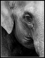
| 03/03/2003 04:40:48 AM |
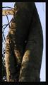
Set Me Freeby NatashaComment: Greetings from the Critique Club
Does this meet the challenge? yes, I say yes! It definitely does. This is a very evocative image and you convey the depression this wild animal is feeling in captivity really well. I like the use of the black and white, and I also think you made the right choice in the composition and framing; I even like the border, which sometimes is detrimental to the photo, but not here. In my eyes, this is almost a perfect photo. I think the only reason it didn't do as well as it could have was because it is an animal shot. A lot of people don't realize that animals have feelings too, and maybe this is too subtle for the average user here.
Beautiful work, I'm sorry you didn't score higher!
-Annida |
| Photographer found comment helpful. |
Home -
Challenges -
Community -
League -
Photos -
Cameras -
Lenses -
Learn -
Help -
Terms of Use -
Privacy -
Top ^
DPChallenge, and website content and design, Copyright © 2001-2025 Challenging Technologies, LLC.
All digital photo copyrights belong to the photographers and may not be used without permission.
Current Server Time: 08/04/2025 07:32:56 PM EDT.