| Image |
Comment |
| 03/19/2003 07:30:48 AM |
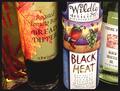
Black Heatby BAMartinComment: Very appealing colours in this photograph. I think it would have been a more interesting composition if you hadn't cut off two bottles on the sides, and had focused on either or, to have three bottles in focus instead of just two. |
 Photographer found comment helpful. Photographer found comment helpful. |
| 03/19/2003 07:28:14 AM |
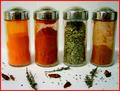
Kitchen Artby bcncrazyComment: Heh, is that you in the chrome? I would have liked this better if there weren't those spices flounced around on the front there. nice colours. The border is a bit distracting. |
| Photographer found comment helpful. |
| 03/19/2003 07:27:07 AM |
Macedonian Saladby pitsamanComment: nice looking salad. I've known this to be a greek salad instead of macedonian. What's the difference? Nice composition. The colours are great, very appetizing. |
| Photographer found comment helpful. |
| 03/19/2003 07:19:51 AM |
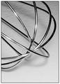
Whiskby lisaeComment: great whisk. I like the black and white. the light is a bit harsh on some of the uh... metal bits. Other than that, high marks from me. |
| Photographer found comment helpful. |
| 03/19/2003 07:17:28 AM |
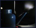
Ssssteamby robbiehComment: Good motion shot. I like this. I wish you'd moved back a bit to get a bit more of the kettle's height in the frame. Other than that great shot! |
| Photographer found comment helpful. |
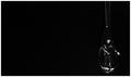
| 03/19/2003 07:14:12 AM |
Cagedby muckpondComment: Great creative concept! I love the negative space. Gosh, I just love this. 10 |
| Photographer found comment helpful. |
| 03/19/2003 07:13:41 AM |
Real Powerby mliborioComment: Heh, nice blender. I wish mine had all these features. I like the black and white on this. I'm not sure I like the framing. I would have cut off a tiny bit more from the left hand side to make it more symmetrical :) |
| Photographer found comment helpful. |
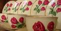
| 03/19/2003 07:12:35 AM |
Mom's Chinaby KimInNBComment: Great photo. The composition is a bit busy for my liking. I would prefer if there was not such a glare on the plates, or if you couldn't avoid that, not on the roses! That's very distracting, i'll admit. The depth of field is pretty good in this. Perhaps it would have been better without the plates, and only the cups. |
| Photographer found comment helpful. |
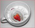
| 03/19/2003 07:10:32 AM |
Strawberries and Creamby kandyjComment: hehe, another splash! I do so enjoy the splashes. Improvements. I would have prefered this if it didn't have the other strawberry in there, and if the background colour was more appealing. There's a certain graininess to it, but that doesn't matter to me. Well done, you captured the splash well! High marks from me :) |
| Photographer found comment helpful. |
| 03/18/2003 12:56:26 AM |
|
| Photographer found comment helpful. |
Home -
Challenges -
Community -
League -
Photos -
Cameras -
Lenses -
Learn -
Help -
Terms of Use -
Privacy -
Top ^
DPChallenge, and website content and design, Copyright © 2001-2025 Challenging Technologies, LLC.
All digital photo copyrights belong to the photographers and may not be used without permission.
Current Server Time: 08/04/2025 04:03:51 PM EDT.