| Image |
Comment |
| 03/26/2005 09:58:53 PM |
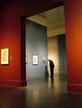
DSCF7349.jpgby trnqltyComment: Love the colors, and the man with the cane. Wish he were looking at a piece of art instead of the placard, but you can't have everything. You were fortunate to get such a wide shot in a museum with no one else in it! |
 Photographer found comment helpful. Photographer found comment helpful. |
| 03/24/2005 11:34:51 AM |
|
| Photographer found comment helpful. |
| 03/23/2005 11:40:01 PM |
|
| Photographer found comment helpful. |
| 03/23/2005 11:30:02 PM |
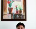
A Touch of Thaiby librodoComment: Originally posted by sher9204:
another wonderful capture of emotion! you are the master of portraits! |
That!
Really, I wish I could add you to my favorites over and over and over. I would have a favorite photog list that just says:
Librodo
Librodo
Librodo
Librodo
Librodo
Librodo
Librodo
Librodo
Librodo
Librodo
Librodo
Librodo
ad nauseam |
| Photographer found comment helpful. |
| 03/23/2005 11:15:13 PM |
Perfect Lineby peeceeComment: Originally posted by rex07734:
Maybe the perfect title for this would be "Oh Shit" |
LMAO - a hilarious comment for a hilarious photo! |
| Photographer found comment helpful. |
| 03/23/2005 11:14:12 PM |
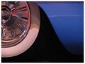
Chrome and Curvesby ShannonComment: The fact that the focus is soft and there is grain makes me think you didn't have enough light. I also think the white line is distracting. The composition is interesting. I think it needs to be reshot, but there's potential there. |
| Photographer found comment helpful. |
| 03/23/2005 11:08:42 PM |
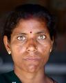
devkiby gaurawaComment: Coming from the "Want Comments?" thread. Several things jump out at me in this photo. The eyes, while they have sensational catchlights seem unnaturally lightened, particularly the eye-whites. They may not be as it appears she is facing a very bright lightsource and the white could just be reflecting heavily, but it's detracting for me. The hindu mark on her forhead seems photoshopped in. I realize it's probably not, but something about it seems off. Is it a stick-on? Aren't they usually added with pencil? I would also clone out the tiny portion of the flower showing on the gown at the bottom of the frame. Lastly, her hair gets lost in your dark background. I wonder if a B/W conversion would mask some of these elements? |
| Photographer found comment helpful. |
| 03/23/2005 10:51:17 PM |
Winter Wonderlandby justin_hewlettComment: Coming from the "Want Comments?" thread. You're probably fed up with "doesn't meet the challenge" type comments, especially since the challenge is over, but I'm curious what your take on this was in terms of surrealism. It is a lovely photo, and I like the interplay of shadow and light. You exposed the sky and the snow perfectly, which isn't an easy task, so A+ there. |
| Photographer found comment helpful. |
| 03/23/2005 10:48:16 PM |
Historic Reflectionsby TuckersmomComment: I like the composition, but it seems a bit too contrasty for the homey feeling I think it should evoke. If you didn't bump the contrast, perhaps this is the result of sharpening?
ETA - Found this photo from the "Want Comments?" thread. Message edited by author 2005-03-23 22:48:40. |
| Photographer found comment helpful. |
| 03/23/2005 10:46:47 PM |
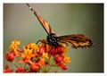
Dinner time for the Monarchby arpitaComment: Coming from the "Want Comments?" thread. I agree that that this is very nearly perfecly executed. It does bother me that the top wing is clipped; or more accurately, that is seems to have been clipped inadvertantly. absolutely terrific colors and great focus. |
| Photographer found comment helpful. |
Home -
Challenges -
Community -
League -
Photos -
Cameras -
Lenses -
Learn -
Help -
Terms of Use -
Privacy -
Top ^
DPChallenge, and website content and design, Copyright © 2001-2025 Challenging Technologies, LLC.
All digital photo copyrights belong to the photographers and may not be used without permission.
Current Server Time: 06/16/2025 10:57:28 AM EDT.