| Image |
Comment |
| 04/25/2005 12:08:39 PM |
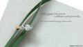
Writing a Love Poemby admart01Comment: What a wonderful and creative idea for your photo! Color, comp, DOF, lighting ... all well done. Text works, Font works., nice and light and doesn't overpower the ring. It may be an intentional misspelling, but it's DeBeers. DeBears is a Chicago football team. |
 Photographer found comment helpful. Photographer found comment helpful. |
| 04/25/2005 12:04:10 PM |
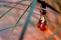
Amber Sunsetby ZoomdakComment: Beautiful photo. I like the way you have framed the earrings with the lines. Composition is great. Focus holds up on your entire subject. Well done. |
| Photographer found comment helpful. |
| 04/25/2005 12:02:41 PM |
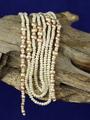
Natural pearlsby aKiwiComment: Very nice photo and I gave it a good score. Two things would improve it in my opinion: 1) DOF is such that you're losing focus on the edges of the pearls. It may be just my predjudice but I think having all the pearls with the DOF limits would improve it slightly. 2) The background appears to be a single monochrome color. I believe it would add interest if there was some variation in the background. Not something to go crazy with but something subtle. Neither of these are a big deal, just slight improvement at the margin. Good luck. |
| Photographer found comment helpful. |
| 04/25/2005 11:58:03 AM |
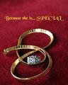
Because You LOVE herby RayEthierComment: I like this very much and gave it a good score. You chose a nice font for this, however, I think it could be improved by changing the color of the font. The yellow overpowers the jewelry because it is so bright. Next time, try using your color picker and choosing a color already in the photo for the text. The text would then harmonize witht the photo better. You can try this without reshooting. See if it doesn't improve it. PM me if you'd like after the voting ends. |
| Photographer found comment helpful. |
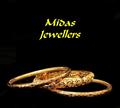
| 04/25/2005 11:53:13 AM |
midas jewellersby naomikComment: The photo of the rings is superb. Good lighting, color, focus, composition ... nearly perfect. But the COLOR of the text detracts. Next time I would suggest using your color picker and choosing a color for the text that is in the photo. More of a gold than a yellow. As it is the color of the text overpowers the otherwise fine photo. I don't much care for the font, but that's just personal prejudice. I might have chosen a lightr weight font more in keeping with the delicate rings. I have a favorite font that might have worked well, Papyrus. You can try these suggestions w/o reshooting. See if they don't help. PM me if you'd like after voting ends. |
| Photographer found comment helpful. |
| 03/29/2005 01:08:38 AM |
|
| Photographer found comment helpful. |
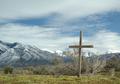
| 03/29/2005 01:04:23 AM |
Forgottenby jrtoddComment: I grew up in a place that looked much like this, Montana USA, where the culture of the old west presided, and boot hill was something real, because people really died with their boots on. I like it a lot and it gave me a real nostalgia trip. Thanks and good luck! |
| Photographer found comment helpful. |
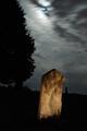
| 03/29/2005 01:02:02 AM |
Sentryby crabappl3Comment: Wonderful photo. I love the colors and especially the color of the stone contrasting with dark background. Great composition. So far, among the best I've seen this challenge. |
| Photographer found comment helpful. |
| 03/29/2005 01:01:24 AM |
R.I.P.by bormicComment: Beautiffuly captured and processed. May be a ribbon winner here. |
| Photographer found comment helpful. |
| 03/29/2005 01:00:50 AM |
|
| Photographer found comment helpful. |
Home -
Challenges -
Community -
League -
Photos -
Cameras -
Lenses -
Learn -
Help -
Terms of Use -
Privacy -
Top ^
DPChallenge, and website content and design, Copyright © 2001-2025 Challenging Technologies, LLC.
All digital photo copyrights belong to the photographers and may not be used without permission.
Current Server Time: 08/26/2025 03:59:49 PM EDT.