| Image |
Comment |
| 05/04/2005 11:41:15 AM |
|
 Photographer found comment helpful. Photographer found comment helpful. |
| 04/28/2005 12:31:02 PM |
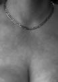
All You Need Is Goldby Mr_PantsComment: It appears to me that you have blurred the background. Where the necklace (which is in perfect focus -- nice job with that by the way) is resting against her skin, the skin would have also been in focus. But it doesn't appear to be. Thus the blurring makes it look like the necklace has been placed on top of a photo. This effect (whether gausian or DOF) detracts from the impact of the photo in my opinion. Further, I think the composition might be improved by moving the necklace down in the frame ... showing a little more neck to balance the image would improve it possibly. You are welcome to PM me after the voting if you like. |
| Photographer found comment helpful. |
| 04/28/2005 12:14:38 PM |
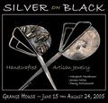
Silver on Blackby Bear_MusicComment: One of the criteria I used in my voting is whether or not I could imagine the photo in an ad in a magazine I might pick up. This certainly meets the test. The photo of the jewelry isn't the best in the challenge (don't take offense, it's plenty good enough) but what really sets your entry off is the integration of photo and text. I really can imagine it in a magazine ad. Well Done! Among my top picks. |
| Photographer found comment helpful. |
| 04/28/2005 12:12:01 PM |
February by nico_blueComment: In the thumbnail, the background looks weak, but as you expand the photo, it works well with the subject ring. I love the focus and clarity of the image. Great DOF. Good lighting. Among my top picks. Hope this does well in the voting! |
| Photographer found comment helpful. |
| 04/28/2005 12:10:11 PM |
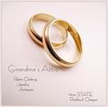
Grandma's Atticby tfarrell23Comment: Excellent entry and among my top picks. Ultra light font is terrific but is somewhat pixelated. In a real ad, you'd want to lay the text on top of the photo in a program other than Photoshop. For the challenge you did about as good a job as possible with it. Congratulations and good luck. |
| Photographer found comment helpful. |
| 04/28/2005 01:14:26 AM |
OUTBACKby DrJOnesComment: Outstanding photo. Well composed, captured and executed. Unique in a very positive way. Understated focus on the watch is dynamite. Text on wrist and below watch fits perfectly. If this doesn't ribbon, I'll be well and truly disappointed in DPC voters. |
| Photographer found comment helpful. |
| 04/28/2005 01:12:03 AM |
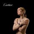
Defining Beautyby arnitComment: Pretty girl. Nice jewelry. Great technically. I can really imagine this in a high end magazine. It would fit perfectly in Conde Nast Traveler, for example. Congratualations on a superb image! |
| Photographer found comment helpful. |
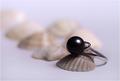
| 04/28/2005 01:10:05 AM |
The Black Pearlby vasilkovayaComment: Stunning photo. From my perspective, this is best of show. It's not perfect (I'm bothered a bit by the focus and losing detail in the front shell) but it is so well composed, colored, leveled and so on that it overcomes the few minor glitches. Congratulations, and well done! |
| Photographer found comment helpful. |
| 04/25/2005 12:25:44 PM |
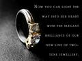
Round Brilliant Two-Tone Ringby mocabelaComment: Nice photo. Well executed. Text over powers the subject in my opinion. Perhaps a smaller font and with less space between the lines would help. Fewer words would also limit the impact. How about "Light the way into her heart with the elegance of our new two-tone jewelry?" |
| Photographer found comment helpful. |
| 04/25/2005 12:12:43 PM |
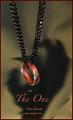
The Oneby jperez1690Comment: This is one of the cleaverest photos in the challenge. It is well executed ... photo, text, font. Love the way the shadow works! My only fear is that the thumbnail looks so dark, it may not attract voters to open it and give it the score it deserves. |
| Photographer found comment helpful. |
Home -
Challenges -
Community -
League -
Photos -
Cameras -
Lenses -
Learn -
Help -
Terms of Use -
Privacy -
Top ^
DPChallenge, and website content and design, Copyright © 2001-2025 Challenging Technologies, LLC.
All digital photo copyrights belong to the photographers and may not be used without permission.
Current Server Time: 08/26/2025 03:59:59 PM EDT.