| Image |
Comment |
| 06/17/2015 10:43:50 AM |
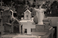
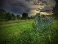
In memoriam by SaraRComment: Yes, it's a graveyard or it has that feel, I just feel that the effect tends to take away too much of the subject matter. Another thing is the "black hole" at the top right of the image lends nothing positive to the over-all image. |
 Photographer found comment helpful. Photographer found comment helpful. |
| 06/17/2015 10:41:02 AM |
|
| Photographer found comment helpful. |
| 06/17/2015 10:40:02 AM |
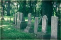
old stonesby jgirl57Comment: You got the idea, I'm just not sure whether the "gaussian blur" worked... ? |
| Photographer found comment helpful. |
| 06/17/2015 10:36:24 AM |
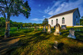
The Old Methodist Burying Groundby Bear_MusicComment: Looks like a well executed HDR photo. Love it! The theme, cropping and post-processing is great! Absolutely taken at the right time of the day! Well done!! :) |
| Photographer found comment helpful. |
| 06/17/2015 10:35:07 AM |
Loftyby herfotomanComment: I'm sorry, but this image makes me dizzy! This idea was not thought through very well in terms of composition and colour and too much negative space. Keep that in mind next time. |
| Photographer found comment helpful. |
| 06/17/2015 10:33:27 AM |
Forgotten Fateby RyconComment: It's a great photo, well executed with good colour and saturation and composition! A good find and well processed! :) |
| Photographer found comment helpful. |
| 06/17/2015 10:29:31 AM |
the earth is warm and forgiving by jmritzComment: Firstly, I must say that there is a total lack of composition here. The blurred image and the washed-out whites adds negatively to this image. Those could just as well have been road markers on the edge of the road. The portrayal of the theme doesn't come across very well here. The overall greyscale isn't executed either. |
| Photographer found comment helpful. |
| 06/17/2015 10:26:29 AM |
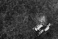
The Immortality Machineby rooumComment: Not quite sure whether this fits the bill here. I understand that you are trying to think out of the box, but the photo doesn't really tell me a story, it's too confusing and not quite a graveyard of sorts... The rule of thirds has not been applied and therefore the image looks boring and out of place. It also looks too fabricated, sorry |
| Photographer found comment helpful. |
| 06/17/2015 10:23:09 AM |
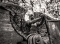
The Angel of Death Victoriousby tateComment: A nice concept, just one little issue here and that is the blown-out whites. One must be very careful with that. If there were distinct beams of light coming through the trees and branches, you would get away with it, but this is purely blown-out. Professional photography doesn't allow for this. A rule of thirds could also have been better executed. |
| Photographer found comment helpful. |
| 06/17/2015 10:18:31 AM |
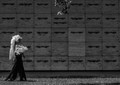
the long walkby tangueraComment: This photo has a good concept of the theme, but a technical error in photography lends to it's possible demise... The branches appearing in the top of the image is a no-no. Otherwise the composition is good. |
| Photographer found comment helpful. |
Home -
Challenges -
Community -
League -
Photos -
Cameras -
Lenses -
Learn -
Help -
Terms of Use -
Privacy -
Top ^
DPChallenge, and website content and design, Copyright © 2001-2025 Challenging Technologies, LLC.
All digital photo copyrights belong to the photographers and may not be used without permission.
Current Server Time: 08/19/2025 04:47:14 PM EDT.