| Image |
Comment |
| 04/30/2005 05:38:59 PM |
DPC - Demerging Personality Conflict by kiwinessComment: I agree with you... Sometimes it happens that way with art, ya know? You come back later and realize the mistakes; even if the finished product looks incredible, it can still be better.
That's the nature of photography and art in general, don't you think?
I guess that's why no picture will ever satisfy me as being the best; satisfaction is never within reach for the whole of photography, because that will mean the death of future creativity. |
 Photographer found comment helpful. Photographer found comment helpful. |
| 04/30/2005 01:52:57 PM |
|
| Photographer found comment helpful. |
| 04/30/2005 07:15:26 AM |
|
| Photographer found comment helpful. |
| 04/30/2005 07:14:59 AM |
|
| Photographer found comment helpful. |
| 04/30/2005 07:13:46 AM |
In the redby liquidprideComment: Visually fits the theme, but conceptually, I don't think the dollar is a minimal form of money, globally. If it was, the photograph would be more compelling in this particular competition. But right now it's just a technically great photograph that I'll soon forget.
There's an element to photography that is elusive depending on the subject of the photograph. What I mean is, if you are going to take a picture of something that crosses over from art to the "real world", and then put it in a contest where the main objective is to display "minimalism", i think the rest of us will assume that you are offering commentary on the main subject, which is the dollar.
I don't think you did that, so I think I'll give it a 4, because despite the technical greatness of the piece, you gave yourself some extra responisiblity by involving this particular subject. |
| Photographer found comment helpful. |
| 04/30/2005 07:01:08 AM |
|
| Photographer found comment helpful. |
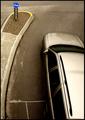
| 04/30/2005 07:00:18 AM |
This Wayby SiRaComment: I like the color of the car, and I guess if there MUST be a car in the picture, at least it's a gray one and blends nicely with the road. It does distract from the little sign, though I think, all things considered, the photo is actually very technically good, with a nice range of values, some awesome textures, and no blownout highlights.
Overall, I see what you're getting at, and I think you did it pretty well. :) 7 |
| Photographer found comment helpful. |
| 04/30/2005 06:56:04 AM |
Pierre Morteby madhatterComment: Pretty good. Nice execution, nice colors, but for me, it would be 100 times better without the mountain in the background, even at the expense of the cool cloud over it. 6 |
| Photographer found comment helpful. |
| 04/30/2005 06:53:25 AM |
|
| Photographer found comment helpful. |
| 04/30/2005 06:53:03 AM |
a grey day in montereyby kmbr2001Comment: Love the colors... In Florida, the sand doesn't look like that... Neither does the water... I like this more and more as I look at it - man... the color is spectacular!! sorry for being repetitive. 8 :) |
| Photographer found comment helpful. |
Home -
Challenges -
Community -
League -
Photos -
Cameras -
Lenses -
Learn -
Help -
Terms of Use -
Privacy -
Top ^
DPChallenge, and website content and design, Copyright © 2001-2025 Challenging Technologies, LLC.
All digital photo copyrights belong to the photographers and may not be used without permission.
Current Server Time: 08/24/2025 06:31:18 AM EDT.