| Image |
Comment |
| 08/06/2004 12:58:31 PM |
"POP !" a macro illusion by graphicfunkComment: Very appealing image but your Champagne looks a bit watered down!!! Let me try to guess: upsidedown image of water pouring over supported cork - support later cloned out?????? Try sparkling mineral water with a dash of tea for colouring next time!!!! |
 Photographer found comment helpful. Photographer found comment helpful. |
| 08/06/2004 12:54:54 PM |
|
| Photographer found comment helpful. |
| 08/06/2004 12:53:20 PM |
|
| Photographer found comment helpful. |
| 08/06/2004 12:48:35 PM |
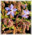
When Spring Breathsby dustin03Comment: Really nice composition but I feel the ?natural light isn't enough here....I would like to see more detail underneath |
| Photographer found comment helpful. |
| 08/04/2004 03:10:10 PM |
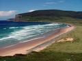
Rackwick.jpgby TallblokeComment: Great shot. Nice blues and I like the way the waves look like they are layered. What was the water temperature like?! We're going to make it up there sometime - my wife's an archaeologist so we'll have to go and look at every lump of stone stuck in the ground..any pictures of those? |
| Photographer found comment helpful. |
| 07/30/2004 02:03:28 PM |
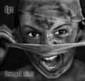
DPC - Demerging Personality Conflict by kiwinessComment: Outstanding. Joint favourite. The white stands out brilliantly from the grey tones. The subject really grabs you. Great cropping and composition. Minor criticism...not sure title text style quite right |
| Photographer found comment helpful. |
| 07/30/2004 01:48:01 PM |
|
| Photographer found comment helpful. |
| 07/30/2004 01:44:03 PM |
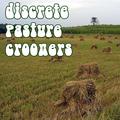
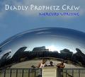
Deadly Prophetz Crewby flip89Comment: too much sky but otherwise this is the real deal. I COULD see this in the record store. Nice capture |
| Photographer found comment helpful. |
| 07/30/2004 01:38:17 PM |
Dynamic Percussion Companyby ToddhComment: great technique...would have been a lot more impactful without the metal and blue parts of the drum or the central logo. |
| Photographer found comment helpful. |
| 07/30/2004 01:36:17 PM |
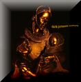
Dark Primate Cultureby biggood53Comment: Coulda been a great. pic...nice lighting, text and colour...would have moved the statue to the left....don't like the white border effect as it obscures part of the picture...and too small |
| Photographer found comment helpful. |
Home -
Challenges -
Community -
League -
Photos -
Cameras -
Lenses -
Learn -
Help -
Terms of Use -
Privacy -
Top ^
DPChallenge, and website content and design, Copyright © 2001-2025 Challenging Technologies, LLC.
All digital photo copyrights belong to the photographers and may not be used without permission.
Current Server Time: 08/06/2025 01:58:31 AM EDT.