DPChallenge: A Digital Photography Contest You are not logged in. (log in or register
 
Browse Settings
Currently viewing:
Registered UserKaDi

Show comments:

Per page:

Order:

Comments:


Comments Made by KaDi
Pages:   ... [72] [73] [74] [75] [76] [77] [78] ... [137]
Showing 741 - 750 of ~1363
Image Comment
Ashleigh
09/24/2005 09:26:20 AM
Ashleigh
by train

Comment:
*Greetings from the Critique Club*

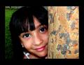
Portraiture is not my forte...but I'll do my best.

First Impressions: Lovely subject! Beautfiul tones! Nice expression! What unusual red hair! I like the way she's looking at "me"!

Then my critical side kicked in...I wondered first about the heavy chain--it doesn't seem to fit the mood of the portrait or the character being expressed of your daughter. The stray strap draws attention next. These two elements seem to fight for attention with the rest of the image. I like the proportion of the image, but cropping some from the bottom would eliminate these seemingly contradictory elements.

The image is high key without deep shadows. I think that's good. But something about it seems odd--it's as if there were a shadow behind her that was lightened bringing the rest of the picture up in tone. Perhaps the background doesn't recede enough--could be caused by the subject being placed too close to the background or small aperature setting.

I like to see a single well-defined catch light in each eye. Multiple reflections just seem to steal some of the magic of the eyes. Otherwise the lighting is very pleasing.

Your commenters were contradictory--some like it soft, some like it not. Some find it delicate, some find it blah. Her expression is nice, her expression is tentative. I don't disagree. =o By that, I mean, I can see that the viewer wants you to come down on one side or the other of these choices...without being overtly obvious, of course. If you made the edges of the image a little softer, for example, the viewer would believe the intention without wondering if it's just slightly OOF--that doesn't mean that the viewer would like it better. If you had chosen a slightly different moment to capture her expression her lips would express less of a smile or more of one--it would take away the uncertain expression.

Overall, I think you have a very nice portrait of your daughter. There are technical things I and others have hinted at that could help you take the image in a slightly different direction if you want. You have captured her beauty and sweetness...though her deeper personality seems to be a bit hidden yet. A lovely image for the yearbook or family "wall-of-fame"...not yet "high art" but maybe it doesn't need to be.

(I see you have the approval of "graphicfunk," an artist whose work I admire for his ability to see people so well. If he thinks it has a touch of delicacy, how can I argue otherwise?)

Looking forward to seeing more of your portraits!
--Kadi
Photographer found comment helpful.
Joy
09/21/2005 06:39:36 PM
Joy
by arsenal

Comment:
Hello from the Critique Club!

The expression of the girl in this portrait is very engaging! Her eyes are bright and well lit. The color of the image is vibrant. The way she is half-hiding behind the tree lends a playful quality to the image.

The comments you received point out many of the same things I noticed, so I'll echo them.
The tree does take up a lot of the image--maybe a bit too much. It seems to demand attention simply because of its size. Could you have cropped more of it and still conveyed the idea of the tree?
The highlights in her hair come off as a bit unnatural. This could be because of using a flash or over-sharpening when you processed the image, or a combination of both. Her lips and some of the bark on the tree show similar effects.
Even though you have applied the wide border, your image still comes under the allowable 640 pixels on the long side. It also comes well under the 150 kb file size allowed for challenge entries. In this case it isn't a huge draw-back since the image is large enough and clear enough to enjoy. (There is a tutorial and currently a few threads discussing how to get your image to the greatest size allowable if this is something you want to work on.)
Usually I dislike large borders as they tend to create their own element and draw attention from the subject--in this case, your border helps balance the weight of the tree and brings emphasis to the girl's eyes and hair. If you cropped the tree, however, the border could shrink some.
I like this portrait. Even though it's what some would call "casual" or "environmental" I think it was well within the challenge guidelines. Because she is outdoors we have context and a hint of "story" to help us know her at that moment. Well done!
--Kadi
(Feel free to PM me if you want clarification on anything I've said.)
Photographer found comment helpful.
The 5:00pm Driver's Perspective
09/21/2005 01:10:32 PM
The 5:00pm Driver's Perspective
by okiesisi

Comment:
*Critique Club*

You have chosen an interesting perspective--both the point-of-view of the driver and the scene itself. The lines of the road play to the traditional "art" concept of converging lines of perspective. They show the depth of the scene well. The near symmetry of the roads offers balance to the composition. Much for the eye to travel around and visit.

The story in this photo, as I read it, is of being on the better side of the road at rush hour. I think if the truck on the left were absent the viewer would have a clearer view of the backed-up oncoming traffic...it would also lend more open space to give a stronger feel of the freedom of being on your side of the road. The near vehicle on the right contributes to the sense of being locked in as well.

The light falls on the far point of the hill. I think that helps take the eye into the distance. But once there, the sky is rather disappointing--not a huge detraction, though.

What probably hurt this most in the challenge has already been mentioned by several of your commenters--the image quality is not very strong. Grain (or noise) is fine for some subjects, but it gives this image the feel of something printed in a newspaper. I think the tonal range is also limited--again, not always a bad thing, but could the post processing have made some of those reds in the oncoming trucks "pop"? Are there undiscovered grey-tones whose detail has been lost that could make the photo richer, or more 'real'?

Normally, I'd say, "Go do it again, and try to improve your result based on the comments you find helpful..." However, I think I'd rather say, "Please drive carefully--both hands on the wheel and both eyes on the road." =)

Good luck in future challenges!
--Kadi
Photographer found comment helpful.
His Deepest Question
09/21/2005 10:51:49 AM
His Deepest Question
by PoetryInColor

Comment:
Lovely portrayal of innocence! So beautifully lit!. Such gentle colors!
Photographer found comment helpful.
Typhoon Talim
09/20/2005 01:44:10 PM
Typhoon Talim
by eschelar

Comment:
Since you are actively seeking comments on your entry, I'll oblige.

This feels like a snapshot to me because the composition does not seem planned. The image includes a second car and what appears to be part of the hood of another while a portion of the driver-side rear wheel is cut off. Since I have the benefit of your after-challenge photographer notes, I'll point out that even you mention it was a snapshot--something grabbed because the subject was compelling. It seems that different angle could have helped isolate the subject of your image and given the fallen limbs more prominence.

You chose to present this with bright highlights loosing some of the finer detail in the leaves and along portions of the white car. It makes it feel a little stark and perhaps a bit flat. I think there may have been more detail in the shadows as well that if a fuller range of tones were present could have made the image richer, more painterly.

It appears there could have been some serious damage to the car, but the point of view doesn't express that. The car itself is without hubcaps and has lost trim painting on the bumper--there seems to have been potential for emphasizing the lack of luck this car and its owner have had. I want the image to take me closer to the car so I can witness its character and history beter.

The title is enigmatic to me. I'm not sure if it refers to the type of car or a weather event. Overall it seems to be the kind of image one would send to their insurance company to make a claim--a document of the moment rather than an interpretation.

Again going soley on your own comments, I would suggest that you take more control of your post-processing. There are technical choices that could have been made differently. But I feel those choices are secondary to the ones you could have made on site in composing the image.
Photographer found comment helpful.
i've got a secret...
09/15/2005 07:07:25 AM
i've got a secret...
by bragur

Comment:
Love the use of the hood to frame the face. Lighting is lovely. This has a lot going for it....
....but she looks a bit sinister with no pupil showing in her right eye.
Photographer found comment helpful.
Innocence
09/15/2005 07:02:15 AM
Innocence
by Patrol

Comment:
Nice casual portrait. Wish it wasn't cropped so closely under her chin.
Eyes are odd without any hint of a iris--a little alien-feeling with those huge pupils.
Lighting is lovely. Expresion conveys the "innocence" of your title and the curiositiy of a child that age.
Photographer found comment helpful.
Just being Me
09/15/2005 06:54:28 AM
Just being Me
by Rikki

Comment:
Perfect expression! There's a lot of personality showing through!
Lighting is pleasing and flattering to the subject...except for the multiple lights in the eyes.
You may have been going for soft-focus here but it doesn't feel that way....perhaps the highlights on the teeth and eyes compete with the concept.
Photographer found comment helpful.
Commesso di Limoncello
09/12/2005 08:04:08 AM
Commesso di Limoncello
by tate

Comment:
You look like you cried all night...how clear one's eyes are the day after.

Gently lit. Natural colors. Nice DOF...though a little more sharpness at the neck would keep the head connected...
Photographer found comment helpful.
Summertime Scents
09/09/2005 04:13:48 PM
Summertime Scents
by CreativeFlyPhoto

Comment:
Not a very emotive piece for me. A little blown out in the lights, I don't think you've answered the challenge very well. Frame is distracting.
Photographer found comment helpful.
Pages:   ... [72] [73] [74] [75] [76] [77] [78] ... [137]
Showing 741 - 750 of ~1363


Home - Challenges - Community - League - Photos - Cameras - Lenses - Learn - Help - Terms of Use - Privacy - Top ^
DPChallenge, and website content and design, Copyright © 2001-2025 Challenging Technologies, LLC.
All digital photo copyrights belong to the photographers and may not be used without permission.
Current Server Time: 08/26/2025 08:59:23 PM EDT.