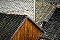
DPChallenge: A Digital Photography Contest You are not logged in. (log in or register
 
Browse Settings
Currently viewing:
Registered UserKaDi

Show comments:

Per page:

Order:

Comments:


Comments Made by KaDi
Pages:   ... [71] [72] [73] [74] [75] [76] [77] ... [137]
Showing 731 - 740 of ~1363
Image Comment
Night Out
10/09/2005 02:04:33 PM
Night Out
by bigfish

Comment:
A well done image. Texture, focus, both spot on. I just don't see the challenge topic being represented here.
Photographer found comment helpful.
Door of Contrast
10/09/2005 02:03:42 PM
Door of Contrast
by littlebertha34

Comment:
The subject is a nice choice. The dull white sky in the upper left corner detracts from the composition. I like the crispness of the textures. It just seems that there were opportutnities to present your topic more dramatically.
Photographer found comment helpful.
Just because that Duffy's Eye...
10/09/2005 02:02:28 PM
Just because that Duffy's Eye...
by lsmart

Comment:
Lovely picture of this water bird. Though your title implies that I should accept the blue of the eye as the complement to the orange, it just doesn't seem that color is answering the challenge very well.
Photographer found comment helpful.
Last One
10/09/2005 02:01:15 PM
Last One
by olddj

Comment:
Interesting subject. I wonder if a square crop would have helped emphasize the shape of the bowl. The studio quality of the shot is belied by the reflections from the sky and trees. Grain is not bad, but it is noticeable.
Photographer found comment helpful.
Barking Up the Wrong Tree
10/09/2005 01:59:09 PM
Barking Up the Wrong Tree
by amyrh

Comment:
Cute way to meet the challenge topic but the focus seems to be on the rock pile in the distance--perhaps a bit overexposed as well.
Photographer found comment helpful.
I used to be green too, you know !
10/09/2005 01:58:28 PM
I used to be green too, you know !
by maessenger

Comment:
Interesting composition and choice of muted tones. However the pixelation on this photo is distracting.
Photographer found comment helpful.
Road Work Ahead
10/09/2005 01:57:46 PM
Road Work Ahead
by elemess

Comment:
The color is there but the reason for the picture eludes me.
Photographer found comment helpful.
The Sensual Wife
09/28/2005 12:44:12 AM
The Sensual Wife
by gebhardtk

Comment:
Excellent photo!
Unfortunately, you added text to your submission--so it won't be around for long.
Post it in the forums if you'd like comments....
....and welcome to DPC!
Photographer found comment helpful.
Slate-roof
09/24/2005 12:36:51 PM
Slate-roof
by photomartyn

Comment:
*Hello from the Critique Club*
(Congratulations on a well-placed first entry--and welcome to DPC!)

This image has a wonderful graphic quality to it! I love the way the lines play off one another! The color is inviting and warm. The texture is appealing.

The focal point of the composition, to me, is the triangular side of the building. It provides an interesting shape and leads the way in to the rest of the composition. Its color sets the standard for contrast and also pulls the rusty colors from the rooftops. There's a lot for the eye to enjoy as it wanders through the lines of this picture.

Technically, it seems to be a little soft. I'm not sure exactly what is in focus--perhaps lines on the near roofs--but the wall seems to be out of focus. To heighten the graphic quality all, or most, of these lines/elements should be in focus. Since your depth of field was (apparently) limited perhaps the issue is focus--it could be that a little more sharpening in post-process would satisfy more as well.

Some of the commenters suggested a different time of day--I think they may be looking for heighted contrast, greater shadowing to pull out the different layers of the roofs--I don't know that I agree but perhaps that would provide a little more "pop" to the elements presented here.

Overall, a well-received image. I like what you have done here. The photo has graphic interest. The composition leads the eye...even to that wonderful opening in the one roof which begs the viewer to consider it and its purpose.

I hope you find my comments helpful.
--Kadi
Photographer found comment helpful.
high
09/24/2005 10:54:46 AM
high
by pbelasco

Comment:
*Greetings from the Critique Club*

I really like this image and it's point of view. The perspective is interesting--it makes a graphic and pleasing composition.

I think it would be better if the man's head was in focus as well as the brick walkway. It loses some of its impact because of that.

Because the light falls off on the left side the image environment seems curved--I like that because it makes it look like the curve of the earth--I wish the right side of the picture continued that feeling.

The thing the man is carrying has very closely set lines--because of that, they seem to vibrate in the image. Perhaps there was too much "sharpening" in the prepration of this image that accentuated the vibration of the lines.

Overall, I think this is a pleasing image and perspective. The few technical issues add up to alot in such a simple composition and, unfortunately, hurt its appeal some. I would definitely suggest this is worth trying to take again (or something similar)!
--Kadi
Photographer found comment helpful.
Pages:   ... [71] [72] [73] [74] [75] [76] [77] ... [137]
Showing 731 - 740 of ~1363


Home - Challenges - Community - League - Photos - Cameras - Lenses - Learn - Help - Terms of Use - Privacy - Top ^
DPChallenge, and website content and design, Copyright © 2001-2025 Challenging Technologies, LLC.
All digital photo copyrights belong to the photographers and may not be used without permission.
Current Server Time: 08/27/2025 12:06:10 AM EDT.