| Image |
Comment |
| 10/18/2005 11:54:24 PM |
Grievingby jpochardComment: For me, the best of the challenge!
I hope it does very, very well.... |
 Photographer found comment helpful. Photographer found comment helpful. |
| 10/17/2005 12:09:21 AM |
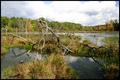
18mmby OdysseyF22Comment: This looks like the Binghamton University Nature Preserve....What happened to the tree! And why weren't you at the DPC Ithaca Get Together today?
(If this is not the BU preserve and you have no idea what I'm talking about, please forgive me...I'll edit later and give you a proper comment.) |
| Photographer found comment helpful. |
| 10/11/2005 07:11:08 PM |
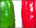
Red Hot... , no wait, Green Chili Peppersby hitendraComment: Italian flag?
This image could work, but the red is very strange on my monitor, the lighting a bit too harsh (highlights blown and shadows unhelpful). The idea is there, the execution is lacking. |
| Photographer found comment helpful. |
| 10/11/2005 06:59:19 PM |
Small red against greenby HoddssonComment: Interesting location. Image lacks a clear topic. Contrast is jarring. Sky is rather dull. Sorry, just the way I see it. |
| Photographer found comment helpful. |
| 10/11/2005 06:56:22 PM |
otter popsby larscComment: The colors are complementary. The pattern of the image has some appeal. Because you've made a "product shot" I'd like to see more care taken to the detail--perhaps freezing them face down so the air bubbles didn't fall behind the logo? Appears to be a bit jaggy on the white lines and highlights as well.... |
| Photographer found comment helpful. |
| 10/11/2005 06:53:08 PM |
Brown & Blueby GoldBerryComment: This is a sweet image. I like the composition a lot! The width of the image is nice as it really sets this couple in their environment. I would like to see a bit more foreground for balance. Perhaps shielding the lens from the sun would have prevented the flare in the upper right corner? |
| Photographer found comment helpful. |
| 10/11/2005 06:51:30 PM |
Red vs Greenby TheresaAComment: This strikes me as a grab shot. No real decisive moment here...no emotional impact. I think the colors are a bit dull and the image a tad fuzzy. If I were editing this photo I'd bump up the hue/saturation and apply a bit of sharpening to the whole. |
| Photographer found comment helpful. |
| 10/11/2005 06:46:26 PM |
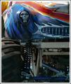
Vrroom!by glad2badadComment: Interesting subject. I think the composition is busy and the colors could have been played up a bit more. |
| Photographer found comment helpful. |
| 10/11/2005 12:45:56 PM |
The Triumph Of The Yellowby LongComment: Nice play of light. Not really sure what to make of the subject and composition. My eyes are drawn to the numbers on the jar with yellow liquid but I don't understand how they are meaningful. I'm sure it's just me, but unless you meant to be cryptic (and the title doesn't help me here) I see what appears to be a detail of a larger "work"... |
| Photographer found comment helpful. |
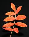
| 10/11/2005 12:43:14 PM |
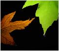
Nature's fireby M.O.C.Comment: Very graphic! A pretty and controlled picture--a nice specimine photo. I'd like to see a bit more definition in the veins and some crispness on the hairs of the stem. Overall, very nice and well conceived. I'll let others help you decide if these are complementary colors... |
| Photographer found comment helpful. |
Home -
Challenges -
Community -
League -
Photos -
Cameras -
Lenses -
Learn -
Help -
Terms of Use -
Privacy -
Top ^
DPChallenge, and website content and design, Copyright © 2001-2025 Challenging Technologies, LLC.
All digital photo copyrights belong to the photographers and may not be used without permission.
Current Server Time: 08/26/2025 11:42:30 PM EDT.