|
|
|
Showing 681 - 690 of ~1363 |
| Image |
Comment |
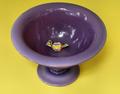
| 10/09/2005 02:01:15 PM | Last Oneby olddjComment: Interesting subject. I wonder if a square crop would have helped emphasize the shape of the bowl. The studio quality of the shot is belied by the reflections from the sky and trees. Grain is not bad, but it is noticeable. |  Photographer found comment helpful. Photographer found comment helpful. |
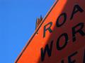
| 10/09/2005 01:59:09 PM | Barking Up the Wrong Treeby amyrhComment: Cute way to meet the challenge topic but the focus seems to be on the rock pile in the distance--perhaps a bit overexposed as well. | | Photographer found comment helpful. |
| 10/09/2005 01:58:28 PM | | | Photographer found comment helpful. |
| 10/09/2005 01:57:46 PM | | | Photographer found comment helpful. |
| 09/28/2005 12:44:12 AM | The Sensual Wifeby gebhardtkComment: Excellent photo!
Unfortunately, you added text to your submission--so it won't be around for long.
Post it in the forums if you'd like comments....
....and welcome to DPC! | | Photographer found comment helpful. |
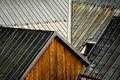
| 09/24/2005 12:36:51 PM | Slate-roofby photomartynComment: *Hello from the Critique Club*
(Congratulations on a well-placed first entry--and welcome to DPC!)
This image has a wonderful graphic quality to it! I love the way the lines play off one another! The color is inviting and warm. The texture is appealing.
The focal point of the composition, to me, is the triangular side of the building. It provides an interesting shape and leads the way in to the rest of the composition. Its color sets the standard for contrast and also pulls the rusty colors from the rooftops. There's a lot for the eye to enjoy as it wanders through the lines of this picture.
Technically, it seems to be a little soft. I'm not sure exactly what is in focus--perhaps lines on the near roofs--but the wall seems to be out of focus. To heighten the graphic quality all, or most, of these lines/elements should be in focus. Since your depth of field was (apparently) limited perhaps the issue is focus--it could be that a little more sharpening in post-process would satisfy more as well.
Some of the commenters suggested a different time of day--I think they may be looking for heighted contrast, greater shadowing to pull out the different layers of the roofs--I don't know that I agree but perhaps that would provide a little more "pop" to the elements presented here.
Overall, a well-received image. I like what you have done here. The photo has graphic interest. The composition leads the eye...even to that wonderful opening in the one roof which begs the viewer to consider it and its purpose.
I hope you find my comments helpful.
--Kadi | | Photographer found comment helpful. |
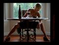
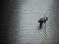
| 09/24/2005 10:54:46 AM | highby pbelascoComment: *Greetings from the Critique Club*
I really like this image and it's point of view. The perspective is interesting--it makes a graphic and pleasing composition.
I think it would be better if the man's head was in focus as well as the brick walkway. It loses some of its impact because of that.
Because the light falls off on the left side the image environment seems curved--I like that because it makes it look like the curve of the earth--I wish the right side of the picture continued that feeling.
The thing the man is carrying has very closely set lines--because of that, they seem to vibrate in the image. Perhaps there was too much "sharpening" in the prepration of this image that accentuated the vibration of the lines.
Overall, I think this is a pleasing image and perspective. The few technical issues add up to alot in such a simple composition and, unfortunately, hurt its appeal some. I would definitely suggest this is worth trying to take again (or something similar)!
--Kadi | | Photographer found comment helpful. |
| 09/24/2005 09:26:20 AM | Ashleighby trainComment: *Greetings from the Critique Club*
Portraiture is not my forte...but I'll do my best.
First Impressions: Lovely subject! Beautfiul tones! Nice expression! What unusual red hair! I like the way she's looking at "me"!
Then my critical side kicked in...I wondered first about the heavy chain--it doesn't seem to fit the mood of the portrait or the character being expressed of your daughter. The stray strap draws attention next. These two elements seem to fight for attention with the rest of the image. I like the proportion of the image, but cropping some from the bottom would eliminate these seemingly contradictory elements.
The image is high key without deep shadows. I think that's good. But something about it seems odd--it's as if there were a shadow behind her that was lightened bringing the rest of the picture up in tone. Perhaps the background doesn't recede enough--could be caused by the subject being placed too close to the background or small aperature setting.
I like to see a single well-defined catch light in each eye. Multiple reflections just seem to steal some of the magic of the eyes. Otherwise the lighting is very pleasing.
Your commenters were contradictory--some like it soft, some like it not. Some find it delicate, some find it blah. Her expression is nice, her expression is tentative. I don't disagree. =o By that, I mean, I can see that the viewer wants you to come down on one side or the other of these choices...without being overtly obvious, of course. If you made the edges of the image a little softer, for example, the viewer would believe the intention without wondering if it's just slightly OOF--that doesn't mean that the viewer would like it better. If you had chosen a slightly different moment to capture her expression her lips would express less of a smile or more of one--it would take away the uncertain expression.
Overall, I think you have a very nice portrait of your daughter. There are technical things I and others have hinted at that could help you take the image in a slightly different direction if you want. You have captured her beauty and sweetness...though her deeper personality seems to be a bit hidden yet. A lovely image for the yearbook or family "wall-of-fame"...not yet "high art" but maybe it doesn't need to be.
(I see you have the approval of "graphicfunk," an artist whose work I admire for his ability to see people so well. If he thinks it has a touch of delicacy, how can I argue otherwise?)
Looking forward to seeing more of your portraits!
--Kadi | | Photographer found comment helpful. |
| 09/21/2005 06:39:36 PM | Joyby arsenalComment: Hello from the Critique Club!
The expression of the girl in this portrait is very engaging! Her eyes are bright and well lit. The color of the image is vibrant. The way she is half-hiding behind the tree lends a playful quality to the image.
The comments you received point out many of the same things I noticed, so I'll echo them.
The tree does take up a lot of the image--maybe a bit too much. It seems to demand attention simply because of its size. Could you have cropped more of it and still conveyed the idea of the tree?
The highlights in her hair come off as a bit unnatural. This could be because of using a flash or over-sharpening when you processed the image, or a combination of both. Her lips and some of the bark on the tree show similar effects.
Even though you have applied the wide border, your image still comes under the allowable 640 pixels on the long side. It also comes well under the 150 kb file size allowed for challenge entries. In this case it isn't a huge draw-back since the image is large enough and clear enough to enjoy. (There is a tutorial and currently a few threads discussing how to get your image to the greatest size allowable if this is something you want to work on.)
Usually I dislike large borders as they tend to create their own element and draw attention from the subject--in this case, your border helps balance the weight of the tree and brings emphasis to the girl's eyes and hair. If you cropped the tree, however, the border could shrink some.
I like this portrait. Even though it's what some would call "casual" or "environmental" I think it was well within the challenge guidelines. Because she is outdoors we have context and a hint of "story" to help us know her at that moment. Well done!
--Kadi
(Feel free to PM me if you want clarification on anything I've said.)
| | Photographer found comment helpful. |
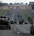
| 09/21/2005 01:10:32 PM | The 5:00pm Driver's Perspectiveby okiesisiComment: *Critique Club*
You have chosen an interesting perspective--both the point-of-view of the driver and the scene itself. The lines of the road play to the traditional "art" concept of converging lines of perspective. They show the depth of the scene well. The near symmetry of the roads offers balance to the composition. Much for the eye to travel around and visit.
The story in this photo, as I read it, is of being on the better side of the road at rush hour. I think if the truck on the left were absent the viewer would have a clearer view of the backed-up oncoming traffic...it would also lend more open space to give a stronger feel of the freedom of being on your side of the road. The near vehicle on the right contributes to the sense of being locked in as well.
The light falls on the far point of the hill. I think that helps take the eye into the distance. But once there, the sky is rather disappointing--not a huge detraction, though.
What probably hurt this most in the challenge has already been mentioned by several of your commenters--the image quality is not very strong. Grain (or noise) is fine for some subjects, but it gives this image the feel of something printed in a newspaper. I think the tonal range is also limited--again, not always a bad thing, but could the post processing have made some of those reds in the oncoming trucks "pop"? Are there undiscovered grey-tones whose detail has been lost that could make the photo richer, or more 'real'?
Normally, I'd say, "Go do it again, and try to improve your result based on the comments you find helpful..." However, I think I'd rather say, "Please drive carefully--both hands on the wheel and both eyes on the road." =)
Good luck in future challenges!
--Kadi | | Photographer found comment helpful. |
|
Showing 681 - 690 of ~1363 |
Home -
Challenges -
Community -
League -
Photos -
Cameras -
Lenses -
Learn -
Help -
Terms of Use -
Privacy -
Top ^
DPChallenge, and website content and design, Copyright © 2001-2025 Challenging Technologies, LLC.
All digital photo copyrights belong to the photographers and may not be used without permission.
Current Server Time: 08/26/2025 08:49:26 PM EDT.
|