| Image |
Comment |
| 09/11/2006 04:47:07 PM |
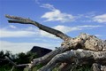
Fallenby sadiebirdComment: I like the repetition of triangular form in this image. But, unfortunately, the dominant branch sends my eye flying out of the picture to the left. The color and exposure seem alright...there is, though, some pixelation along the edges of the branch where it meets the sky....just a few things to think about for your next entry. |
 Photographer found comment helpful. Photographer found comment helpful. |
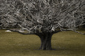
| 09/11/2006 04:10:31 PM |
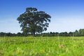
Big Wall Flowerby michael_pComment: I like the low angle of view! Wish the tree were a bit to the left and the background slightly blurred to get greater depth. |
| Photographer found comment helpful. |
| 09/11/2006 03:53:59 PM |
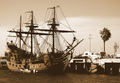
Juxtaposedby jadComment: When I look at this my mind says, that's an image of an interesting old boat. The tree is a very unimportant part of this image to me. On a technical note, you've lost your range of contrast....no true blacks in this image and nothing really white....detail like this wants to stand out (yes, even in a sepia-toned image). |
| Photographer found comment helpful. |
| 09/11/2006 03:51:43 PM |
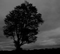
Hayfield treeby snafflesComment: I think the idea of creating a silhouette against the drama of the sky is a good one. The leaves of the trees and the horizon line, however, have some white outlining....I think that makes it feel like a cut-out and not a seemless image. |
| Photographer found comment helpful. |
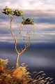
| 09/11/2006 03:49:28 PM |
Wickedby LozzaComment: I like the way you've filled 2/3 of the frame with texture and 1/3 is smooth...it gives it a nice balance. I think this would be more impressive as "wicked" if the point of view made the tree more imposing...it's hard to feel threated looking down on something. |
| Photographer found comment helpful. |
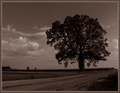
| 09/11/2006 03:46:01 PM |
Hard to Find a Single Tree...by tfarrell23Comment: Classic composition. I like that you used monotone to unify the image. My only objection is that it appears a bit too dark overall on my monitor. |
| Photographer found comment helpful. |
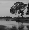
| 09/11/2006 03:38:08 PM |
Single but Lookingby tjbel05Comment: The focus seems to be on the near middle foreground ripples of water rather than the tree....whatever is in focus will demand to be the "subject" of an image. A little cropping from the right to rid the image of that intrusive second tree would help as well. |
| Photographer found comment helpful. |
| 09/11/2006 03:35:15 PM |
The Sentinelby IvoryComment: The subject is a lovely find. I'd like to see as much detail in the tree's leaves as in the grain in the lower portion of the image. The most distracting element for me, however, is where the horizon line intersects the tree. It would feel less intrusive if it cut through the trunk rather than the branches. |
| Photographer found comment helpful. |
| 09/11/2006 01:53:56 PM |
Gift of lifeby LalliSigComment: Interesting idea but to accept her as goddess I think the image needs to be more perfect...Detail and sharpness in the tree are lacking. The hair at the top of her head merges with the background and thus has lost it's detail as well. The position of her lower right leg is awkward and looks uncomfortable...as if she's about to be unbalanced. A bit more polished in its presentation and it would have been a ten. |
| Photographer found comment helpful. |
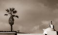
| 09/11/2006 01:43:58 PM |
Oasisby GermaineComment: One's eye tends to go to areas of high contrast and brightness first in an image. For this image it means that the shapes in the lower right hand corner are dominant....not your intention, I'm sure. |
| Photographer found comment helpful. |
Home -
Challenges -
Community -
League -
Photos -
Cameras -
Lenses -
Learn -
Help -
Terms of Use -
Privacy -
Top ^
DPChallenge, and website content and design, Copyright © 2001-2025 Challenging Technologies, LLC.
All digital photo copyrights belong to the photographers and may not be used without permission.
Current Server Time: 08/25/2025 08:13:26 PM EDT.