| Image |
Comment |
| 04/27/2007 12:44:41 AM |
DSCF3429_600px_edit.jpgby BradComment: Really nice! I over-blurred in my version....you found all the information and made an amazing transformation! That's a tremendous improvement over the orignial! Surprising how much information is retained in those files! See...all that ppchallenge pays off once in awhile. :) |
 Photographer found comment helpful. Photographer found comment helpful. |
| 04/25/2007 07:31:27 AM |
Lest We Forgetby xXxscarletxXxComment: This image tells the whole story...it's got moment and context. Like what you did with the post-process on it. |
| Photographer found comment helpful. |
| 04/11/2007 09:07:37 AM |
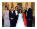
Reaching for the skyby purpleflutterby13Comment: Greetings (again) from the Critique Club! My first reaction on drawing this image from the CC pool was "Cool! I get to comment on an image I really like!" My second reaction? "Cool! It's another purpleflutterby13 shot!" :)
The first thing that strikes me about this image is its strong graphic quality. I love the way the spaces between the people create interesting shapes and invite the eye to explore the human forms. There is pleasing repetition in the mirroring of the arms holding up the man's legs and in the connection of this main figure to the hands he holds. The figures have such a nice variety of shape...there's a young girl, a guy with dreads....it's fun to try and relate to this diverse group and what they're doing.
I love the color and the way it fades to light across the image. It seems to give dimension to the flat silhouetted shapes.
Is it "contre-jour"? Well, yes the main light source is behind the individuals so, as far as I understand it, it is. In some of the other challenge images the light was stronger. Were this light stronger or slightly differently oriented you might have gained some rim lighting along one side of the figures. I think that would move the idea a bit further towards 3-dimensional space. That might or might not be a good thing--just something to play with to see if you like the effect.
This placed fairly well in the challenge. Still, I would have liked to have seen it place higher (since I voted it fairly high myself). I'm not sure what's holding it back. Maybe people don't find the bits of humans cut off by the frame pleasing? Maybe it feels too much like a graphic and not enough like a "photo"? (I'm guessing that might be where those 1's to 3's came from.)
Overall, this image has impact, style, story, pleasing lines and decent composition. Well done! (Now get those folks together and make them do it again. :-) )
--Kadi |
| Photographer found comment helpful. |
| 04/11/2007 07:48:16 AM |
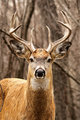
his majesty II.jpgby PhotoDaveComment: What a change from the first one! That buck really pops, now!
On the other hand....so does that branch that spears his head...
Tweak, tweak, tweak....That's the problem sometime, once you heal the broken foot you find the bunion. :) |
| Photographer found comment helpful. |
| 04/10/2007 06:04:45 PM |
Fishingby meendeeComment: Greetings from the Critique Club!
What a fun image you have here! Don't ask my why it didn't score better...I can only imagine unfamiliarity with the game (as in my case) or eyes rolling at another "woody" or that there were so many more images with something the voters liked better. But I suppose this does need to be addressed first in terms of the challenge because it probably wouldn't be done if it weren't for that topic. So, it fits the challenge. It interprets the challenge well. (Even if you don't know the game....I thought it was a spin-art kit.)
Technically this is well lit. I like the composition and framing. The overall colors are pleasing...though the tabletop might have been more harmonious in a more "festive" color to complement the game. The whites on the bobble are a bit bright and lacking in detail and richness of color...admittedly hard to control with your lighting method. What should be sharp is. What shouldn't be isn't.
If I were trying to improve this image, I'd tip woody's head a bit more down and crop that tiny triangle out of the lower right corner. With a different editing rule-set than Basic, I'd try to improve the contrast on the bobble and I'd clone some of the highlight on the green part of the game to soften it and possibly do something to lessen the obviousness of the joint on woody's shoulder. But there's not much here to improve, in my opinion. It seems you found a way to answer the challenge topic. What would this be outside of the challenge?
Keep shooting! Keep creating! There's a lovely sense of humor at work in you!
--Kadi |
| Photographer found comment helpful. |
| 04/10/2007 03:32:09 PM |
his majestyby PhotoDaveComment: A nice portrait of a deer.
The overcast sky helps even out the exposure of the entire image...that's nice. But there's lost life-lights in the eyes on days like that. Still, it's a good capture for illustration.
A couple of background things that bother me:
--the orange leaf
--the globular shape between the antlers
--the definition in the background twigs...perhaps a little selective blur to take care of what the lens could not would be in order? |
| Photographer found comment helpful. |
| 04/10/2007 03:27:06 PM |
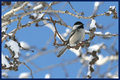
lill birdby PhotoDaveComment: This is a beautiful shot of a chickadee! The texture in the feathers is sweet. The separation of the eye from it's black "cap" is hard to achieve.
However, I don't see the reason for the left half of the image. Yes it puts the bird on one of the "thirds"...but it doesn't really add to the story. If the bird were facing the other direction it would...here he's looking out of the frame. I'd rather see a centered subject than one that leads my eye out of frame. Have you considered making a crop to portrait orientation? |
| Photographer found comment helpful. |
| 04/09/2007 05:27:18 PM |
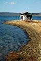
Old beach shed, Nova Scotiaby WinkComment: Again, classic ess-curve...follows "rule of thirds"...interesting subject. But...it looks a bit too rich in color and a bit to sharp on the details. I think, too, this would be better if you could get a slightly different angle of view--I'm not fond of the way the building's roof line merges with the line of the far shore. Another thing to try in this setting is lengthening the exposure...you'd probably need to add a neutral density filter to do so... The reason I suggest it? Because this is such a tranquil setting and the little motion of the water would go almost completely smooth and "smoky" making a nice contrast for the pebbly shore.
Ah well, done blithering. I like it. :-) |
| Photographer found comment helpful. |
| 04/09/2007 05:20:20 PM |
The Cove, Prospect, Nova Scotiaby WinkComment: What a serene and classic landscape! I like the way the water forms an ess-curve leading to the red building. Somehow, though, there seems to be a color cast to the image making it feel dull...don't know if it's yellows making the clouds green or what. Still, it's nearly a postcard shot...perhaps you could put on your waders and stand about 6 feet left to push that barn a bit further off center? :) |
| Photographer found comment helpful. |
| 04/09/2007 05:17:20 PM |
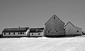
Nova Scotia Barnsby WinkComment: Nice! I love the classic B&W tones and the lines of the buildings! Simple and effective statement of place. |
| Photographer found comment helpful. |
Home -
Challenges -
Community -
League -
Photos -
Cameras -
Lenses -
Learn -
Help -
Terms of Use -
Privacy -
Top ^
DPChallenge, and website content and design, Copyright © 2001-2025 Challenging Technologies, LLC.
All digital photo copyrights belong to the photographers and may not be used without permission.
Current Server Time: 08/25/2025 04:05:11 AM EDT.