| Image |
Comment |
| 05/13/2007 01:08:06 PM |
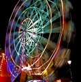
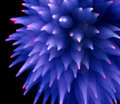
Big Wheel Acceleration = ( 4 x Pi Squared x R ) / ( Time Squared )by JonathanJComment: Greetings from the Critique Club!
What a lovely sense of color and motion! The geometry of shapes in this image really pulls me in! However, I have to agree with some of your commentors that the relationship to the challenge is somewhat weak and mostly argued in the title.
The image itself is exciting to look at...all the way to the little stars made by the lights. I feel the composition could be strengthed by a different point of view. The cropping of the top of the wheel is fine but I'd like to be viewing this from about 15 degrees to the left so the wheel would appear more round. The lamp in the lower right hand corner is also a liability, in my view. It demands attention because it is so well defined against the black space.
Overall, a great subject and a wonderful approach to it!
Keep shooting! |
 Photographer found comment helpful. Photographer found comment helpful. |
| 05/13/2007 11:57:16 AM |
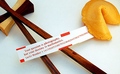
An Irrational Fortuneby m_sarzynskiComment: Greetings from the Critique Club!
What a clever answer to the challenge topic! Pi is represented in so many ways in this image that not only does it meet the challenge but one could guess the challenge topic without knowing it. Love the title, too!
What strikes me most about this image is the puzzle it poses. I like the ideas in the image more than the image itself. The composition holds all the elements but I'm not fond of the mergers with the frame in the upper left and right corners--one maybe, but not both. I guess I'd choose to bring the cookie into the picture entirely to help preserve the concept of circle it conveys.
The lighting feels odd to me, as well, on two points. The color balance feels off...somehow too blue in parts and yet there appears to be a yellow light source too. Secondly the shadows...or near lack of them. The lighting provides some definition of shape on the cookie...but that is lost on the chopsticks especially where they meet near the block. I think lighting may be the one most important element holding this image back.
Overall, a clever concept competently executed. Keep shooting and entering! |
| Photographer found comment helpful. |
| 05/13/2007 11:30:05 AM |
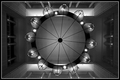
Below a web of lightby jprezantComment: Greetings from the Critique Club! ...and congratulations on a high-placed image!
The first thing that strikes me about this image is the abstraction and clarity of line. The gradation of tones is rich and satisfying and pulls me in to discover the subject. I like that the architecture slowly reveals itself...that the eye is led to the ceiling and out to the walls then back to the chandelier.
After looking for awhile, however, I had a sense of something being askew. It appears that the lens distortion causes the lines of the windows left and right to slant inward...thus breaking the perfect nature of the symmetry. I don't think cropping more would help. Though a square crop would eliminate this minor distraction the architecture would be lost. One thing that is asymmetrical which does not, for me, hurt the image is the slight rotation on the lines of the light fixture...in this case the slight break in symmetry helps add to my experience of the subject.
Overall, a technically well done image that makes me pause to discover its true nature. |
| Photographer found comment helpful. |
| 05/13/2007 10:40:27 AM |
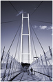
Out of the Spiders Lairby havy2008Comment: Greetings from the Critique Club!
This image has immediate impact! It's crisp! The lines are full of energy--what lovely leading lines and diagonals! I love the limited color choice--it unifies what could otherwise be a complicated color image. The symmetry sings, there are so many ways this image echos itself. I especially like the way the simple lines at the top of the span are repeated at the level of the walkway.
Two elements, the clouds and the people, effectively break the symmetry and add impact. I notice your commentors are divided in their opinions on the inclusion of the people. I think the people add to the composition--they provide scale and help me move into the image. However, I think the expression of their postures is somewhat "blah" in comparison to the energy of the topic. They appear merely incidental to the image and I'd like to see a stronger connection between them.
Overall, technically well done and artistically rendered.
--Kadi |
| Photographer found comment helpful. |
| 05/12/2007 06:37:22 PM |
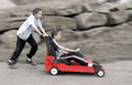
Free Wheelin'by jgriecoComment: Greetings from the Critique Club!
What a fun image! Feels like I'm right there with the boys watching them zoom past downhill! I like the emphasis on the red car. The expression on the pusher carries me into the moment...the near-concetration on the driver seems just real. Sure, you could want more expression from the driver if this were staged or you were making a movie but I don't feel that life needs to be artificially dramatized all the time.
Because of your notes I guess that you dimmed down the elements outside of the buggy. This, to me, is effective with the exception that some of the life has been lost from the boys' skin tones. I'd probably choose to pull that desaturation back a bit if I were editing. Otherwise there's nothing I want to quibble with. I see a beautiful slice of time captured by skillful panning which takes me back to the soap-box derby days of my childhood.
Sweet! Thank you for sharing this honest picture worth the time to enjoy!
--Kadi |
| Photographer found comment helpful. |
| 05/12/2007 03:53:13 PM |
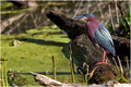
Green Heronby docurrieComment: Greetings from the Critique Club!
Ah! A heron! What magnificent colors! How fine the detail in its feathers! I love looking at birds and stalking them with my camera. They are often difficult subjects...even herons who seem to pose... The watery environment they inhabit poses obstacles for the photographer attempting the best composition. Their intentness on fishing suddenly moves them to action and the moment is gone before the focus is fixed.
I like this image. I like the character of the bird...it's frozen stance and gaze. To isolate the subject better a more limited depth of field would help. But even with that you're fighting the darkness of the log behind the subject and the merger of the beak with the line of that log would still exist. I think that the left hand portion of the image has little to offer...perhaps cropping it out and creating a square format would bring the viewer's attention back where the interest of the image lies? Even within the advanced (not expert) editing rules the background could be slightly desaturated, again with the intent of placing emphasis on the heron.
Overall, a well done image at a beautiful time of day!
Keep stalking!
--Kadi |
| Photographer found comment helpful. |
| 05/11/2007 10:09:29 AM |
|
| Photographer found comment helpful. |
| 05/02/2007 04:20:48 PM |
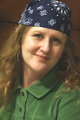
Pirate (Day 5?)by bergiekatComment: I'm guessing this is the one to print out so I recognize you. :)
Nice portrait! Self-ports are hard to do really well, I think.
I don't look at all like this:  |
| Photographer found comment helpful. |
| 05/01/2007 01:27:46 PM |
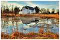
The Golden Lightby OdysseyF22Comment: What a lovely location to shoot.... ;-)
Nice interpretation of Kip's Barn!
(But you could sure use a touch of Spring in Central New York.) |
| Photographer found comment helpful. |
| 04/28/2007 10:03:22 AM |
|
| Photographer found comment helpful. |
Home -
Challenges -
Community -
League -
Photos -
Cameras -
Lenses -
Learn -
Help -
Terms of Use -
Privacy -
Top ^
DPChallenge, and website content and design, Copyright © 2001-2025 Challenging Technologies, LLC.
All digital photo copyrights belong to the photographers and may not be used without permission.
Current Server Time: 08/25/2025 01:38:23 AM EDT.