| Image |
Comment |
| 04/28/2004 04:43:24 PM |
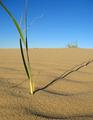
The Shady Proportions of Time.by boredComment: Nice use of proportion to create importance for a small subject. The distant clump of grass adds context and emphasizes the solitary nature of the subject. Beautiful color, shadow, texture.... Luck! |
 Photographer found comment helpful. Photographer found comment helpful. |
| 04/28/2004 04:23:48 PM |
Big cat in a small bathby menardmamComment: Actually, the way you've cropped this it looks more like a small (though chubby) cat in a big sink--which is really very funny! Love the expression on the cat! The whole arrangement really conveys the cat's sense of proportion concerning the threat of the tap being turned on. Unfortunate red reflection on the chrome. Otherwise, nearly perfect. Hope the cat haters don't bring you down. Luck! |
| Photographer found comment helpful. |
| 04/28/2004 04:09:18 PM |
Spring lonelinessby cmartosComment: Beautiful and a nice idea for the challenge. I think it would look a little more lonely cropped from the bottom and the left a bit more. Gorgeous color--simply composed--effective. |
| Photographer found comment helpful. |
| 04/28/2004 10:04:49 AM |
|
| Photographer found comment helpful. |
| 04/28/2004 09:21:40 AM |
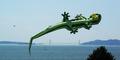
Bellyflopby GeneralEComment: Perhaps if the tree wasn't in the way, I could buy the title. The second kite detracts as well. I wonder if this reflects use of proportion or is really a use of perspective. Cute idea--worth another try. |
| Photographer found comment helpful. |
| 04/28/2004 09:09:24 AM |
Pink to Redby Hallie1Comment: There is limited detail in the red tulips. Perhaps a shallower depth of field and focus more on the flowers, less on the pine tree and grass. The idea of the pink to red ratio is interesting but technically I don't think you pulled it off. |
| Photographer found comment helpful. |
| 04/28/2004 09:07:20 AM |
Raindropsby mannjuditComment: Lovely, rich color. Beautiful detail on the droplets. Nice texture. Good use of negative space. The only disappointment is the foreground leaf because it's in the center and out of focus, and because it hides some of those wonderful water drops. |
| Photographer found comment helpful. |
| 04/28/2004 09:02:37 AM |
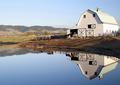
Reflection Twoby michaelkComment: Nice. I like the idea that the mirrored world can be in perfect proportion to the "real" one. By setting the division of these two at the mid-point of the photo you emphasize this equivalency. Sharp colors, nicely lit and composed. The smaller format makes it hard to really appreciate the details, though. |
| Photographer found comment helpful. |
| 04/28/2004 08:49:44 AM |
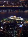
Filling the Dock: QM2 in New Yorkby cmberghoutComment: Interesting night shot. Very poster-like. I like the way that the boat not only fills the slip but is also brighter than the surronding buildings. It is this second aspect that I think speaks to the challenge topic. (If there were a small boat at the other dock the comparison hinted at in the title woudl come through.) Nice capture! |
| Photographer found comment helpful. |
| 04/23/2004 07:39:24 PM |
serendipitous waterby shutterflyComment: Maybe I'm missing something here. The image seems to have been rotated 90 degrees to the right. The light is interesting and the play of line and color nice. Serendipitous? Not sure about that. |
| Photographer found comment helpful. |
Home -
Challenges -
Community -
League -
Photos -
Cameras -
Lenses -
Learn -
Help -
Terms of Use -
Privacy -
Top ^
DPChallenge, and website content and design, Copyright © 2001-2025 Challenging Technologies, LLC.
All digital photo copyrights belong to the photographers and may not be used without permission.
Current Server Time: 08/24/2025 03:24:51 AM EDT.