| Image |
Comment |
| 02/03/2003 05:03:29 PM |
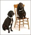
Bahsworth & Brodamireby GotchaComment: Great work - composition and framing are near perfect, focus is very good and the dogs are lovely. Probably the biggest distraction I have are the shadows (especially around the chair). Everything else is wonderful though. |
 Photographer found comment helpful. Photographer found comment helpful. |
| 02/03/2003 12:30:32 AM |
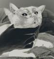
Look here dammit!:-)by ParentxComment: Interesting shot, although I don't feel it's "the best you can" - it's a little unconventional for a pet photo. As an artistic photo though it works very well - it certainly held my attention for a while. |
| Photographer found comment helpful. |
| 02/03/2003 12:19:52 AM |
All grown up and ready for college!by svitalComment: This is a pretty good portrait although my eyes are drawn to his hands rather than his face. I think it's because they are lighter. Composition is very good although the white background is perhaps a little too stark. Focus is good, colour is good. Finally, the shadows are a little harsh - perhaps a second light source would be good. Having said all that though - still a lovely portrait. |
| Photographer found comment helpful. |
| 02/03/2003 12:13:59 AM |
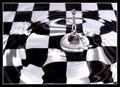
Two Classics by JackoComment: Very cliche and very well done! The reflection of the board in the very top drop really makes this photo for me. The border is simple and appropriate. A really good photo - the only critical comment is the reflection of the room where the drop meets the water, but it's only a minor thing. |
| Photographer found comment helpful. |
| 01/23/2003 11:05:30 PM |
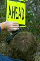
Head Gamesby jitamsComment: It looks like some tag team photography going on here - congrats. That also looks like a good camera in his hands. I love the humour of the sign in this shot - very dry. Composition is pretty good however the top edge is a little uncomfortable - difficult to crop with the top of the sign crooked. I wonder if rotating the image to crop along the sign edge would have worked or looked silly. |
| Photographer found comment helpful. |
| 01/23/2003 10:40:23 PM |
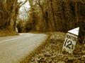
Are We Nearly There Yet?by ioComment: Nice composition and colour. The image is perhaps a little too soft for my preference although I'm not sure whether sharpening it might help or hinder. The mile marker is well positioned in the frame and I love the way the road disappears - it makes me want to know where it goes. |
| Photographer found comment helpful. |
| 01/23/2003 10:27:41 PM |
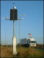
Highway 314by vjozComment: I like the colouring however the white snow (?) on the road is a little too bright - perhaps try toning this down a little. Composition is good - especially the perspective on the sign. |
| Photographer found comment helpful. |
| 01/23/2003 10:13:31 PM |
|
| Photographer found comment helpful. |
| 01/23/2003 09:55:31 PM |
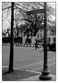
1600 Pennsylvania Ave.by iraeComment: It's a lovely building in the background, but the tree and sign fight with each other too much. |
| Photographer found comment helpful. |
| 01/23/2003 09:52:39 PM |
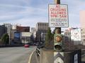
Martian robot disguises itself as a roadsign!by MarklaneComment: Composition is good for the suggested target. In some ways the giveway sign is distracting - since it's a more traditional sign it fights for attention. I think this would have been more effective with no other signs in the shot - although I realise that probably wasn't possible without losing the road (unless you hid the giveway sign behind the solar panel) |
| Photographer found comment helpful. |
Home -
Challenges -
Community -
League -
Photos -
Cameras -
Lenses -
Learn -
Help -
Terms of Use -
Privacy -
Top ^
DPChallenge, and website content and design, Copyright © 2001-2025 Challenging Technologies, LLC.
All digital photo copyrights belong to the photographers and may not be used without permission.
Current Server Time: 08/26/2025 11:43:19 AM EDT.