| Image |
Comment |
| 01/04/2010 10:21:50 PM |
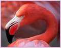
Pretty in Pinkby DigiFotoBuddyComment: What a cute fella. I think this is a nice piece, cropped well and the colours are nice. I enjoy the clarity of fur/feathers as well as the focal range. After looking this second time I will bump the score a bit. However it does lack a strong wow factor for me. |
 Photographer found comment helpful. Photographer found comment helpful. |
| 01/04/2010 10:20:37 PM |
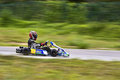
Go-Kart Actionby andrewtComment: Fun image. I bet the rider and stuff are excited about it. The motion blur looks nice and the near focus of the rider/cart work well. Though for me, it just does not push it far enough to keep my attention. it is nice and well done but not enough for me. |
| Photographer found comment helpful. |
| 01/04/2010 10:13:06 PM |
Piercing by scarbrdComment: First thing I notice is the noise/texture across the skin. It also moves into the wall behind her so I know it is not skin texture. The hair seems blurred as if in motion, and the lighting may have been facilitated in post hence the noise. For me this straight on view is not appealing and does not flatter the model. It is an ok portrait but does nothing for me. |
| Photographer found comment helpful. |
| 01/04/2010 10:11:23 PM |
Lushby CuttoothComment: The first thing I notice is the 'dreamy' effect. For me it really distracts from the image. The slight blur over everything reduces the clarity I crave. The colours are nice from the blues and greens however the large unappealing clouds seem to have been forgotten during post. Overall for me it is an ok image but does nothing for me. |
| Photographer found comment helpful. |
| 01/04/2010 10:08:43 PM |
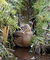
Mallardby SteveJComment: Little quack'r in the pond. I find that the side foliage here seems to be sharper focus then the duck. Also the near center composition leaves me wanting something more. I would have liked a bit more separation as well as depth with the feller. |
| Photographer found comment helpful. |
| 01/04/2010 10:07:09 PM |
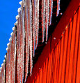
Lines & Coloursby pjotre7Comment: I like the concept but I feel it did not work. I think I find the most distracting is the narrow focal range as well as the camera angle of the image. I would like something a bit more dramatic with much more clarity. However that being said the red and blue work well to contrast and if there gave more blue on the ice I think it would have really popped more. |
| Photographer found comment helpful. |
| 01/04/2010 10:06:00 PM |
The boysby JudiComment: One of the better clean portraits in this challenge. Clarity colours lighting all work out nicely. I am sure the owners are thrilled with this in their hands. However for me, it really is just another portrait without much else to keep me interested. Yet, after really looking at a few others I will bump this up a bit because it does have nice technical skill. |
| Photographer found comment helpful. |
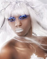
| 01/04/2010 10:04:42 PM |
Winter Breezeby LVicariComment: Interesting makeup. Makes me want to see more from the shoot. However for me and this image it appears overly soft, it distracts my eye. It feels like something is missing, maybe a bit of contrast, or even more personality of expression. It is interesting but does not wow me. |
| Photographer found comment helpful. |
| 01/04/2010 10:03:34 PM |
Duchesne PEby zeuszenComment: No idea what the concept of this is. No idea what the title says much less means. All I see is an upside down image, from my perspective. That being said, I don't think this really is anything. For me it does not say anything do anything and makes no sense. I would pass by this every day and never notice it once. |
| Photographer found comment helpful. |
| 01/04/2010 10:02:23 PM |
Daisyby DCrest01Comment: Nice flower image, I enjoy the crop used for this. The pastel colours are nice however for me it does not pop enough. Simple, delicate clean but does not wow me. |
| Photographer found comment helpful. |
Home -
Challenges -
Community -
League -
Photos -
Cameras -
Lenses -
Learn -
Help -
Terms of Use -
Privacy -
Top ^
DPChallenge, and website content and design, Copyright © 2001-2025 Challenging Technologies, LLC.
All digital photo copyrights belong to the photographers and may not be used without permission.
Current Server Time: 09/01/2025 03:33:29 AM EDT.