| Image |
Comment |
| 07/01/2007 01:07:40 PM |
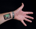
Bi-annual Tune-upby GreetmirComment: Fun idea, yet, the elements I don't feel are put together strong enough. I would see a straight arm/wrist as apposed to this angled version here. Also, The skin edging you created, doesn't give me a feel of robotics here. Classically this type of thing is created with torn flesh or straight edged box type of covering. The edgeing here, just doesn't seem to hold out enough depth for me. Also, I would see more mechanical functions in the wrist than electronically, lots of joints and stuff that need to move. but thats just my personal opinion. |
 Photographer found comment helpful. Photographer found comment helpful. |
| 07/01/2007 01:04:02 PM |
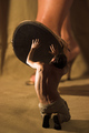
Gulliverby Rino63Comment: I view this more as a fable than sci-fi. That being said, I think there needs to be more consistent lighting between both objects in the image. The two images appear very separated. Maybe a trick you could have done, is add shadows of the fingers/hands to the bottom of the shoe to add that connective element. |
| Photographer found comment helpful. |
| 07/01/2007 12:59:56 PM |
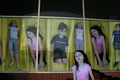
Clones For Saleby posthumousComment: nice idea, the children going down a slide helps create that 'pod' like feeling. I think that bothers me the most, are the reflections on the glass and the lack of consistency with the sizes. Also, the young lady in the front, does not stand out terribly much from the back. I think a little more separation would have been nice. I great idea all the same. |
| Photographer found comment helpful. |
| 07/01/2007 12:57:38 PM |
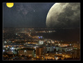
Cityscape in Spaceby PascalComment: What a wonderfully beautiful image, however, I find three things that distract for me, the yellow orb seems a bit out of place, the blue neon building off center, and the lack of reflection of the moon in the water. |
| Photographer found comment helpful. |
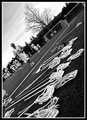
| 05/28/2007 10:28:29 AM |
Silent-Sticks (Day 2)by cryanComment: This is an interesting perspective... but not quite sure it works for me. I think it may have worked better 90Degrees CW... hmmm |
| Photographer found comment helpful. |
| 05/28/2007 10:27:15 AM |
family3.jpgby electrolostComment: interestingly creative shot, I think the textures and stuff really add to a nice mood for this image. |
| Photographer found comment helpful. |
| 05/28/2007 10:25:26 AM |
|
| Photographer found comment helpful. |
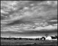
| 05/28/2007 10:24:00 AM |
White Barnby HipychikComment: very interesting image, I think the biggest fault is the front of the building being blown out. I think if it had a shade like the side, It still would have stood out, but not been an eyesore. The clouds are really fun, I wonder what a touch more contrast would bring? |
| Photographer found comment helpful. |
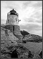
| 05/28/2007 10:22:03 AM |
Day 2 - Castle Hill Lighthouseby CapeSailComment: I think the sky needs to be processed separately from the rest of the image. For me, the sky is blown out, but the rest is still kinda flat. |
| Photographer found comment helpful. |
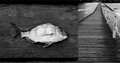
| 05/28/2007 10:20:30 AM |
Fishby RetroesqueComment: Personally, I don't care for this 'double' image. They just don't seem to be connected enough for me. And the angle of the pier just really feels, incomplete. The fish itself is fairly fun, Although I think I would have liked more contrast between his face and plank, as it is now, it seems to get lost. |
| Photographer found comment helpful. |
Home -
Challenges -
Community -
League -
Photos -
Cameras -
Lenses -
Learn -
Help -
Terms of Use -
Privacy -
Top ^
DPChallenge, and website content and design, Copyright © 2001-2025 Challenging Technologies, LLC.
All digital photo copyrights belong to the photographers and may not be used without permission.
Current Server Time: 06/25/2025 12:38:10 PM EDT.