| Image |
Comment |
| 06/24/2009 06:27:22 PM |
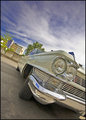
Ghetto Blasterby h2Comment: Strong compostion that matches the spirit of the car, I just wish you had better saturation, everything else in the image is loud and in your face, the muted colors really drain the drama. |
 Photographer found comment helpful. Photographer found comment helpful. |
| 06/24/2009 06:24:52 PM |
Graby ButterflyGirlComment: Great find, and feeing in this shot, but I am bothered by a few things. My main issue is that you took the middle path on the distance from your subject, so the two are pretty balanced, but I don't feel they should be. If you got in tighter on the car it would be more car in odd location; If you moved back it would be more landscape with car dumped on it. As it is it has a more documentary feel than artistic. Does that make any sense?
The other two points are minor quibbles that would be more in the arena of how to score better here than how to make better photographs.
The overall image is soft focally. If you crunched it through a sharpening filter a few times it would be more easily accepted. the second point is even more awful to say, but the horizon is not flat. i can see that the trees are growing straight up and that you have not tilted a flat horizon, but if you want a few more points, you need to flatten that horizon , even if the trees go out of 90% a degree or two.
Third point; clever titles bring up the score half a point, incomplete or misspelled title cost you points.
The more I look at this shot the more I like it, but it flies in the face of all things DPC. |
| Photographer found comment helpful. |
| 06/24/2009 06:12:28 PM |
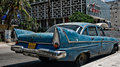
Havanas finest legacy of capitalismby johst582Comment: Nice setting for the car, my only real knock is that the car seems mushed into the lower right corner, a bit more breathing room down there would have made a much nicer composition. |
| Photographer found comment helpful. |
| 06/24/2009 06:10:02 PM |
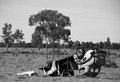
Back in the Daysby AJFIComment: Lovely car, in tough light. The biggest issue I have with this image is that it shows off the car, but ends up looking like a shot from a want ad. The barn in the background is only half there, so it is more distraction than mood setting. Same with the big wheel (antique bicycle? carriage wheel?) on the left. Had you backed up the car a few steps to get the whole thing in the tree shadow, shifted your POV up to show off the setting, or down to created more dramatic line in the car and cut out the background, this would have been a stronger shot. All the components are here, but they just don't come together as a whole. |
| Photographer found comment helpful. |
| 06/24/2009 06:00:06 PM |
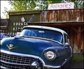
Antiquesby EmerkazaComment: I'm torn on this one, the blown out sky and the flat shadowless light eat up a lot of the drama of the shot. The Caddy is a great find and the canted over, riding on the rim, angle of the car is nice, as is the worn out and left behind setting. If you could have only come back when the light was better, this shot would have been a ribbon contender. |
| Photographer found comment helpful. |
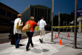
| 06/23/2009 01:54:44 PM |
5430by jdannelsComment: Nice find. Where is this Joe? That art deco building in the background looks familiar but I can't place it. |
| Photographer found comment helpful. |
| 05/20/2009 11:18:16 AM |
The Princess Brideby scalvertComment: Lovely shot Shannon, and as the other images in your portfolio will loose their luster and freshness, shots that capture a specific slice of our children's lives just get more and more valuable. It is rare to see the simple and sophisticated mixed so well. |
| Photographer found comment helpful. |
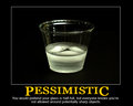
| 05/20/2009 03:08:04 AM |
Pessimisticby klkitchensComment: I don't understand how this slid so far down the challenge. I guess not all the tools got sharpened before they got put away. The image doesn't have a ton of pop, but the phrase is snarky as hell, a perfect de-motivator. |
| Photographer found comment helpful. |
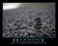
| 05/20/2009 02:24:47 AM |
ZenLifeby mpetersComment: Great shot Mark, and the first placed De-movtivator with an original phrase that is spelled correctly. |
| Photographer found comment helpful. |
| 05/18/2009 12:44:27 AM |
Hotel Lampby rrdjservComment: I alway like to comment on the shot with the biggest disparity between my score and the finish. I had this in my top five. I got yours in there with first, second and fourth places, how yours slid so far I don't understand. It is beautifully rendered with tons of texture and variants of subtle light. I'm sure the prosaic hotel furniture didn't help your score but I thought it was a good choice and the tight crop created an enclosed feeling that reminds me of many hotel rooms I've stayed in. Great job, keep it up. Message edited by author 2009-05-18 00:47:19. |
| Photographer found comment helpful. |
Home -
Challenges -
Community -
League -
Photos -
Cameras -
Lenses -
Learn -
Help -
Terms of Use -
Privacy -
Top ^
DPChallenge, and website content and design, Copyright © 2001-2025 Challenging Technologies, LLC.
All digital photo copyrights belong to the photographers and may not be used without permission.
Current Server Time: 08/13/2025 01:12:23 AM EDT.