| Image |
Comment |
| 07/20/2004 12:31:11 PM |
Just Tby MonaComment: Since this is an advanced editing challenge, you could have brightened this up and still kept the brooding sky colors. othere than the darkness I love this shot, seems deeply odd but quite at ease, good focal depth and i like the centered composition. |
 Photographer found comment helpful. Photographer found comment helpful. |
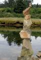
| 07/20/2004 12:28:18 PM |
Precariousby ZoomdakComment: I would have liked to see a bit more foreground instead of the cairn shooting into the frame. Other than that, nice focus and colors, interesting composition, well framed by thirds. |
| Photographer found comment helpful. |
| 07/19/2004 04:45:55 PM |
quietudeby LokiComment: Nice idea but the watch hurts the balance of left righ,t and the sense of balanced quietude. Outline of figure could be more crisp, but a good idea and a nice graphic solution. |
| Photographer found comment helpful. |
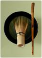
| 07/19/2004 04:43:04 PM |
Zenby JesuispeureComment: Wave I seen this wisk before? Not as Mimsy this time. Great green, very evocative of the ceremonial mood. The sense of balance here is very asian, lacking classical helenistic bi-symmetrical axis so it may not score too well, but it sure is sweet. Not sure about the fuzzy little border though. |
| Photographer found comment helpful. |
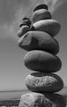
| 07/19/2004 04:37:43 PM |
Tower of Powerby cabaComment: Good composition and focus, but I wish you had a blacker black and a whiter white on the B&W conversion. |
| Photographer found comment helpful. |
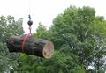
| 07/19/2004 03:22:48 PM |
Up and Awayby dphillipsComment: I think a portrait orientation would have better emphisised the lifting going on here. |
| Photographer found comment helpful. |
| 07/19/2004 02:50:53 PM |
glass half fullby slingshotComment: Bit too dark and perhaps too much USM. I like the way the red comes through the glass. |
| Photographer found comment helpful. |
| 07/15/2004 12:41:56 AM |
Reflectionby PaulMdxComment: would have been nicer if the whole thing was as crisp as the word beyond the looking glass, but this was a good idea. |
| Photographer found comment helpful. |
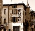
| 07/15/2004 12:40:39 AM |
The Camelia Bazarby jjbeguinComment: I'm not too keen on the building looming into the frame on the left, but the central third of this shot is my favorite of the challenge. Great duotone reductionand nice balance between the curves and the rectalinear forms, but I think it would have been stronger cropped up and right. |
| Photographer found comment helpful. |
| 07/14/2004 07:55:22 PM |
Enjoyby film_de_verreComment: nice shot but look up the tutorial on posting to the size limit. More pixels make more points in the scoring. |
| Photographer found comment helpful. |
Home -
Challenges -
Community -
League -
Photos -
Cameras -
Lenses -
Learn -
Help -
Terms of Use -
Privacy -
Top ^
DPChallenge, and website content and design, Copyright © 2001-2025 Challenging Technologies, LLC.
All digital photo copyrights belong to the photographers and may not be used without permission.
Current Server Time: 08/06/2025 08:18:49 PM EDT.