| Image |
Comment |
| 11/21/2005 12:25:02 PM |
Playing Fieldby StopDownComment: I like the way you've set this up, but I think the light has made the white pieces look a bit 'fake' somehow, almost like in a film where they've not used CGI very well!
Love how the light fades towards the far side of the board though. 7 |
 Photographer found comment helpful. Photographer found comment helpful. |
| 11/21/2005 12:20:06 PM |
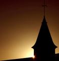
The Final Showdownby JohnTFComment: Nicely composed and lit... it's a shame that compression has shown up in the area around the white, but on the whole I like this one. well done. |
| Photographer found comment helpful. |
| 11/16/2005 03:41:06 PM |
A Shot in the Darkby soupComment: Love the concept, but not so keen on the dribble! I don't like it when people can't hold their drink :-) 6 |
| Photographer found comment helpful. |
| 11/16/2005 10:08:29 AM |
Mommy's Makeupby LokiComment: Gorgeous expression, and what a cute girl. I find the background to the left a bit distracting though. |
| Photographer found comment helpful. |
| 11/16/2005 10:05:22 AM |
Click Meby JRalstonComment: Not a bad image, but I just don't find the subject very inspiring/unusual. |
| Photographer found comment helpful. |
| 11/16/2005 10:02:28 AM |
Daybreakby BrinComment: Gorgeous. Skillful editting to keep a true 'gradient' effect after having to compress/resize the image. Well done |
| Photographer found comment helpful. |
| 11/09/2005 02:03:02 PM |
Dance of Great Bison Spiritsby elee3009Comment: I didn't vote/comment on this challenge, but I imagine there will have been lots of standard DPC 'perfectionist' photos entered, so no doubt compared to these yours didn't fit in.
For me, if you take a bit of time to look at your image (admittedly not something I always do when voting), the motion blur really adds to the atmosphere, almost as if you can feel the ground shaking because of the strength of the bison. I quite like the processing you've done too - very bold especially if you've not done much editting before. I'm not so keen on the whiteness of the ground as I think it's a bit distracting, buit maybe you couldn't do much about this.
As you said in the comments, it was never going to score particularly highly, but I'd be proud of this if I'd produced it. |
| Photographer found comment helpful. |
| 10/17/2005 02:44:46 PM |
Magical Morning Mist by jemisonComment: Congratulations! It's great to see a ribbon being won by someone who's not won any before... it gives the rest of us some hope :-)
I didn't vote in this challenge, but would have given your shot an 8/9 probably. Well done. |
| Photographer found comment helpful. |
| 09/10/2005 03:23:38 AM |
|
| Photographer found comment helpful. |
| 09/10/2005 03:22:41 AM |
Spring Coloursby naomikComment: Spring Colours? Am I missing something here? Your photo has contrast, but I'm not sure what you want me to look at. Also, it needs rotating slightly to the left. |
| Photographer found comment helpful. |
Home -
Challenges -
Community -
League -
Photos -
Cameras -
Lenses -
Learn -
Help -
Terms of Use -
Privacy -
Top ^
DPChallenge, and website content and design, Copyright © 2001-2026 Challenging Technologies, LLC.
All digital photo copyrights belong to the photographers and may not be used without permission.
Current Server Time: 07/15/2026 05:37:56 PM EDT.