| Image |
Comment |
| 12/04/2008 09:03:45 PM |
Self Portrait Studyby shamerComment: Usually the "self portrait" challenges makes people cringe, but you did one in a free study; impressive! The B&W works well this this shot, it makes it look very crisp. The lighting is great with no harsh shadows or uneven lighting and the glint off the earing is a plus. If i had to give criticism, I would say that its not the most "original" shot. 6 |
 Photographer found comment helpful. Photographer found comment helpful. |
| 12/04/2008 08:59:34 PM |
Fallen Autumn Leavesby arpitaComment: Nice Shallow DOF on this shot, and it works well with the subject. My main dislike with this shot is the centerd framing, and the leaf in the foreground. I think a SDOF image should have the subject be in the foreground to avoid having blurry stuff in front being a distraction. 4 |
| Photographer found comment helpful. |
| 12/04/2008 08:56:16 PM |
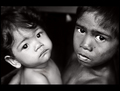
Bonded in Poverty : Sagkahan Slum, Philippinesby hotpastaComment: Amazing dichotomy shot! I love the sharp black and white detail in this image, and the children in this shot just sell it. I also like how you were able to keep the reflections in the eyes under control. Nothing bad to say about this image. 8 |
| Photographer found comment helpful. |
| 12/04/2008 08:52:40 PM |
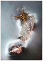
samaraftby skewsmeComment: Great macro of a spider and what looks like a leaf. The subject is great, and the lighting is even better, how it reflects off the water. I especially like the dimples created by the feet. However, the focus is a bit soft for my likings. This is a small subject, with great detail and should be shown as such. But then again, it could be my monitor. 6 |
| Photographer found comment helpful. |
| 12/04/2008 08:49:56 PM |
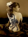
Art de Corpby naomikComment: Absolutly beautiful coloring here. I like the speia-but-somehow-not look. Not much of a fan of the framing; I would like to see this in thirds. Great model. 6 |
| Photographer found comment helpful. |
| 12/04/2008 08:48:08 PM |
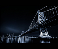
Bridge to a Cityby APComment: Great high contrast black and white, but having the reflections cut off makes it look awkward. Same thing with the top right of the bridge being cut off. Idk if this was a result of croping, or a lack of a wider lens. Nonetheless, great composition. 6 |
| Photographer found comment helpful. |
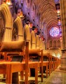
| 12/04/2008 08:45:41 PM |
Silenceby sekarmalathyComment: The composition of this shot is AMAZING! I love the colors, I love the glow off the chairs and I love the stained glass. Unfortuatly I think this image is let down by the lack of a wider angle. The ceiling is leading you on and wants to be looked at, but is cut short. So i think if you do this shot again you should focus on the chairs or the ceiling, not both. 7 |
| Photographer found comment helpful. |
| 12/03/2008 12:16:38 AM |
|
| Photographer found comment helpful. |
| 11/26/2008 12:19:20 AM |
|
| Photographer found comment helpful. |
| 11/22/2008 06:23:06 AM |
Noirby violinist123Comment: ...means Black. Looks like the knob on a watch, but on the inside??? great B&W |
| Photographer found comment helpful. |
Home -
Challenges -
Community -
League -
Photos -
Cameras -
Lenses -
Learn -
Help -
Terms of Use -
Privacy -
Top ^
DPChallenge, and website content and design, Copyright © 2001-2025 Challenging Technologies, LLC.
All digital photo copyrights belong to the photographers and may not be used without permission.
Current Server Time: 08/19/2025 10:17:12 PM EDT.