| Image |
Comment |
| 06/19/2007 04:26:09 PM |
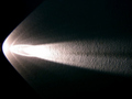
Comet on the wallby dudeman13Comment: Hi Dan,
I don't mean to be harsh here but this is what happens when we just shoot something for the sake of getting something, anything for the challange. The idea was nice but thats where it ended. The comp & framing are awful, the toneal rangers are way off & the image is over exposed. |
 Photographer found comment helpful. Photographer found comment helpful. |
| 06/19/2007 03:20:22 PM |
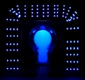
- - emanating illumination - -by ManicComment: Hi Manic,
Neat image, all tho centered it works really well here. The color scheme also works real well here. The bulb part of image is nice and crisp.What I do see here is some possible camara shake which seems more apparent on the right side squares. Also and this was a killer, may eye was immediately caught by the upper left & right corners of the image. There are two sets of squares one in each corner that are completely out of place, they just seem to jump out of the image and keep pulling the eye to them. |
| Photographer found comment helpful. |
| 06/05/2007 03:45:52 PM |
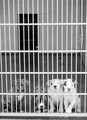
dogpoundby electrolostComment: Hi Robert,
A few things here that need to be addressed.
(1) The tonality of the image seems to be a bit off here.
(2) The loss of detail in the white areas of three dogs to the right seem to be slightly blown out.
(3) Looks like either this was hand held or your tripod was not square the image seems to be ever so slightly tilted.
(4) Image for some reason just looks flat or drabe if you will has no pop. |
| Photographer found comment helpful. |
| 06/05/2007 02:56:08 PM |
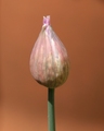
Chiveby CoinCounterComment: Hello Alessio,
Two things stick out here, fill flash to eleminate the shadows & a darker background. The darker BG would have helped make your subject more pronounced. Also some saturation of your colors (stem) would have helped. |
| Photographer found comment helpful. |
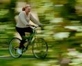
| 06/05/2007 02:34:07 PM |
Ridergalby GrandadComment: Hello Ken,
Nice effort but I do believe your panning is way over done and the right side of image is to busy a major distraction here. In fact the whole background here is way to distracting. |
| Photographer found comment helpful. |
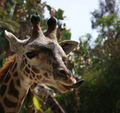
| 06/05/2007 02:27:18 PM |
giraffeeby jenlund70Comment: Hi Jen,
Nice image for having limited control of a boxed in moving subject. With that being said, there are three distractions in the background. First the patch clear sky, second the animal just under her chin and third that green leaf (bottom) is reflecting way to much light. As for your main subject, in any wildlife image we must have that catch light in the eye, it's missing here. Your exposure looks fine to me the shadows are what hurt you here. I think what would have been of great help to you in this situaton would have been shooting in continuos mode following the giraffee has she walked along or turned her head. This would have given you a better chance to eliminate the shadows get that catch light or both. With that, I still think this is a great image taking into account the conditons I mentioned above Nice Image !!!!. |
| Photographer found comment helpful. |
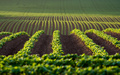
| 06/05/2007 01:32:25 PM |
furrowsby sidpixelComment: Hi Sid,
Nice image, I think the one thing bothering me here is the frontal dof, just seems out of place to me taking away from the overall image. |
| Photographer found comment helpful. |
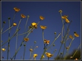
| 06/05/2007 12:34:44 PM |
buttercupby karmatComment: Hi Karma,
I like the idea but I beleave your choice of the plant itself was the wrong choice. The plant itself has to many spent flowers & the one right in front there is a real distraction. I would have liked to have seen a fuller more tightly packed group. I would have also recomposed eleiminateing the tree line (lower right). In this case because of the butter cup being so small by nature more would have been nice. Also with that beautiful blue sky with no distrations showing us all of the cups would have helped greatly. |
| Photographer found comment helpful. |
| 05/30/2007 12:54:35 PM |
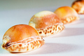
Shellsby PaulEComment: Hi paule,
This image does'nt really work for me. I don't care for the compostion here one line dead center leaveing to much dead space to the left and right. Also as you noted yourself the contrasting shades upper left, lower right are killers. The overall texture is also bothersome. Also your first shell (bottom 1/3) the focus seems a bit soft. |
| Photographer found comment helpful. |
| 05/30/2007 12:28:08 PM |
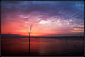
MidnightSunsetby jeroweComment: Morning jerowe,
Great image, your compostion is dead on plenty of detail rich color awsome sky. The only thing that was a bit of a distraction is that pin point of light to the right side off in the distance it kept puling my eye. Otherwise it's perfection ! |
| Photographer found comment helpful. |
Home -
Challenges -
Community -
League -
Photos -
Cameras -
Lenses -
Learn -
Help -
Terms of Use -
Privacy -
Top ^
DPChallenge, and website content and design, Copyright © 2001-2025 Challenging Technologies, LLC.
All digital photo copyrights belong to the photographers and may not be used without permission.
Current Server Time: 08/20/2025 01:00:45 AM EDT.