| Image |
Comment |
| 07/07/2005 11:33:27 PM |
Bottom Roundby CalliopeKelComment: This could have been a good image, but imo, the tags poking out of the swimsuit just kill it. Takes the shot from quality art to voyeristic snapshot. |
 Photographer found comment helpful. Photographer found comment helpful. |
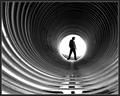
| 07/06/2005 07:23:45 PM |
Light at the End of the Tunnelby babylonComment: Stylish and classy. The composition works well. I would like to see more light on the front of the subject, thus more detail in his clothing and face.........or total silhouette. |
| Photographer found comment helpful. |
| 07/06/2005 07:21:22 PM |
|
| Photographer found comment helpful. |
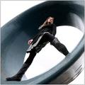
| 07/06/2005 07:20:26 PM |
Off To Save A Life!by JayWalkComment: So far, my favorite of the challenge. Only wish it were larger and with a bit more light on the front of the wrapper. |
| Photographer found comment helpful. |
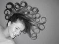
| 07/06/2005 07:19:37 PM |
"Courtney"by tmorninglory96Comment: A creative take on the challenge, I like that. Nice lighting and a lovely subject, but the image is a bit flat. Bumping contrast a touch might help, but probably needed to add another, softer light source low and near her face. (That would also serve to remove the dark shadow beneath her face.) 8 |
| Photographer found comment helpful. |
| 07/06/2005 08:55:57 AM |
Circle of Oneby arngrimurComment: Excellent image! But MAIN subject is to be circle.....
Thank you for your message - You are quite right and I stand corrected. I have adjusted my score accordingly. |
| Photographer found comment helpful. |
| 06/29/2005 04:15:09 PM |
Oldtimerby nickstyleComment: Bit over exposed on the right, but overall pleasing. Even the reflection is nice. |
| Photographer found comment helpful. |
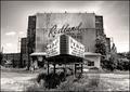
| 06/29/2005 04:14:24 PM |
Last Showingby er0kComment: Ah! Nicely composed. This is an example where centering the image DOES work. Refreshing. |
| Photographer found comment helpful. |
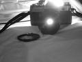
| 06/29/2005 04:13:43 PM |
through the lenseby chris_23Comment: This is a nice idea, however... The light is visible in the background laying across what appears to be a bed?!?! For a better composition, the light should not be visable at all, the camera should be a bit closer and fully in the shot and the lens cap should have been removed from the frame. Also, fill-flash or 2nd light source in front of the subject would have helped to bring out detail on the front of the camera. I hope this is helpful. |
| Photographer found comment helpful. |
| 06/29/2005 04:09:28 PM |
|
| Photographer found comment helpful. |
Home -
Challenges -
Community -
League -
Photos -
Cameras -
Lenses -
Learn -
Help -
Terms of Use -
Privacy -
Top ^
DPChallenge, and website content and design, Copyright © 2001-2025 Challenging Technologies, LLC.
All digital photo copyrights belong to the photographers and may not be used without permission.
Current Server Time: 08/25/2025 12:00:47 PM EDT.