|
|
| Image |
Comment |
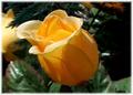
| 10/09/2005 06:18:46 PM | Friendshipby rayg544Comment: Greetings from the Critique Club Ray:
I like the colors, the lighting and the border, but flower photos are typically considered to pretty easy to do and thus they need to be pretty outstanding to score well here. Composition wise, I’d take just a little off the left side of the photo to make it fit the rule of thirds a little better.
Also, as your comments say, it really hurts that it’s a fake flower. This exact same photo with a real flower would probably score at least a full point higher. I doubt you’d ever see a fake flower on a greeting card.
I hope you find this helpful, good luck on future challenges.
|  Photographer found comment helpful. Photographer found comment helpful. |
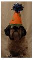
| 10/09/2005 06:03:23 PM | Happy?......birthday.by ShermyComment: Greetings from the Critique Club Mackenzie:
Cute photo and a good concept, but there are a few flaws that kept you from getting a higher score. First, the lighting is not very good, you need more of it. It looks like you just used the existing light in the room? If you don’t have lighting equipment, you can use the on-board flash with good results, just be sure to turn it down to it’s lowest setting and/or diffuse it somehow (I’ve heard of people putting a piece of semi clear tape over the flash to diffuse it).
Also, for a portrait like this I shouldn’t be able to see all the wrinkles/creases/details in the backdrop. I don’t know if your camera has manual settings, but if it does you would want to set the aperture as low as it goes to get a nice shallow depth of field. This will blur the background. You can also set your dog up further from the background to blur it more.
The photo looks a little soft as well, that may be because of your camera, a slow shutter speed (because of the low lighting) or it just needs to be sharpened.
Again, great concept (a similar shot took second place) but it needs a little work. Great dog by the way, it’s either very patient or very well trained to sit there like that. Good luck on future challenges.
| | Photographer found comment helpful. |
| 10/05/2005 10:29:32 AM | | | Photographer found comment helpful. |
| 10/04/2005 08:56:19 PM | My Sweet Nieceby auntek 3Comment: Greetings from the Critique Club!
What a great shot. Beautiful girl, great composition, great pose/expression, good lightingâ€Â¦
A couple of constructive comments; I like the lighting, but it’s a little harsh on her right sleeve. It looks like you had the lighting to the left of you. I think the photo would stand out a little more if the lighting was on your right. It would make all those whites a little more evenly lit and remove the shadows on her face. That chair does not need to be in the photo and kind of draws attention from her, cheap stools work great and for what ever reason kids live playing on them. The photo also seems a little soft, not soft focus, but not tact sharp. Were you going for soft focus or tac sharp? You are somewhere in between.
Great photo though. I would have scored it a 6 or 7 and I’m a harsh scorer. Good luck of future challenges!
| | Photographer found comment helpful. |
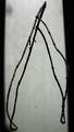
| 09/23/2005 06:34:38 PM | Shortsightedby joyseeComment: Greetings from the critique club Joyce!
Very interesting photo, I like the technique and the idea. Unfortunately the result wasn’t attractive enough or exciting enough to get the wow votes. I think the subject and the technique are good, but a flaw in your plan is the in focus part on the bottom of the image. It draws my attention to a place in the photo that I shouldn’t be paying attention to.
Suggestions: Get a little closer to the glasses with the camera to put more of the image in focus (through the glasses), but pull the glasses away from the board a little more (to eliminate the in focus part outside of the glasses). Maybe compose it so just one lens is visible and it coves about half the image, with the rest of the image out of focus?
I hope to see more photos from you as it looks like you have a interesting/creative mind. I hope you find this helpful, feel free to PM me if you have any questions of my review.
| | Photographer found comment helpful. |
| 09/23/2005 06:18:13 PM | Biker dude.by Nick-SComment: Greetings from the critique club Nick!
First off, DPC allows you to have a maximum image width or height of 640 pix. It’s in your best interest to use all of that so people can see your image in all it’s glory. That might be part of the reason for the low score. You chose the point of view definition of perspective, as I did, and I think that is also part of the reason for the low score/placement as most people seemed to be looking for the distance/size definition.
Positives: I think the composition is great, text book rule of thirds. The colors are really good as well and the nice deep DOF works perfect. I love the expression on the kid’s face.
Negatives: The lighting on his fact is a little off. Turn him into the sun a little more and the shadows disappear. Image size as noted. His clothes are a little loud or off, but I don’t know if I’d call that a negative.
Congrats on your first entry! I hope it doesn’t discourage you from entering again as it looks like you have a great eye. I hope you find this helpful, feel free to PM me if you have any questions of my review. Message edited by author 2005-09-23 18:35:38. | | Photographer found comment helpful. |
| 09/22/2005 07:25:13 PM | Mona Lisa Smileby fplouffeComment: Greetings from the Critique Club!
Considering the lighting equipment you had to work with, this turned out really well. The model is great and the pose is good but I’d rather see an expression with a little more spunk. She looks like a spunky person and the expression she has seems like she is holding back. Kind of like she is trying to force a un-natural smile.
There was one comment on the shirt and I agree. Either have her wear a more neutral shirt, or concentrate the composition on the face (which is my portrait style). The shirt is the most vivid part of this photo and I doubt that was your intention.
You had mixed comments on the lighting and a lacks impact comment, here is what I think: The lighting on the face is perfect, but not for the background you used. Crop off the shirt and change the background to a dark color and she will stand out perfectly. Here you have a grayish background and a dimly lit face and they just kind of blend together. With the dull-lighter background you need brighter lighting to stand out.
Overall you did pretty good. I probably would have scored it a 6. Your DOF is dead on and the focus/sharpness is perfect. You have a good grasp of lighting, you should get some good lighting equipment so you can do some real damage!
I hope this is helpful, I’m not an expert by any means so this is all just my opinion. Feel free to PM if you want discuss anything I said further.
| | Photographer found comment helpful. |
| 09/20/2005 08:56:06 PM | Aloneby tribalComment: Greetings from the Critique Club Rob,
Congrats on your first entry! You received a pretty low score and all your comments are positive, which doesn’t help you to do much to improve.
The background sets a great mood. The black borders, the grain and the specs give it a worn out/used feel to it. The subject just isn’t strong enough to carry the photo though. Maybe a branch with more interest would help? I know there is not much exciting about a branch, but with a background like this you set a great mood to tell a story and the branch just didn’t do it for most people.
Hope this helped. Feel free to PM me if you have any questions.
| | Photographer found comment helpful. |
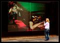
| 09/20/2005 08:32:14 PM | Comparisonby e301Comment: Greetings from the Critique Club Ed,
First off, I feel weird critiquing your photo because I think you are one of the best photographers on this site. But on to your imageâ€Â¦ The only reason this did not score in the 6’s is because a lot of people didn’t like how it fit the challenge. Based on your comments, you were expecting that though.
I really like the idea and the colors/editing are great. Uma is not bad to look at either. I believe what you were going for was the lady comparing herself to Uma. Great idea, something different then what everyone else would do. There is a small flaw in that, but most people probably missed it. If you look at the lady’s reflection in the window, she is pretty clearly looking down the street and not at Uma.
Other things I like about the photo, the reflections on Uma make it clear this is a store front advertisement. That makes it real and believable. Without the reflections it would look like a photoshop job. The angle you chose to shoot from is good too, I like the angle of the sidewalk in the photo.
Other critiques, it looks like you got a little motion blur on her hand. Minor thing, but I’m a detail person and when I notice things like that I tend to have trouble ignoring it. Another thing, if you took a step to the right her reflection would be a more prominent part of the photo. If she were looking dead at Uma that would really add to the drama and what I believe you were going for.
Great photo and great idea. Good job as usual.
| | Photographer found comment helpful. |
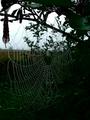
| 09/19/2005 07:36:13 PM | God's Morning Jewelsby paul58Comment: Greetings from the Critique Club,
Excellent image! I love the composition and that is such a great subject. The incorporation of the sky is perfect as well as it breaks up what would be a very dark image.
The image is on the dark side, but it looks like you had to do that to keep the sky from blowing out. Maybe, try taking it from a higher angle to get less sky and more of that great web on the dark background, but I wouldn’t take the sky out of the photo completely. I do like the darkness, but I think it would need to be a little more colorful as a print.
I’m a little curious about your aperture of F5.7. Were you going for a deep DOF but needed to open it up a little to shoot it hand held? Personally I think I’d rather see it with a more shallow DOF to draw all attention to that great web.
If you have any questions or comments on my critique, feel free to PM me.
| | Photographer found comment helpful. |
Home -
Challenges -
Community -
League -
Photos -
Cameras -
Lenses -
Learn -
Help -
Terms of Use -
Privacy -
Top ^
DPChallenge, and website content and design, Copyright © 2001-2025 Challenging Technologies, LLC.
All digital photo copyrights belong to the photographers and may not be used without permission.
Current Server Time: 08/01/2025 01:20:01 PM EDT.
|