| Image |
Comment |
| 02/21/2006 10:48:35 PM |
|
 Photographer found comment helpful. Photographer found comment helpful. |
| 02/21/2006 10:42:03 PM |
GLUTTONYby JPRComment: A little blood trickling out the mouth and I give it a 10. Fantastic! |
| Photographer found comment helpful. |
| 02/21/2006 10:32:36 PM |
Flowerynessby senojComment: The 8th deadly sin? Maybe it's to abstract for me to understand, but this just looks like a mess that needs to be cleaned up. |
| Photographer found comment helpful. |
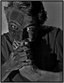
| 02/21/2006 10:26:21 PM |
WRATHby ACheltonComment: Great photo, but looks more like dispair or shock then wrath. He looks like someone just stole his camera, not like he wants to kill the guy that stole it. Great entry still. |
| Photographer found comment helpful. |
| 02/21/2006 10:18:59 PM |
Lustby LalliSigComment: I love the way the eyes and strawberry stand out. Great photo! |
| Photographer found comment helpful. |
| 02/21/2006 10:16:25 PM |
WRATHby AlexSaberiComment: Great pose and lighting. Very good take on the challenge. |
| Photographer found comment helpful. |
| 02/21/2006 10:14:57 PM |
An Object of Lustby fadedbeautyComment: I like the way the pale white legs on the white background makes the stockings stand out. Great pose and composition. Great job! |
| Photographer found comment helpful. |
| 01/25/2006 10:01:32 PM |
The local time in Iceland is..by KrisbyComment: Greetings from the on request Critique Club!
There is that focus problem. You meet the challenge in an obvious way here but there are a few other problems. Your editing made the image really grainy. Not sure if that was intentional or not, but with the textured wall it’s too much for me. The background is the biggest downfall of the shot in my opinion. Too shiny, too much texture, and it simply draws too much attention away from your subject. As for the subject, I think the clock alone and a different title would have faired better.
I do like the shadow and that you composed it with the rule of thirds. More crisp and a different background and I’d give you a 6.
Good luck and keep working on it. I’m expecting you to have the top image for your camera here real soon.
|
| Photographer found comment helpful. |
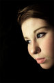
| 01/25/2006 09:40:34 PM |
The Signs of Sorrow come from the eyesby KrisbyComment: Greetings from the on request Critique Club!
First off, excellent photo! The low score is only because you didn’t even come close to meeting the challenge. If you want to score well you kind of have to meet the challenge, usually in an obvious way. In the portrait challenge this would score a 6 or 7 from me.
What I like about the image: it conforms to the rule of thirds, very well lit, I love the eyes and the way they look off out in the darkness, and the black background accents your face perfectly.
What I don’t like; you said this one wasn’t blurry, but it’s sure not crisp either. I’m assuming this is a self portrait, in that case, it’s hard to focus because the camera sets the focus when you start the timer and not when you are in front of the camera. Thus, you need to set up a prop where you’ll be to get the focus right, or use manual focus. Or it might be the camera, do you have problems getting images in focus normally? Also, in the title you are going for sorrow, but the image doesn't say sorrow to me. You look more optimistic or in deep thought. For sorrow, try looking down.
Look at the bright side though; you have the 6th highest scoring image ever on DPC with your camera!!!
|
| Photographer found comment helpful. |
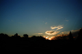
| 12/19/2005 10:09:06 PM |
Not Quite Sun-Upby GeneralEComment: Greetings from the Critique Club GeneralE,
Very nice scene. It seems to be missing something to give it a wow factor though. It was probably a better shot 10 minutes after you took this, but then it would have been just in time. I like the clouds, but I don’t like the over all color of the photo. It’s kind of a dull shade and it over powers the small spot of sun.
I like silhouette shots, but I’d like to see something from the bottom coming up higher, maybe on the left side? A tree or a branch maybe? Right now it looks like a cluster of stuff along the bottom.
Overall I would have scored this a 5. It meets the challenge and it’s an attractive scene but it just seems to be missing something.
I hope you find my review helpful, if you have any questions feel free to PM me.
|
| Photographer found comment helpful. |
Home -
Challenges -
Community -
League -
Photos -
Cameras -
Lenses -
Learn -
Help -
Terms of Use -
Privacy -
Top ^
DPChallenge, and website content and design, Copyright © 2001-2025 Challenging Technologies, LLC.
All digital photo copyrights belong to the photographers and may not be used without permission.
Current Server Time: 07/31/2025 03:38:46 PM EDT.