| Image |
Comment |
| 06/03/2004 02:13:05 PM |
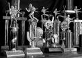
Emily's Trophiesby bobdaveantComment: This one falls a bit flat with me, unfortunately. I'm trying to figure out why. Maybe if it was composed slightly different - with some of the trophies piled up to the right or lef t- maybe using the rule of thirds a bit and allowing the use of a bit more negative space on top or to the right or left. The trophies seem very shiny and I'm wondering the light source you were using. Maybe there's no way to get around it. Maybe a reflector and lighting away from the subject would have helped a bit. Like it in black and white though. |
 Photographer found comment helpful. Photographer found comment helpful. |
| 06/03/2004 02:11:53 PM |
Ball in trainingby grosmongolComment: Really love the rich greens in the grass. I love that you took the time to think about proper lighting to bring out the richness of the colours. Like the composition a lot. Love the red stitching. -7 |
| Photographer found comment helpful. |
| 06/03/2004 02:11:07 PM |
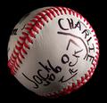
Pride of the East Side Rangersby fisheyeComment: Very cool. Would have liked to see the ball to either the right or left side - maybe rule of thirds (and I know it's frustrating to hear that after the centred challenge - I know people on this site tend to go on about rule of thirds too much) - but this would have been just even more interesting as an actual photograph if the ball was balanced against negative space - to the right or left. Love that you tookt he time to light it properly and like it a lot against the black. - 7 |
| Photographer found comment helpful. |
| 06/03/2004 02:08:55 PM |
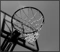
Nothin' But Netby lizzyc3Comment: Great shot. love the black and white. Love the angle. I realize you can't spot edit - or prevent where birds are going to pooh, but the poop is a little distracting along the back boards. good luck though. I'm sure you're going ot do really well. Love the negative space tothe right hand side. |
| Photographer found comment helpful. |
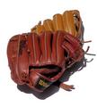
| 06/03/2004 02:08:05 PM |
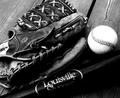
The Louisville Sluggerby ShakeyComment: Love the old-time feel of this. Well composed, sharp image. Really great to use worn equipment. Love the black and white. May have looked good in sepia also. |
| Photographer found comment helpful. |
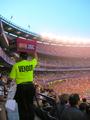
| 06/03/2004 02:07:37 PM |
Fans, Vendors, and Lightsby TranquilComment: Excellent idea for this challenge. It's too bad it's a bit washed out to the right hand side; however, I almost think it adds a bit tothe image once I really look at it. Good luck -9 |
| Photographer found comment helpful. |
| 06/03/2004 02:06:22 PM |
Go Catchby ChefbozComment: This seems to have a bit of noise or compression artifacts that are a tiny bit distracting. However, good use of lighting. I like it on the white background. -7 |
| Photographer found comment helpful. |
| 06/03/2004 02:05:55 PM |
Netby tmb1070Comment: Great idea for this challenge. Love the sepia tones. Maybe would have liked to see the front part of the basket in focus, but I know sometimes these thigns don't work out. -8 |
| Photographer found comment helpful. |
| 06/03/2004 02:05:07 PM |
"Go Blue!"by sfarrell23Comment: Love that you took the time to construct something with composition in mind. Love the colours and the fact that you used effective lighting to illuminate things. Good luck - 7 |
| Photographer found comment helpful. |
| 06/03/2004 02:04:39 PM |
|
| Photographer found comment helpful. |
Home -
Challenges -
Community -
League -
Photos -
Cameras -
Lenses -
Learn -
Help -
Terms of Use -
Privacy -
Top ^
DPChallenge, and website content and design, Copyright © 2001-2025 Challenging Technologies, LLC.
All digital photo copyrights belong to the photographers and may not be used without permission.
Current Server Time: 07/24/2025 10:28:55 PM EDT.