| Image |
Comment |
| 05/09/2006 10:02:07 PM |
Balloonsby careComment: Hello from the critique club,
I see that this is your first dpc challenge. Welcome! I think this is a very good first entry. Well done. Good luck on many mroet o come.
I like this entry very much. It fits the challenge perfectly. The colors are great. The blue and orange are vibrant without looking overprocessed.
The most striking part of the image is the composition. I love the way the balloons fill the upper corner. The line of the hand and the string draws your eye right up to the balloons. I like the negative space left in the background. It makes the composition not too busy.
I think I would have rotated the image clockwise so that the hand was coming out of the corner of the frame (or close). I think that the lines would have beena little stronger this way. A minor detail. I also would like to see just a little bit more of the arm.
It is hard to tell if this is a studio shot or if it was taken against a bright sky. If the background is meant to be pure white, it would have been helpful to light the other side so that it is evenly white. Many commenters felt that you were blowing out a blue sky here. If that is the case then I agree that it would be nicer to see more blue. A tough exposure, though.
I didn't vote in this challenge, but I would have given this image a 6 for its originality and playfullness and its excellent intpretation and execution of the challenge.
Please fee free to pm me if you have any questions about my comments.
Cheers,
Liza
|
 Photographer found comment helpful. Photographer found comment helpful. |
| 05/08/2006 08:54:41 PM |
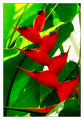
Naturallly Complementedby ericwooComment: Hello from the critique club,
You have already received many very helpful commments. I considered this for awhile before going on to read what others had to say, so I hope that I can add something to the discussion.
My favorite part about this image is the composition. I love all of the diagonal lines and the shape of the red leaves. I like how the red flower cuts into the frame from one direction and the green leaves form lines in the opposite direction. I like how the longest red flower/leaf comes all the way across the very bottom of the image. It keeps my eye from trailing out the bottom of the frame and sends me looking back upwards. The weakest part of the composition, as you know, is the blank space of the window.
It feels like there is a bit of an upward camera angle, which I like here. Kind of like the greenery is towering above the viewer. Maybe this could have been exagerrated with an even steeper angle? Could you have gotten even closer to the base and really shot up at it?
As you mention in your comments there is some significant loss of detail in both the reds and the greens. THis may be from your exposure or your processing, I am not sure. More detail and contrast in the leaves and flowers would give the image more texture and depth. I like the highly saturated colors, though. I think it works for this image (although it probably contributed a bit to the detiail loss).
For the challenge, the mix of red and green is bang on. I didn't vote in the challenge, but I would have given this a 6. I think it can be very hard at a place like a botanical gardens to separate all of the intense visuals of flowers and plants and find the photograph lurking within. This is a very well seen shot that meets the challenge well, but with some technical limitations.
Please feel free to pm me if you have any questions about any of my commets.
Cheers,
Liza
|
| Photographer found comment helpful. |
| 05/05/2006 11:20:19 PM |
Cascadilla at Duskby cresusComment: I think some more midtone contrast in the water could make the waterfall really pop. The image itself has good dynamic range, but somehow the water looks a bit flat. That may have been the effect that you were going for, I realize. Nice composotion. I like how you shot at an angle instead of straight on and how you included the top of the arch in the frame. |
| Photographer found comment helpful. |
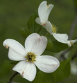
| 05/05/2006 03:49:53 PM |
Signs of Springby DigitalVitaComment: I love the detail that you have captured in the texture of the perals. The composition works very well, too. I feel like this is too flat and a little underexposed. Adding some contrast in the quatertones/midtones and bringing the highlights up just a bit (so that the brightest white is really white, but not blown out) would make this even better. 7 from me. I think it could have been an 8 or a 9 with a curves tweak. |
| Photographer found comment helpful. |
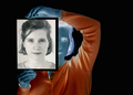
| 05/01/2006 10:53:18 AM |
Two Facedby bvoiComment: Cool idea and nicely done. I think it would have been even better if the picture she is holding up was only half of her face, so that the noses met down the middle. 7 from me. |
| Photographer found comment helpful. |
| 04/30/2006 09:38:12 PM |
Woody and the Boysby lenox114Comment: This is awesome. I stared at this for along time trying to picture the positive image. I am impressed with your light set-up. The shadows work very well for this challenge. 9 from me. |
| Photographer found comment helpful. |
| 04/19/2006 01:39:37 PM |
My little princessby CoozComment: Sweet baby and nice eye contact from such a tiny one. The whites of her dress are blown out. |
| Photographer found comment helpful. |
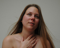
| 04/19/2006 01:39:09 PM |
Untitledby hopelessoptimistComment: Next time try angling her shoulders so that she is not posed so square to the camera. Also, her hand being cut off by the crop makes it look a little disembodied. I might leave more room below her and take some off the top. Lovely model and a very nice expression. |
| Photographer found comment helpful. |
| 04/19/2006 01:38:49 PM |
Praying for youby GunnsiComment: The shawl seems more in focus than the eyes. Cute little model and I like the expression. |
| Photographer found comment helpful. |
| 04/19/2006 01:37:29 PM |
Ms. Perfect Smileby thegrandwazooComment: This seems quite underexposed. I like the way her hair frames her face. I think you could have cropped more off the top, down to the top of her hairline. |
| Photographer found comment helpful. |
Home -
Challenges -
Community -
League -
Photos -
Cameras -
Lenses -
Learn -
Help -
Terms of Use -
Privacy -
Top ^
DPChallenge, and website content and design, Copyright © 2001-2025 Challenging Technologies, LLC.
All digital photo copyrights belong to the photographers and may not be used without permission.
Current Server Time: 08/04/2025 10:08:25 PM EDT.