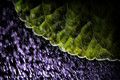
| Image |
Comment |
| 09/30/2014 01:31:02 PM |
|
 Photographer found comment helpful. Photographer found comment helpful. |
| 09/30/2014 01:30:53 PM |
|
| Photographer found comment helpful. |
| 09/30/2014 01:30:21 PM |
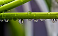
Green Waterby ladpupmoeComment: I like the sharpness on the main splash, although I might have liked a tighter crop. |
| Photographer found comment helpful. |
| 09/30/2014 01:24:34 PM |
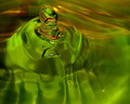
Overflowby vawendyComment: I like the appearance of the faucet, but I would have enjoyed a bit smoother looking water (longer exposure?) I think. |
| Photographer found comment helpful. |
| 09/30/2014 01:19:05 PM |
At Homeby MelonMusketeerComment: I like the green color and the reflections in the water, but the gator is a bit small in the image and I'm not sure the trees framing the image added much. |
| Photographer found comment helpful. |
| 09/28/2014 09:06:31 PM |
Stately Cornerby PangurbanComment: *Greetings from the critique club*
Compositionally I have mixed feelings about this image. It has a great right angle, which was perfect, and required, for the challenge. But I also found myself wanting to see a bit more of the scene. Overall I think you made a good choice. There is a nice variation in color which drew my eye throughout your whole imageand there are also multiple textures which is interesting.
Technically I think your colors are good, they look very real. There seems to be a but of softness in the upper part of the image. Did you use a tripod? I would guess you did since the ground seems very sharp, but I would have preferred sharpness all the way up the wall. The lighting is nice, no areas with overly dark shadows, although the light is a bit flat. There is not a lot of lighting drama in the image.
As far as simple processing advice, I wonder what adding a bit of contrast would do? Also you could play with lowering exposure a bit, or play with levels and curves then adding a bit of saturation & vibrance to the greens and oranges to get a bit more pop to the image.
Overall, nice entry. It certainly meets the challenge. When comparing your image to those top scorers, those images seem to have a bit more depth and lighting drama.
Thanks for sharing this interesting bit of old building. Keep shooting!
Julee |
| Photographer found comment helpful. |
| 09/26/2014 02:05:28 PM |
light and darkby AbraComment: *Greetings from the Critique Club*
This image has some great bones. I love the darkness and high drama in the photo. Compositionally I think this image works well, there is some nice movement and almost leading lines with some of the clouds, so my eye was drawn through the entire image.
Technically I think this shot is very good. There is detail in all of the dark areas, and the I like the depth and contrast in your image. The shades of brown and that bit of blue really made the image to me.
Your image certainly met the challenge, and you scored well. Looking at the highest scores in the challenge, most of those had a little wider range of color - but to me yours is equally as dramatic - and I would say I actually enjoy the asymmetry and drama of your sky even more than some of those on the first page. (The sun spot might be blown out, but frankly to me that just added to the image.)
Nice job I say.
Julee |
| Photographer found comment helpful. |
| 09/26/2014 10:11:34 AM |
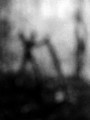
there you are, sweet lollipopby jmritzComment: As I reviewed these challenge entries, where I could see my comment against your thumbnail, I realized that for me this image worked better as a thumbnail. I think I got it now - I'm not sure why, but my eyes were not able to connect the dots with the full size image. Interesting.
(But I love the thumbnail - would have been one of my 10's).
|
| Photographer found comment helpful. |
| 09/25/2014 05:09:15 PM |
dreams that you dare to dreamby posthumousComment: *Greetings from the Critique Club*
I didn't get a chance to vote in this challenge, so the image was new to me. I spent several minutes looking at and thinking about the image before starting to comment. Then I had a work meeting. And then I started looking again and noticed your comment about the image being made from sand. Awesome. I think pure genius. I was enjoying the view, and seeing a fish, and then a woman, and I was looking for more. I did observe that the image appeared a tiny bit 'gritty', but I was so lost in the wonder of the 'clouds' that I had no idea I was not looking at the sky. Well done, well done.
Photographically, I like the colors and the wispy areas that allow one's imagination to wander. But the image does not have strong shapes, and does not have a lot of depth or contrasts. It appears many voters in this challenge idealized a more traditional and shiny image with a skyline from some city with the wildly vivid sky. To me your image is almost a storytelling image, there could be great meaning to the person who took it, but without the viewer understanding that story, this image perhaps seems a bit incomplete. There were however, a few voters who enjoyed your interpretation of skyscape.
(And even after spending nearly 15 minutes with this image, I still see the sky.)
Julee
|
| Photographer found comment helpful. |
| 09/25/2014 11:55:51 AM |
|
| Photographer found comment helpful. |
Home -
Challenges -
Community -
League -
Photos -
Cameras -
Lenses -
Learn -
Help -
Terms of Use -
Privacy -
Top ^
DPChallenge, and website content and design, Copyright © 2001-2025 Challenging Technologies, LLC.
All digital photo copyrights belong to the photographers and may not be used without permission.
Current Server Time: 08/19/2025 07:04:35 AM EDT.