| Image |
Comment |
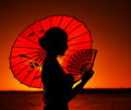
| 07/30/2012 04:31:19 PM |
Elegance by pambComment: This is an excellent concept and I like that both the model and the umbrella give clean silhouettes. I like the use of both the umbrella and the vignette to frame the model's head. As a minor criticism, having the model's left hand (holding the large umbrella) held close to her body spoils the shape of her silhouette a little bit. |
 Photographer found comment helpful. Photographer found comment helpful. |
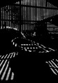
| 07/30/2012 04:24:28 PM |
The Boat House.by mrbig65Comment: This is a fantastic location with lots of beautiful lines and the high contrast makes very good use of it. Some of your highlights are a little blown out (e.g. the boat's crossbeams and at the very top of the image) and spoils the sharp lines a little bit. I also think you could have kept a little less of the image on the bottom. |
| Photographer found comment helpful. |
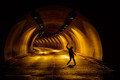
| 07/30/2012 04:15:52 PM |
Into the Belly of the Beast by vawendyComment: This is a great concept with nice lighting and beautiful lines. The model is well placed so the curved lines of the tunnel to lead the eye into the distance. Her shadow makes great shapes on the pavement. The only thing I don't like is that the pose makes her feet look a little odd, but that's a minor nit-pick. |
| Photographer found comment helpful. |
| 07/30/2012 04:11:42 PM |
Lacy in the Skyby shairComment: The colors are beautiful, and the golden border around the strong silhouette at the focal point works well. |
| Photographer found comment helpful. |
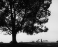
| 07/30/2012 04:07:40 PM |
mother's poetryby bspurgeonComment: The wind-blown hair on the middle child really makes this image and gives a lot of atmosphere. The fuzzy quality is often overdone but it works well here and makes this feel like an earlier memory. I also like that you didn't yield to the temptation to include the entire tree and instead used it for framing. |
| Photographer found comment helpful. |
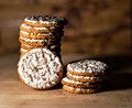
| 07/23/2012 05:41:33 PM |
Cookiesby MinsoPhotoComment: The image is lacking a clearly focused area to look at. There's not a lot of color variation to provide interest. It could have been cropped much closer since there's a lot of unused space on all sides and four or five cookies would have been plenty. |
| Photographer found comment helpful. |
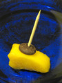
| 07/23/2012 05:41:28 PM |
Mango Kebabby GeneralEComment: I don't know if it's because of the quality of the light coming off the glass on the plate, but it looks like you selected the background separately and did some processing on it that left the edges between your dessert and background looking unreal (that "shopped" look). It looks like the hole for the skewer was created by melting, and there's a blob of chocolate just below where the skewer comes through that ends up being distracting. I don't feel like there's enough texture captured in the mango, and a different combination of viewing and lighting angles might have worked better. |
| Photographer found comment helpful. |
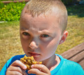
| 07/23/2012 05:32:55 PM |
This is mine...go find your own!!by ksierrasComment: The subject is too centered and there's too much room, especially on the right side (since he's facing to our left). The midday sun leaves harsh and uneven shadows. |
| Photographer found comment helpful. |
| 07/23/2012 05:26:07 PM |
Well hello there rainbow sprinkles... have you met my tummy?by O'HolleranComment: The lighting is uneven and the background is too bright and draws the eye away from the focal point. If only part of the image is brightly lit then it needs to be the focal point. A lot of the foreground sprinkles are out of focus so you probably should have focused on a different spot or used a larger DOF. |
| Photographer found comment helpful. |
| 07/23/2012 05:19:36 PM |
Oby TiberiusComment: The right-most cherry really wants to be the focal point but it's too far over to the side and not enough of it is in focus. I would like it better with a little larger DOF so the near edge of the frosting wasn't as blurry. |
| Photographer found comment helpful. |
Home -
Challenges -
Community -
League -
Photos -
Cameras -
Lenses -
Learn -
Help -
Terms of Use -
Privacy -
Top ^
DPChallenge, and website content and design, Copyright © 2001-2025 Challenging Technologies, LLC.
All digital photo copyrights belong to the photographers and may not be used without permission.
Current Server Time: 08/20/2025 08:13:58 AM EDT.