| Image |
Comment |
| 01/22/2005 05:53:44 AM |
STORM COMINGby DArcy10Comment: If you crop out the top part of the clouds so that only about an inch and a half of the dark clouds are showing I think you will find a better picture. Nice shot tho and nicely leveled. Well done and keep up the good work in 2005. |
 Photographer found comment helpful. Photographer found comment helpful. |
| 01/22/2005 05:50:50 AM |
Unsettled Weatherby jduffettComment: I think this photo may suffer a bit from people with smaller moniters. I find it to be unnecessarily to tall and a 1 inch crop off the top would have had the same impact. I like the B&W style and the way the contrast from the sun whites out the weather vain on the top. It also has excellent clarity and good use of ROT. Well done and keep up the good work in 2005. |
| Photographer found comment helpful. |
| 01/22/2005 05:47:30 AM |
Missing Youby plumber711Comment: Nice trick but not a photo I would hang on a wall. I'm not fond of the positioning and find I have to turn my head to actually get a good look at the photo. The photo has excellent cloros and clarity but in my opinion lacks substance. Well done and keep up the good work in 2005. |
| Photographer found comment helpful. |
| 01/22/2005 05:45:09 AM |
The Great Pumpkinby MobiusComment: I think this would make for a nice calender shot but not something I would have on a wall. Excellent color and clarity and well centered. Good job and keep up the good work in 2005. |
| Photographer found comment helpful. |
| 01/22/2005 05:38:04 AM |
Van Gogh Skyby NeilComment: What an interesting way to shoot a fire. I'm not sure I like it but then again I've been looking at it for about 5 min. now and can't quite graps it. Nice motion blurr and excellent colors and despite there being nothing or very little to look at I am drawn to the photo. Well done and keep up the good work in 2005. <7> |
| Photographer found comment helpful. |
| 01/22/2005 05:34:19 AM |
Painted with fireby tristaliskComment: I like this shot but because of the high contrast from the sun on the clouds in gives a blurry impression in the sky. A beautiful tranquil picture tho to say the least and a shot that you could get lost in just looking at it. Best of luck and keep up the good worlk in 2005. |
| Photographer found comment helpful. |
| 01/22/2005 05:31:57 AM |
Road around Mývatn Wastelandby russiComment: I personally would have taken the shot horizontally instead. I find there is to much wasted space and far to much sky. A tighter crop and a wider picture would have made for a better shot in my opinion. I also find that this photo lack subject. Perhaps if it wasn't so dark and we could see the road better. Good luck and keep up the good work in 2005. |
| Photographer found comment helpful. |
| 01/22/2005 05:28:46 AM |
Light of lifeby nicklevyComment: I like the silhouette look and the selective desaturation. It adds warmth to this photo because its so subtle. I am not fond of the subject but oh well it still a nice shot. Well done and keep up the good work in 2005. <7> |
| Photographer found comment helpful. |
| 01/22/2005 05:23:19 AM |
The Recitalby skiefComment: Nice shot but with her moving it blurrs her and makes the shot OOF. I love the reflection of the piano keys against the piano but again with the blurry from the girl is just to distracting. Good luck and keep up the good work in 2005. |
| Photographer found comment helpful. |
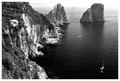
| 01/21/2005 01:56:51 PM |
Faraglioniby ChiquiComment: A beautiful costal shot but the contrast off the rock face is very hard to look at because of the brightness. If I stand back and look its a very nice photo and lots of detail. Well done and keep up the good work in 2005. <7> |
| Photographer found comment helpful. |
Home -
Challenges -
Community -
League -
Photos -
Cameras -
Lenses -
Learn -
Help -
Terms of Use -
Privacy -
Top ^
DPChallenge, and website content and design, Copyright © 2001-2025 Challenging Technologies, LLC.
All digital photo copyrights belong to the photographers and may not be used without permission.
Current Server Time: 08/08/2025 02:56:41 AM EDT.