| Image |
Comment |
| 04/13/2005 08:31:06 AM |
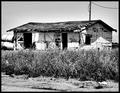
Derelictby Picture ThisComment: Nice photo but looks to be way to much USM. Beautiful B&W conversion and I kinda like the photo but it lacks clarity/definition. I find the contrast to be a little to bright as well. Well done and good luck in this challenge. |
 Photographer found comment helpful. Photographer found comment helpful. |
| 04/13/2005 08:26:23 AM |
Left for deadby rayg544Comment: There is a fine line between abandoned buildings and buildings in ruins. This looks to me like it is in ruins. A very interesting composition tho. |
| Photographer found comment helpful. |
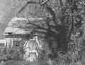
| 04/13/2005 08:17:00 AM |
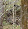
Broken Dreamsby AlbireoComment: Very interesting building but the trees block most of it and in my opinion are very distracting. |
| Photographer found comment helpful. |
| 04/13/2005 08:14:23 AM |
Forgotten Barracksby gbautista87Comment: I think this photo would have looked a LOT better if both your dimemsions were not 640. As it is I find it very hard to look at because of the odd size. |
| Photographer found comment helpful. |
| 04/13/2005 08:12:09 AM |
Faded beautyby ThorrComment: I fear the camera may have focused a little more on the lines in front of the building then the building itself. It appears the building is slightly blurry but a great shot none the less. Good luck in this challenge. |
| Photographer found comment helpful. |
| 04/13/2005 08:08:43 AM |
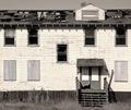
Funeral Home of the Past (Passed)by Resusit8uComment: The contrast of the photo makes the whites look blown out. I find that it has also made the clarity a little OoF. Still a beautiful building tho. Well done and good luck in this challenge. |
| Photographer found comment helpful. |
| 04/13/2005 07:56:52 AM |
Greenhousesby joebokComment: wow excellent shots. could have been a touch brighter tho. Being that the image is so dark it loses a little bit of clarity and depth. I also think that you may get some low scores due to the composition of the shot and that it is small. I would love to see the original after the challenge is over tho if possible. <7> |
| Photographer found comment helpful. |
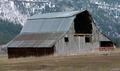
| 04/13/2005 07:49:22 AM |
Rustic Barnby JacksonComment: Nice shot but the photo doesn't look level. Perhaps a 1 or 2 degree rotation cw would have made for a better picture. |
| Photographer found comment helpful. |
| 04/13/2005 07:47:24 AM |
This Old (Spook) Houseby mecomarkComment: interesting photo but way to washed out. It lacks clarity because of the contrast level and the shadow from the tree is very distracting. Good luck with this challenge. |
| Photographer found comment helpful. |
| 04/13/2005 07:45:39 AM |
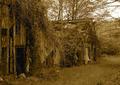
Tulip Field Shedby CantiqueComment: Altho a somewhat nice photo the clarity is off. Beautiful colors but the focus takes so much away from the natural beauty of the shot. The building you have chosen doesn't look abandoned but out of place with the flowers. God luck with this challenge. |
| Photographer found comment helpful. |
Home -
Challenges -
Community -
League -
Photos -
Cameras -
Lenses -
Learn -
Help -
Terms of Use -
Privacy -
Top ^
DPChallenge, and website content and design, Copyright © 2001-2025 Challenging Technologies, LLC.
All digital photo copyrights belong to the photographers and may not be used without permission.
Current Server Time: 08/08/2025 01:42:20 PM EDT.