| Image |
Comment |
| 04/16/2005 04:21:37 AM |
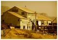
Old Saw Millby drgsoellComment: I find the focus to be a little off in this photo. I also not sure if I like the yellowish hue that covers this photo altho it has made me look at the picture for a litle longer. The photo is level and is well composed. Good luck in this challenge. |
 Photographer found comment helpful. Photographer found comment helpful. |
| 04/16/2005 04:17:48 AM |
twisted and brokenby frogletComment: I'm not sure I like this photo. I find it to be to distracting/busy with the metal gate obstructing the view of the building. The metal also appears to be a little OoF (could be to resizing issues at 640). I also find there is more sky then building and I feel that the building should be the main subject of the shot. Without the metal fence there I think the shot was composed alright but could have done with a lower angle. Good luck in this challenge. |
| Photographer found comment helpful. |
| 04/16/2005 03:52:57 AM |
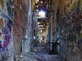
Hall of Horrorby RulerZigzagComment: There is quite a few hotspots in the center of the frame that I find to be very distracting. I assume its where the roof is off near the top center of the photo is the worst one of all. I also find that the photo could have been rotated about 1 or 2 degrees ccw to level out the photo properly. I think the image has some good color but lacks clarity due to image resizing. A different crop of this photo ould have made a greater impact on this photo. Good luck with this challenge. |
| Photographer found comment helpful. |
| 04/16/2005 03:43:56 AM |
|
| Photographer found comment helpful. |
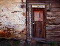
| 04/14/2005 11:05:19 AM |
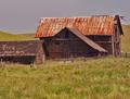
Old Abandoned Wooden Houseby mkirdalComment: Excellent building. Outstanding colors and clarity and excellent composition/perspective. Well done and good luck in this challenge. <8> |
| Photographer found comment helpful. |
| 04/14/2005 11:03:11 AM |
Once was lost...by digital-infinityComment: The contrast from the sky/sun is causing a washout affect on the photo and has made it lose clarity/quality. The composition of the shot is fairl nice as it eases the eyes into the photo. The building also doesn't suggest to me the is is abandoned but more like unused at the moment. Good luck in this challenge. |
| Photographer found comment helpful. |
| 04/14/2005 10:36:25 AM |
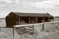
Need of Repairby bobgaitherComment: We have farms in my country that look a lot worse then this and are still in use. The colors appear to be a little washed and the clarity is a little off but thats because of the resizing or the zoom. I do like the composition of the shot and find it draws my eyes into it. Good luck in this challenge. |
| Photographer found comment helpful. |
| 04/14/2005 10:34:13 AM |
Once Homeby GolferDDSComment: personally there is nothing about this shot that would suggest the building is abandoned. It does look old but not abandoned. Perhaps a different view or angle could have improved this. It does have excellent colors and for the most part has clarity. Good luck in this challenge. |
| Photographer found comment helpful. |
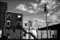
| 04/14/2005 10:32:18 AM |
urban backyard of yesterday's pastby hollisterGqComment: Sorry but nothing in this photo suggests that the building is abandoned. The photo suggests vacant to me. The shadows on the building from the sun also make it hard to look at or are distracting. I do like the composition of the shot and the B&W conversion. Good luck in this chalenge. |
| Photographer found comment helpful. |
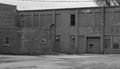
| 04/14/2005 10:28:20 AM |
236 Kansasby IronworkerComment: Perhaps titling it "school's closed" would have made for a better title. The photo is fairly nice and an excellent choice in B&W conversion. I really like the one window that isn't borded up. I find it adds a uniqueness to this photo. Well done and good luck in this challenge. |
| Photographer found comment helpful. |
Home -
Challenges -
Community -
League -
Photos -
Cameras -
Lenses -
Learn -
Help -
Terms of Use -
Privacy -
Top ^
DPChallenge, and website content and design, Copyright © 2001-2025 Challenging Technologies, LLC.
All digital photo copyrights belong to the photographers and may not be used without permission.
Current Server Time: 08/08/2025 10:18:35 PM EDT.